 Adobe Community

Copy link to clipboard
Copied
Information (must read):
I am working on a 2.0 of my website in adobe muse. And in my 1.0 the maximum width on 1080 put and this worked fine. (I also had other breakpoints, but 1080 worked fine for PC.)
Problem:
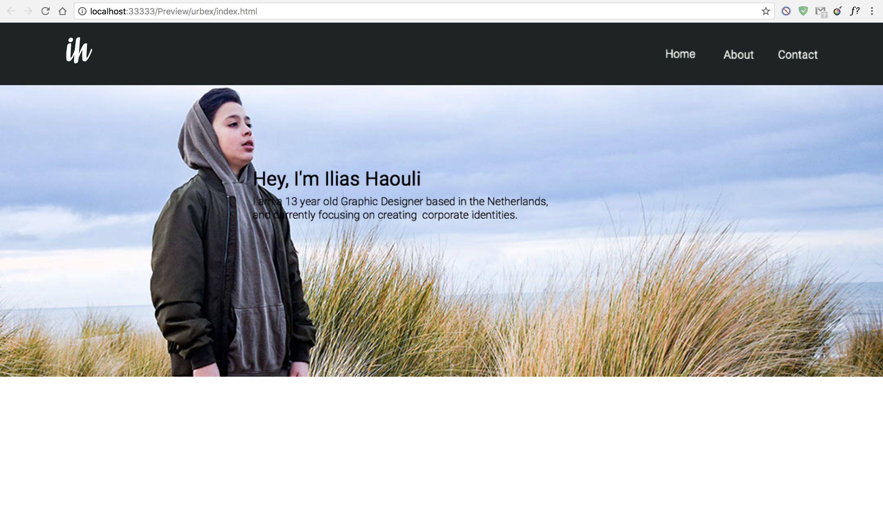
Now 1080 is not working properly anymore. If I look at it in the browser objects seems to move and looks like the perfect breakpoint for pc is 1440, while in adobe muse in 1080 is very nice show (see the difference in 1080 between adobe muse and the browser in the photos). 1080 worked very well first as max size. Why is this happening? And can I prevent this? Because it takes a lot of time to align even more breakpoints


 1 Correct answer

This is correct too. Images can’t be stretched browser wide. You may
- use a rectangle, stretched to browser width, and fill it with your image, or
- stay with you actual design, and respect the following:
As I said:
- Don’t use system fonts! Hope you read the link, I gave you.
- Muse doesn’t know, from which reference point the text should be positioned/shifted. You want the text move relative to the image behind. Since Muse is not you, but an application, it can’t know and interpret your image. It is up to
 5
Replies
5
5
Replies
5
Copy link to clipboard
Copied
The first thing, you should fix: Don’t use system fonts, as you evidently did.
For deeper explanation look here: https://forums.adobe.com/thread/2357163
Additionally you can’t talk about „the perfect breakpoint for PC is 1440 px“, because you stretched you complete page to browser width by using the „>>“ icon top right of the breakpoint bar.
Additionally, a most common layout error (which has nothing to do with your issue): Why do so many user create a 320 px breakpoint – and this often combined with a minimal page width of 320 px too ? Do they know devices with less than 320 px screen width? And, if yes, what do they expect to happen at a fluid breakpoint of 320 px, if the browser is forbidden to do anything, when the screen size gets smaller than 320 px (= minimal page width)?
Copy link to clipboard
Copied
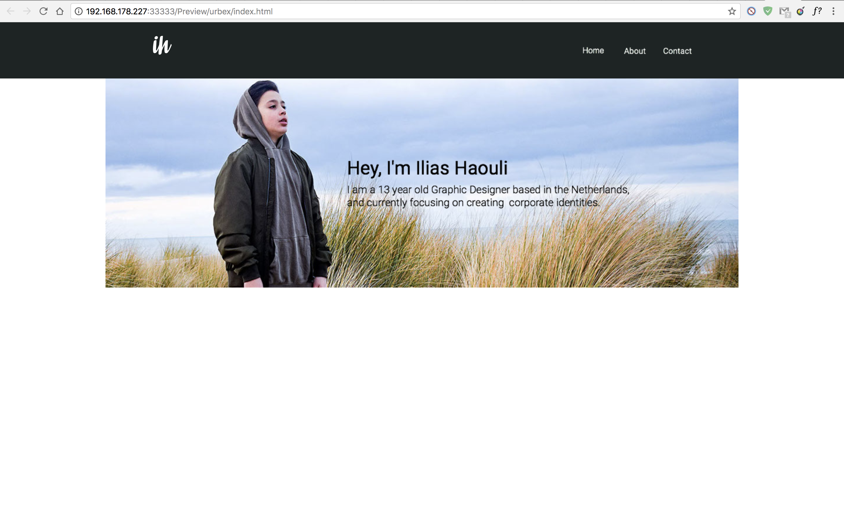
You are right about that browser width icon. And i undo that but then this happens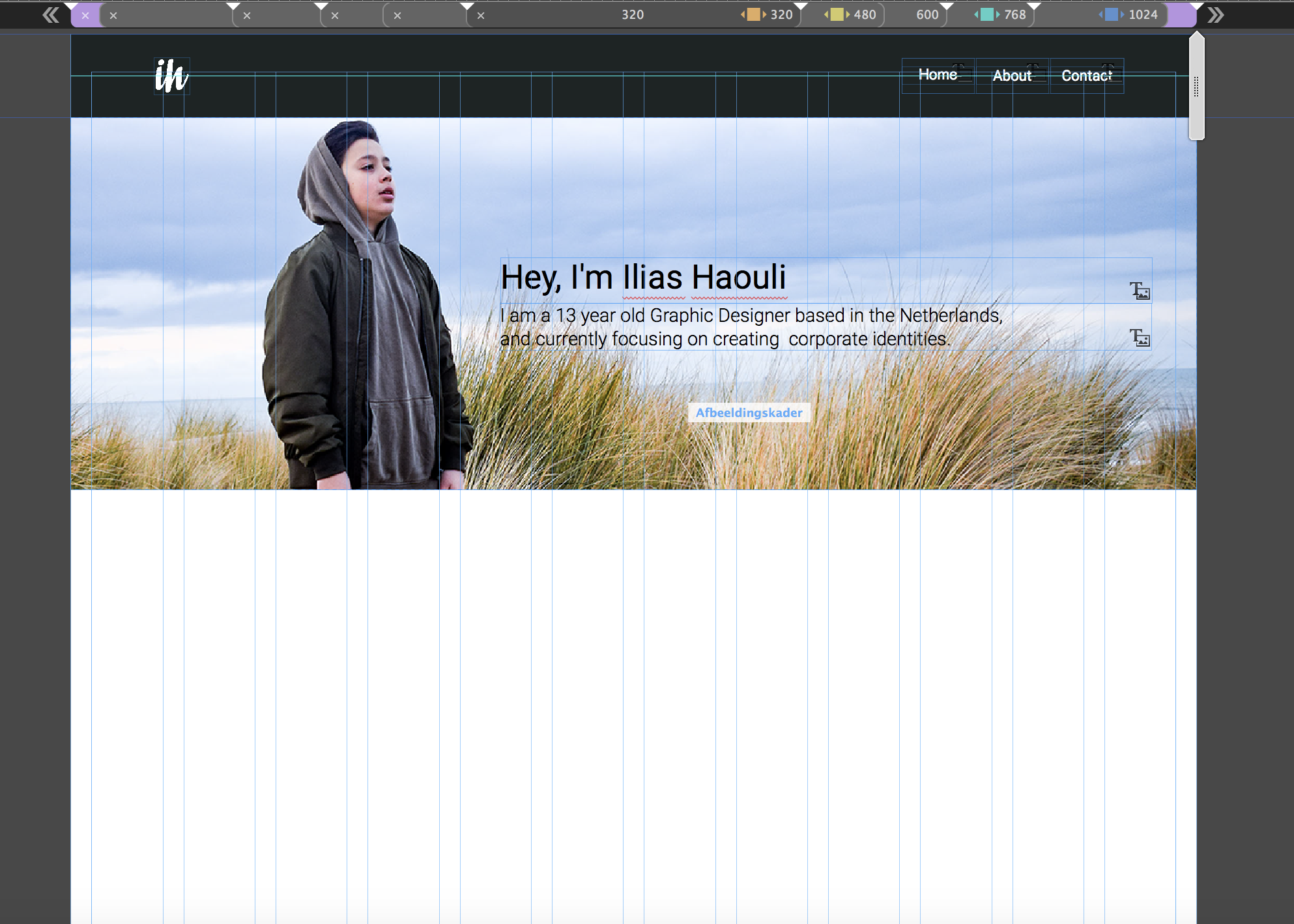
Copy link to clipboard
Copied
This is correct too. Images can’t be stretched browser wide. You may
- use a rectangle, stretched to browser width, and fill it with your image, or
- stay with you actual design, and respect the following:
As I said:
- Don’t use system fonts! Hope you read the link, I gave you.
- Muse doesn’t know, from which reference point the text should be positioned/shifted. You want the text move relative to the image behind. Since Muse is not you, but an application, it can’t know and interpret your image. It is up to you, to explain it to Muse.
You can do this by adding an empty image frame (an image frame, because it scales the same way as the image behind does).
This invisible frame should have the same width as the image behind. Its height shouldn’t overlap the text frame. If you now group this invisible frame with the text below, all should work as expected.
Here you find an example .muse file: https://www.dropbox.com/s/fei6o3keai9jhwg/synchronous-scaling.muse?dl=0
Copy link to clipboard
Copied
i already know this and still got no answer on my question
Copy link to clipboard
Copied
What??? If you really „know this“ all, why on heaven are there so many design issues in your site?
You got an answer and perhaps didn’t try to understand.
What is wrong with the sample file I linked? Did you even have a look?
And if: Provide a small(!!!) .muse file (only one page, only the image and the text)) via Dropbox, CC Files, …), which shows your issues exactly.
(I really am a little upset, when somebody takes time to reproduce your issue and creates a sample file to correct the issues and your simple answer is „I already know this and still got no answer on my question.")
 AdChoices