 Adobe Community
- Home
- Muse (read-only)
- Discussions
- What is the difference between creating breakpoint...
- What is the difference between creating breakpoint...

Copy link to clipboard
Copied
I do not understand the difference between creating breakpoints for a responsive website or by designing it through the desktop/tablet/phone(I inserted a screen shot just in case someone doesn't know what I am talking about) layout. Is it just 2 different ways to accomplish the same thing? Or is there an advantage to each?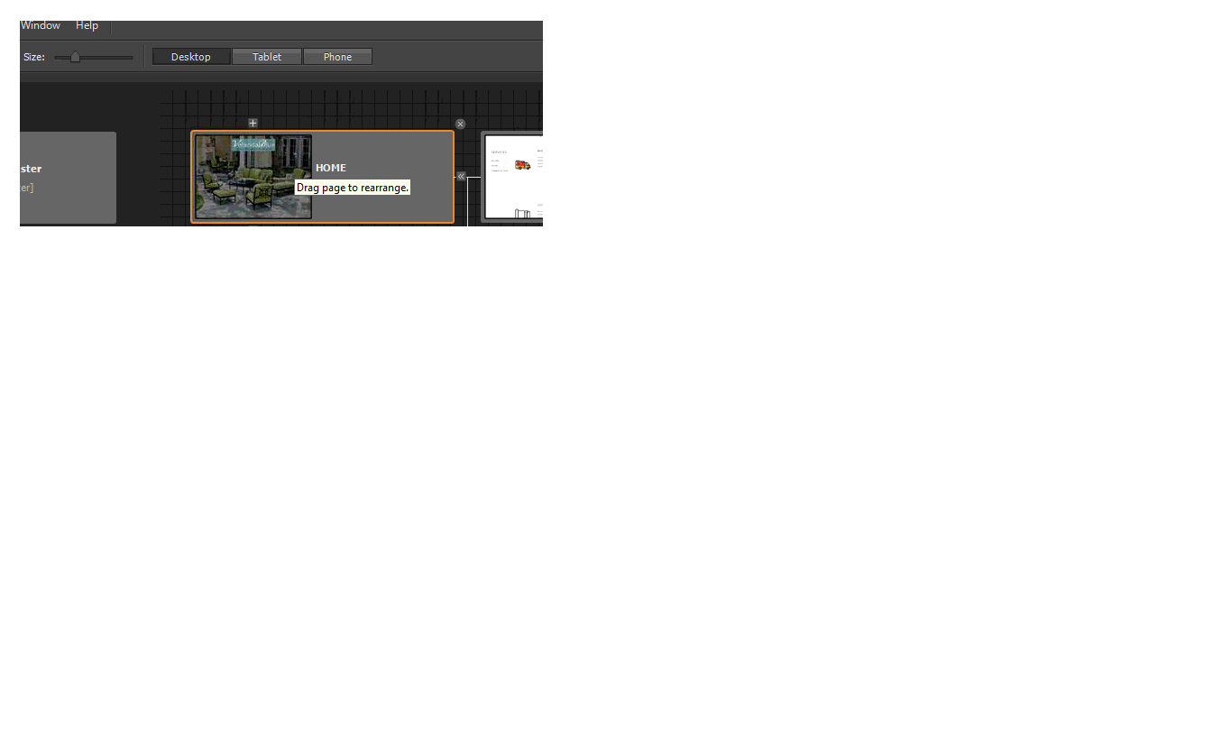


 1 Correct answer

Although the two are good for responsive and another normal is to say that responsive costs a lot of work to adapt is not easy but it requires a lot of work but the fixed as pc, tablet and mobile are three parts but saves less work time is to say just copy and paste to tablet and then move and start to adapt but responsive change that if you touch points and check that you do not have errors but always requires a lot of work when it works well or badly, depends what you want to do in responsive
...
 2
Replies
2
2
Replies
2

Copy link to clipboard
Copied
Hey Dmo68,
See this thread - Responsive vs Alternate Layouts which shall answer most of your queries with responsive web design.
Hope it helps.
Regards,
Ankush
Copy link to clipboard
Copied
Although the two are good for responsive and another normal is to say that responsive costs a lot of work to adapt is not easy but it requires a lot of work but the fixed as pc, tablet and mobile are three parts but saves less work time is to say just copy and paste to tablet and then move and start to adapt but responsive change that if you touch points and check that you do not have errors but always requires a lot of work when it works well or badly, depends what you want to do in responsive or redirect normal the two are good but I always work is to redirect because easier and quickly finish the work. I hope it serves the comments thank you.
 AdChoices