 Adobe Community
- Home
- Muse (read-only)
- Discussions
- Re: Why are all object left positioned in mobile v...
- Re: Why are all object left positioned in mobile v...

Copy link to clipboard
Copied
Hi,
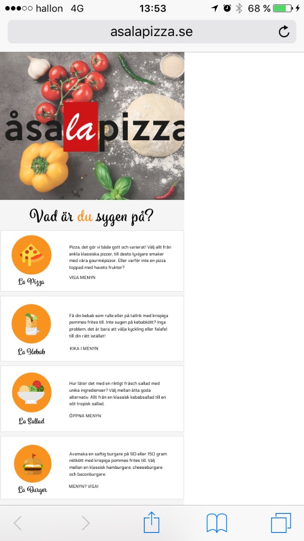
I have trouble with the mobile version of my webpage for a pizza place.
When I open the webpage from my phone - the entire page is positioned to the left. Even though I have marked all object to stretch to length of webpage/have responsive width. I have made sure that no objets are marked to the position to the left, but when I select "stretch to length of webpage/have responsive width", the left positioning gets chosen automatically anyway...(view the attached pic).
Please help me...does anyone have an idea on how I can solve this?
The web version: www.asalapizza.se
Sending a big thank you to any helpers!
Please view the pictures, 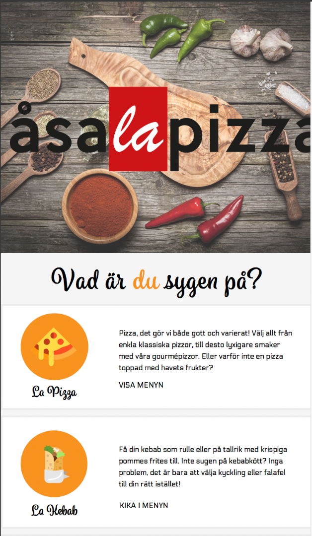


 1 Correct answer

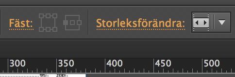
Watching your phone layout:
Browsers try to move to this anchor on the top left of the browser. So everything else has to follow. Place this anchor onto your canvas on the left edge of the canvas.
I realize that composition to be much wider than your canvas. Reduce it, so it fits into your canvas by: stretch to browser width.
For this you first use the left handle of the whole composition to the left edge of the canvas, then you place all contents into the canvas as well, then you move the right ha
...
 9
Replies
9
9
Replies
9
Copy link to clipboard
Copied
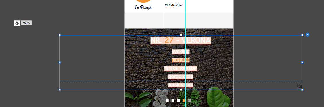
You used adaptive design. It looks like you have all (let´s call it menu-items) buttons pinned to left of the container (what you showed in your first screenshot.
This happens by default. Could`t you pin it to the center like the real menu down the page? This seems to be pinned to the center.
You should watch all items in your menu buttons to be centered as well or, even better, to be not pinned at all.
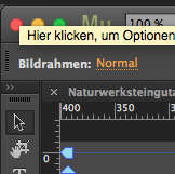
All the time you click an item inside the button or the button itself, you may watch the top left of the muse menu in which part of the button you work at the moment (in my case "Bildrahmen":
You could then pin the button as a whole to center.
If you need any further assistance, we would need a .muse, reduced to one or two menu-buttons and maybe the menu.
Does this help?
Jag har en trevlig dag
Uwe
Copy link to clipboard
Copied
Thank you very much Uwe for taking your time with my question!
Hmmm...I have clicked through most of the objects on my web page in Muse now and all are marked with "Normal".
I tried changing one object from "stretch to length of webpage/have responsive width" to "None" - that made me able to center the object again..but then it won't adapt to the phone...
Maybe I can send you the file and you could help me check it out?  hehe
hehe
Copy link to clipboard
Copied
Of course. You could upload your file to your "local" CC-folder and share it from there or you share it via dropbox.
If it is only one page, shouldn`t be a big deal.
You don`t have to send any assets, you could also send your wireframe layout.
Waiting …
Uwe
Copy link to clipboard
Copied
Thank you so much Uwe!
Please download the muse file from here ---> WeTransfer
Let me know if you need anything more!
Copy link to clipboard
Copied
Watching your phone layout:
Browsers try to move to this anchor on the top left of the browser. So everything else has to follow. Place this anchor onto your canvas on the left edge of the canvas.
I realize that composition to be much wider than your canvas. Reduce it, so it fits into your canvas by: stretch to browser width.
For this you first use the left handle of the whole composition to the left edge of the canvas, then you place all contents into the canvas as well, then you move the right handle of the composition to the right edge of the canvas. You can click through your comp-content inside the layers palette.
The targets of your comp use a system font (this black little T in the right bottom betrayed you). Muse converts this into pixelated graphic elements and no text anymore. Bad for SEO and bad for handlng the text layer.
Changed it to "Fira Sans 2 Book". Change it to any webfont you like.
In your buttons, I changed all graphic elements to not resize but instead to "none" (orange circles, all text elements) and I centered them to the container.
Elements like your header logo, already stretched to browser width do not need to be centered.
All of this leads to this:
Watch it on your phone, if it fits – fine. From desktop you can download the file out of the asapizza.businesscatalyst.com/phone
if you click on your logo.
Interested if this works.
There´s a little question open, why the phone layout is by default set to 380, but needs to set to 320 in responsive design.
It works great now on my android-fairphone.
Hope this helps
Uwe
Copy link to clipboard
Copied
Thank you so much! It worked 
Now only one last problem.....the phone number on the page becomes a blue link...
How do I make this go away and only keep the phone number as regular text?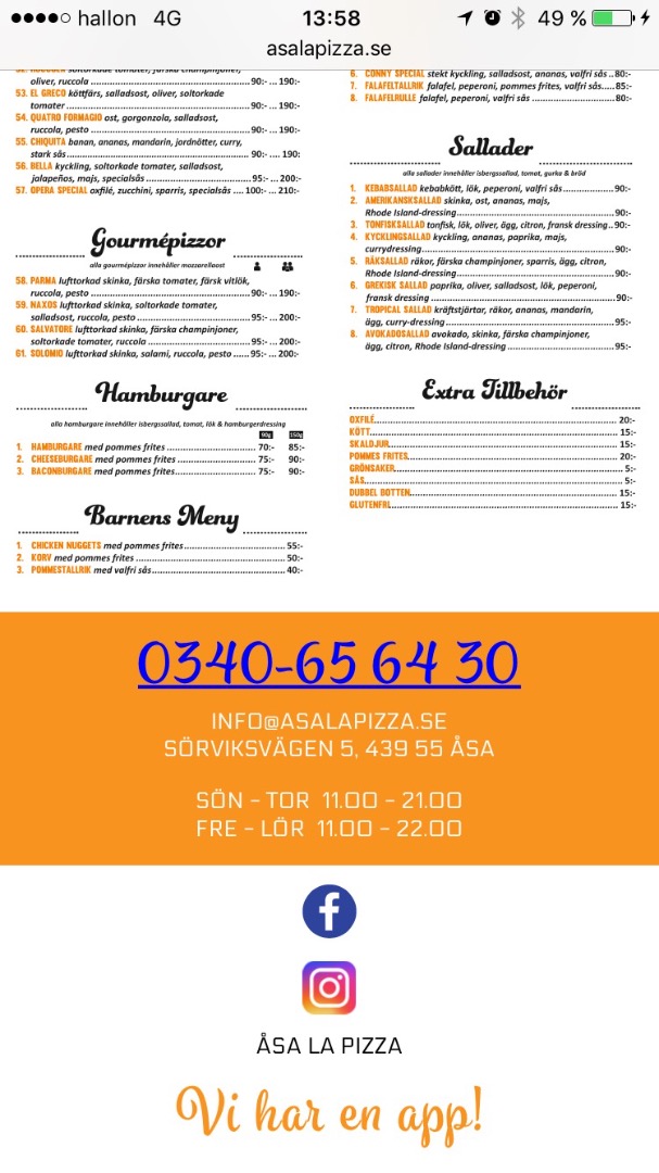
Copy link to clipboard
Copied
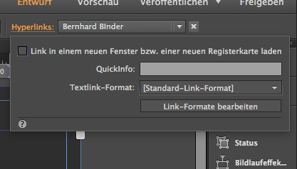
You are kidding  , this is so easy
  .
.
Site properties/Content-tab, rightaboutnow-thefunksoulbrother-checkitoutnow-…
You could even use different link styles for each text button.
This could be then differentiated here (click on the word Hyperlink😞
You know how to link your phone number so that users can call directly from the website? Why would you create a link, if you do not know this, I assume?
Regards
Uwe

Copy link to clipboard
Copied
Your phone autodetects this as aphone number and marks it like that. This is a feature of your phone, not of your site or Muse. If you don't want this, use the "0" instead of the number "0", or fill in a space (blank) into the number, which you can optically "reduce" by using the letter spacing command in the text panel.
Copy link to clipboard
Copied
I still would link it, it´s a nice feature to be able to directly call, right? Is it iPhone which detects it as a phone number automatically?
My Android doesn't. I would have to mark it, before I would be able to talk.
I recommend to link it and change color in site properties.
Regards
uwe
 AdChoices