- Home
- ホーム
- Photoshop デスクトップ/Mobile/web 版
- ディスカッション
- Re: 在Photoshop CC里没有“艺术效果”这个滤镜分类?
- Re: 在Photoshop CC里没有“艺术效果”这个滤镜分类?

リンクをクリップボードにコピー
コピー完了
你好,之前在使用Photoshop CS5的时候,在滤镜选项里有“艺术效果”这个滤镜分类,现在在使用PS CC,当我想找这个滤镜时,发现没有了,那是为什么呢?


 1 件の正解
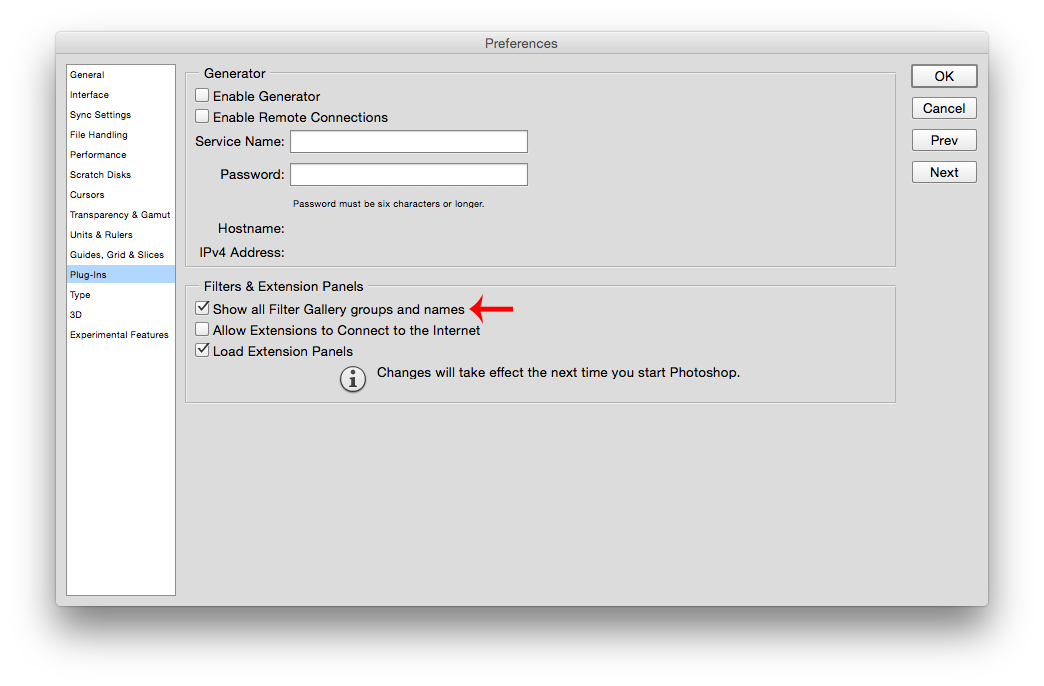
All those filters are still there if you use Filter>Filter Gallery
If you want the filters to show on the Filter menu, go to the Photoshop (Edit)>Preferences>Plug-ins and check Show all Filter Gallery groups and names
Then restart photoshop cc
 9
返信
9
9
返信
9
リンクをクリップボードにコピー
コピー完了
All those filters are still there if you use Filter>Filter Gallery
If you want the filters to show on the Filter menu, go to the Photoshop (Edit)>Preferences>Plug-ins and check Show all Filter Gallery groups and names
Then restart photoshop cc

リンクをクリップボードにコピー
コピー完了
How can adobe possibly defend the in-usability of the UI in that screen shot. Nothing short of disgraceful.

リンクをクリップボードにコピー
コピー完了
Are you referring to the existence of such a preference or the sizes of the fonts at the left where Plug-ins is highlighted?
リンクをクリップボードにコピー
コピー完了
The font sizes, the legibility of the fonts themselves, the lack of contrast between text and background, the whole mess.
リンクをクリップボードにコピー
コピー完了
On my monitor which isn't all that high res, the contrast of black on a light gray background is entirely ok, both in the screenshot and my own PS.
R_Kelley's Preferences panel seems to be on a Mac which may have different font smoothing available. The size of the font at the left and the UI words other than the standard menu is controlled by the UI Font Size parameter in the Interface area of Preferences:
UI Font - Large, Color Theme - Dark:
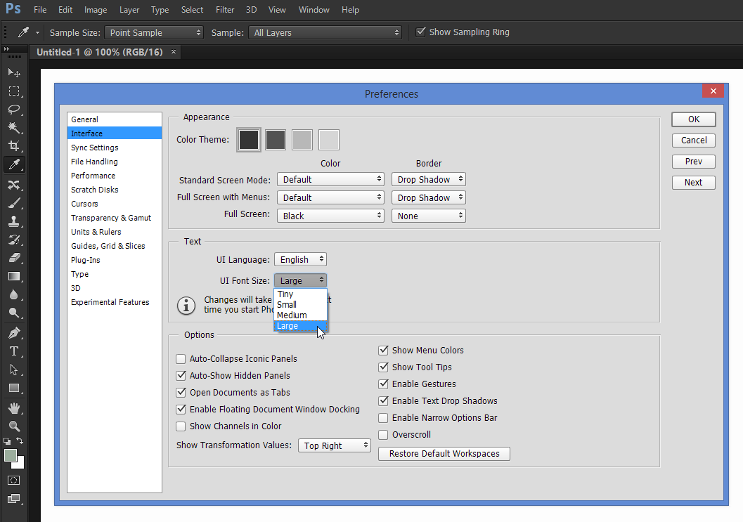
UI Font Size - Tiny, Color Theme - Light:

And I think some of what you're not liking is controlled by the OS, itself, on Windows it's the Display Font Size and ClearType adjustments that try to minimize the artifacts caused by LCD panels where each pixel is really three vertical bars of R, G, B color:

On my monitor, I prefer my Windows settings to what I see in R_Kelley's Mac screenshot, but his screen resolution might be different than mine and look ok on that system.
リンクをクリップボードにコピー
コピー完了
You definitely have pretty low standards then, ssprengel. You must be a very nice guy and very easy to live with—but I wouldn't want to buy software designed by you. 
リンクをクリップボードにコピー
コピー完了
It's probably has more to do the choices i've made in the os preferences and also the fact that i have the photoshop interface set to Tiny.
Mac os x 10.10 also has that awful (to me anyway) level of transparency in the menus and finder, so i've disabled it, which may cut down on the contrast of stuff and also Yosemite uses different fonts for display than earlier versions of mac os.
Definitely not as easy to look at and read as os x 10.6.8 is.

リンクをクリップボードにコピー
コピー完了
I met with the same problem, and your solution really worked! Thank you!

リンクをクリップボードにコピー
コピー完了
你好,艺术效果这个滤镜在滤镜下拉栏有一项滤镜库

 AdChoices