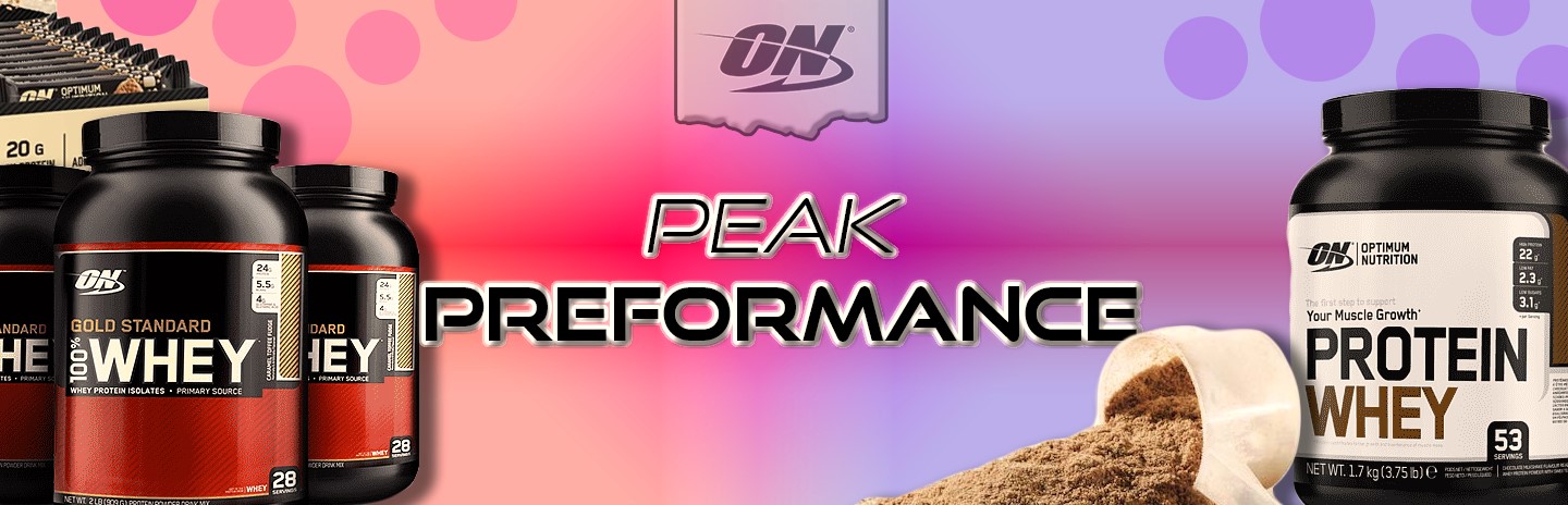
Hi, great first design, just some things to keep in mind:
-Keep your colours consistent (the brown feels a bit off, although I like the other mix of colours)
-Watch your empty space (in between the text and the powder containers feels pretty empty)
-Don't overuse your effects (drop shadow, the bevel and bezier)
This is a big one for first time designers, keep it clean as possible, unless it really needs extra elements
-Lastly, double check your selections (the label on the right container looks a bit off, I'd suggest not using the paint tool)
Great first design, keep it up!


 3
Replies
3
Replies

 AdChoices