 Adobe Community
- Home
- Photoshop ecosystem
- Discussions
- Re: how to fix print colors to match actual colors
- Re: how to fix print colors to match actual colors
how to fix print colors to match actual colors
Copy link to clipboard
Copied
Explore related tutorials & articles
Copy link to clipboard
Copied
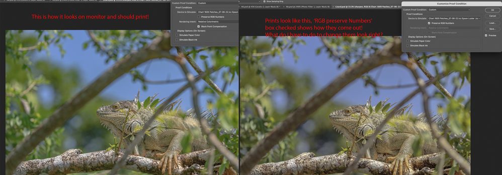
If the image looks like a screen proof with the "preserve RGB values" option set, it means that the RGB color coordinates of your file are sent to the printer directly, without recalculating to the printer profile.
You either need to convert the image to a printer profile beforehand with the "convert to profile" command, or set the "photoshop manages colors" option and select a printer profile in the print window (if printing is done through Photoshop).
Copy link to clipboard
Copied
i have it set to Photoshop manages the colors and made an ICC profile for this paper, Epson Luster, with Canon pro-1000.
Copy link to clipboard
Copied
how do you convert to profile?
Copy link to clipboard
Copied
See: http://digitaldog.net/files/PhotoshopColorSettings.mp4
Photoshop CC Color Settings and Assign/Convert to Profile video
Also:
http://digitaldog.net/files/SoftProofingInPhotoshopCC.mp4
Copy link to clipboard
Copied
These are awesome thanks
Copy link to clipboard
Copied
Ah - "match actual colors" that’s an interesting phrase, because what ARE the actual colours in an image file?
I hope I can help you understand
RGB colour numbers have no unequivocal value - until associated with an ICC profile, let's say Adobe RGB (1998).
A colour management savvy application like Photoshop reads the image's embedded ICC profile (it's colourspace) and makes conversions (to best as possible maintain image appearance) based on 'device' capability.
1: it uses the display screen ICC profile when sending image data to the screen
2: it uses the printer ICC (e.g. in Photoshop manages color") in a conversion during sending print data
SO what IS the actual colour?
It is the visual appearance of the image when the ICC profiles above are in use (and are accurate)
The issue, I fear, is that a user can't tell whether the screen is right, so when a print doesn’t match how can they know what is broken in the workflow? the screen profile? the print profile? both?
An unequivocal reference is needed here, as a target for visual comparison.
I use this:
Have you ever wondered how to KNOW whether your screen [or printer] is ACCURATE and not just 'pleasing'?
If so please check this out
I hope this helps
neil barstow, colourmanagement net :: adobe forum volunteer:: co-author: 'getting colour right'
google me "neil barstow colourmanagement" for lots of free articles on colour management
Copy link to clipboard
Copied
Another thing to consider is the type of lighting the print is viewed under, and how the ink (or dyes) appear under it.
Copy link to clipboard
Copied
Sisunapi, Semaphoric: Definitely, print viewing lighting should be assessed,
Colour management is based on image viewing in a D50 light source
e.g. - real daylight is an easy option.
Also, it's vital to control the room lighting in where the (calibrated) display screen is viewed.
Basically, if the room is bright enough to view prints it's WAY too bright for screen viewing. Lots of users forget how much influence ambient lighting (and colour of nearby objects) has on the perception of onscreen images.
Serious display screen viewing is done in a great painted room with subdued D50 ambient lighting.
There is NO WAY, whilst working, in ambient lighting that one can hold up a print of proof next to the screen and accurately compare - you'd have to have a light booth (print viewer) for that.
"Why do you need an illuminated viewer, for use when viewing prints, proofs and even objects like packs and props?
- Ambient studio, office and print room lighting and the viewing of calibrated monitor displays, prints and proofs - and even objects - is, after display calibration, one of the most important, but seldom properly considered, parts of the colour management jigsaw. Prints, proofs and objects such as products and garments may have significantly different appearances under varying light sources. Consistent Industry Standard illumination is the answer.
The image above shows a small GTI lightbox/light booth right alongside a user's screen (in a rather bright room), in these circumstances I would recommend a much bigger gap, or, even better, as colour management guru Bruce Fraser suggested, site the lightbox so you have to turn 90 degrees in your seat to look at it.
Industry Standard light booth manufacturer, Graphic Technology, also known as GTI, is our favoured supplier for this sector."
I hope this helps
neil barstow, colourmanagement net :: adobe forum volunteer:: co-author: 'getting colour right'
google me "neil barstow colourmanagement" for lots of free articles on colour management
Copy link to clipboard
Copied
Copy link to clipboard
Copied
i know that box checked it tells me how prints will look.
What have i done wrong somewhere them come out like that?
Copy link to clipboard
Copied
This post seems to duplicate the questions you raised in your post "[Photoshop ecosystem] how can I get right colors when Printing?"
Perhaps delete this one so you don't get 2 conversations started on the same issue.
I hope this helps
neil barstow, colourmanagement net :: adobe forum volunteer:: co-author: 'getting colour right'
google me "neil barstow colourmanagement" for lots of free articles on colour management
Copy link to clipboard
Copied
Duplicate post - I'll lock this one.
See original here :https://community.adobe.com/t5/photoshop-ecosystem-discussions/how-to-fix-print-colors-to-match-actu...
Dave


