• Global community
    • Language:
      • Deutsch
      • English
      • Español
      • Français
      • Português
  • 日本語コミュニティ
    Dedicated community for Japanese speakers
  • 한국 커뮤니티
    Dedicated community for Korean speakers
Exit
0

Make image more vibrant

Engaged ,
Mar 23, 2023 Mar 23, 2023

Copy link to clipboard

Copied

I have this image of water in blue.

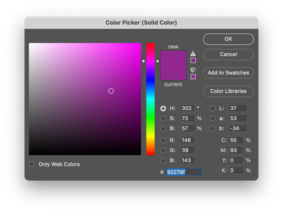
When i add a purple color layer over it, it is no longer vibrant and very pale.


How do i make it more vibrant?

Screenshot 2023-03-23 at 08.50.34.pngScreenshot 2023-03-23 at 08.50.42.png

TOPICS
macOS

Views

288

Translate

Translate

Report

Report
Community guidelines
Be kind and respectful, give credit to the original source of content, and search for duplicates before posting. Learn more
community guidelines

correct answers 1 Correct answer

Community Expert , Mar 23, 2023 Mar 23, 2023

Thanks, yes on the screenshot, no on »Black & White«. 

Gradient Map works based on the »Luminance«, but the hue and sauration should not matter. 

If banding should become noticable try switching to 16bit. 

Screenshot 2023-03-23 at 11.50.16.png

Votes

Translate

Translate
Adobe
Community Expert ,
Mar 23, 2023 Mar 23, 2023

Copy link to clipboard

Copied
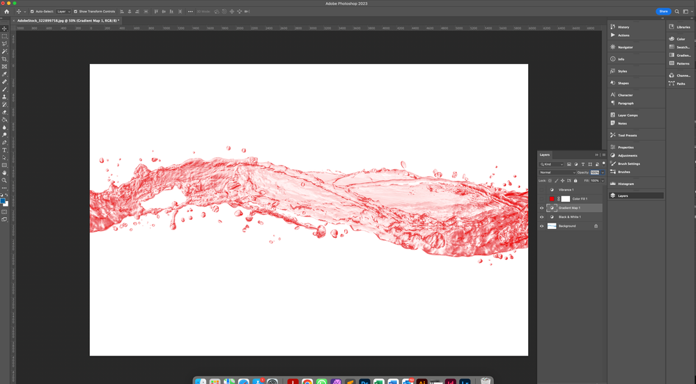
So far you have not explained what »purple color layer« is exactly, its Blend Mode etc.

Could you please post screenshots with the pertinent Panels (Toolbar, Layers, Options Bar, …) visible? 

Votes

Translate

Translate

Report

Report
Community guidelines
Be kind and respectful, give credit to the original source of content, and search for duplicates before posting. Learn more
community guidelines
Engaged ,
Mar 23, 2023 Mar 23, 2023

Copy link to clipboard

Copied

Screenshot 2023-03-23 at 09.22.59.png

Screenshot 2023-03-23 at 09.23.56.png

Votes

Translate

Translate

Report

Report
Community guidelines
Be kind and respectful, give credit to the original source of content, and search for duplicates before posting. Learn more
community guidelines
Community Expert ,
Mar 23, 2023 Mar 23, 2023

Copy link to clipboard

Copied

I am overly simplifying here but basically if you want to make your image more vivbrant you need to increase the saturation, so your purple is maybe not saturated enough.

see my screenshot

Imaginerie_0-1679565440176.png


Also you're using a screen blending mode, by definition it washes out the colours (it only applies to the lighter parts of the layer below and multiplies this effect by the own lighter parts of that layer, so double washed out)
see an explanation on blending modes:
https://helpx.adobe.com/uk/photoshop/using/blending-modes.html
So my best bet to make it more saturated would be to use another blending mode (try Hue and scroll from there, as the effect depends both on the top layer and the one below)

Imaginerie_1-1679565647403.png


Votes

Translate

Translate

Report

Report
Community guidelines
Be kind and respectful, give credit to the original source of content, and search for duplicates before posting. Learn more
community guidelines
Community Expert ,
Mar 23, 2023 Mar 23, 2023

Copy link to clipboard

Copied

I asked for »screenshots with the pertinent Panels (Toolbar, Layers, Options Bar, …) visible«, not »screenshots of individual Panels«. 


If @Imaginerie ’s advice should not suffice, also try the Blend Mode Color and, as an alternative, you could try using a Gradient Map Adjustment Layer instead of a Solid Color Layer. 

That can provide more control over how dark/light regions appear. 

Votes

Translate

Translate

Report

Report
Community guidelines
Be kind and respectful, give credit to the original source of content, and search for duplicates before posting. Learn more
community guidelines
Engaged ,
Mar 23, 2023 Mar 23, 2023

Copy link to clipboard

Copied

Do you mean a picture like below?

I have other colours and the options mentioned here don't work for all colours.

I have tried the gradient map and its seems to give me more control. I'm assuming i have to convert the image to black and white?


Screenshot 2023-03-23 at 10.43.36.png

Votes

Translate

Translate

Report

Report
Community guidelines
Be kind and respectful, give credit to the original source of content, and search for duplicates before posting. Learn more
community guidelines
Community Expert ,
Mar 23, 2023 Mar 23, 2023

Copy link to clipboard

Copied

LATEST

Thanks, yes on the screenshot, no on »Black & White«. 

Gradient Map works based on the »Luminance«, but the hue and sauration should not matter. 

If banding should become noticable try switching to 16bit. 

Screenshot 2023-03-23 at 11.50.16.png

Votes

Translate

Translate

Report

Report
Community guidelines
Be kind and respectful, give credit to the original source of content, and search for duplicates before posting. Learn more
community guidelines
Community Expert ,
Mar 23, 2023 Mar 23, 2023

Copy link to clipboard

Copied

Votes

Translate

Translate

Report

Report
Community guidelines
Be kind and respectful, give credit to the original source of content, and search for duplicates before posting. Learn more
community guidelines