 Adobe Community
- Home
- Photoshop ecosystem
- Discussions
- Re: Making an image with a 'corner'
- Re: Making an image with a 'corner'
Making an image with a 'corner'
Copy link to clipboard
Copied
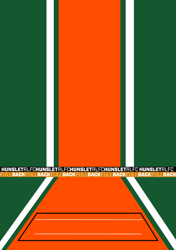
I'm looking to making some player cards to put upn in a sports team dressing room for each player. Each card will have info like player name and picture, squad number, sponsor etc. I want to make it look like it has a floor and wall or a corner in the image. Attached is the first atempt. i'm also thinking of making the coloured lines have a torn edge effect, but wanted to get the over all look right first.
Am i going in the right direction? For some of them i want to make it look like the is a corner on the left or right.
Any pointers would be apperciated
Explore related tutorials & articles
Copy link to clipboard
Copied
It looks like you're off to a great start! Are you looking for tutorials? Here are some that might help...
Here's a tutorial that shows how to make a torn edge effect:
And here's one for making rounded corners:
You might also add some gradients if you want to help sell the floor/wall idea.
Copy link to clipboard
Copied
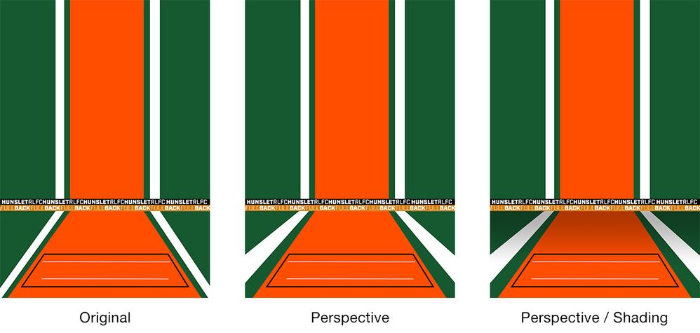
I like your concept. Below are a couple of ideas to give your design a more 3D look.
Perspective
Thickening the white lines and widening their spacing in relation to the orange area suggests these objects are getting closer to the viewer.
Perspective / Shading
Adding a reduced opacity black to transparent gradient along the floor also helps suggest distance. While it doesn't necessarily work with the "wall" I hope it demonstrates the point.

