• Global community
    • Language:
      • Deutsch
      • English
      • Español
      • Français
      • Português
  • 日本語コミュニティ
    Dedicated community for Japanese speakers
  • 한국 커뮤니티
    Dedicated community for Korean speakers
Exit
0

Photoshop is 1px wrong in font spacing comparing to everything else.

New Here ,
Oct 01, 2021 Oct 01, 2021

Copy link to clipboard

Copied

Spacing in every font I set looks different (wrong) comparing to system display, notepad, paint, gimp, office. . .So in every apps Tahoma (and other fonts) looks same, but photoshop display it differnet.


That make work incorrect.

Just check attachement.

TOPICS
Windows

Views

123

Translate

Translate

Report

Report
Community guidelines
Be kind and respectful, give credit to the original source of content, and search for duplicates before posting. Learn more
community guidelines
Adobe
Adobe Employee ,
Oct 01, 2021 Oct 01, 2021

Copy link to clipboard

Copied

Hi there,


We're sorry for the extra spacing issue in Photoshop. Which Photoshop version do you have installed also, which operating system you are on now (Windows Or MacOS)? Are you seeing this issue after a recent update of Photoshop?


Thanks,

Mohit

Votes

Translate

Translate

Report

Report
Community guidelines
Be kind and respectful, give credit to the original source of content, and search for duplicates before posting. Learn more
community guidelines
LEGEND ,
Oct 01, 2021 Oct 01, 2021

Copy link to clipboard

Copied

Are you actually working at 72 or 96 DPI? What are the kerning settings? Metric or Visual? What else? you have to be more specific.


Mylenium

Votes

Translate

Translate

Report

Report
Community guidelines
Be kind and respectful, give credit to the original source of content, and search for duplicates before posting. Learn more
community guidelines
Community Expert ,
Oct 01, 2021 Oct 01, 2021

Copy link to clipboard

Copied

LATEST

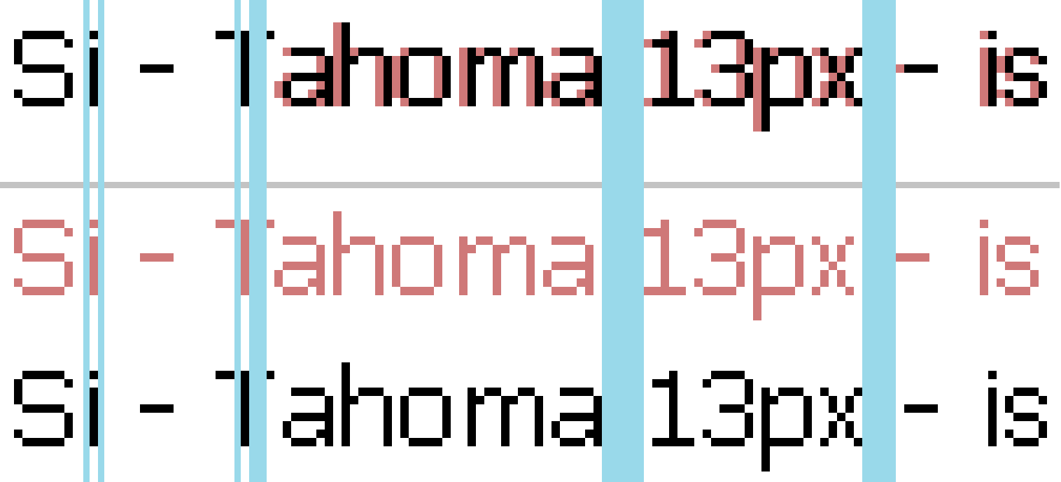
Photoshop is applying professional type kerning. The other programs are not doing any at all, or just different enough to pop a letter over one pixel left or right. You're not dealing with a lot to play with at that size and resolution.

If you notice, the "T" and "a" are tucked closer together to look better optically. Most fonts have these "metrics" programmed into them, but the program you're working with needs to know what to do to them.

If you want PS to match the others, you have to turn kerning off, by selecting "0", but then you lose the benefit of the better look.

Screen Shot 2021-10-01 at 6.03.10 PM.png

Votes

Translate

Translate

Report

Report
Community guidelines
Be kind and respectful, give credit to the original source of content, and search for duplicates before posting. Learn more
community guidelines