 Adobe Community
- Home
- Photoshop ecosystem
- Discussions
- Re: Still confused about profiling (Brightness)
- Re: Still confused about profiling (Brightness)
Still confused about profiling (Brightness)
Copy link to clipboard
Copied
Explore related tutorials & articles
Copy link to clipboard
Copied
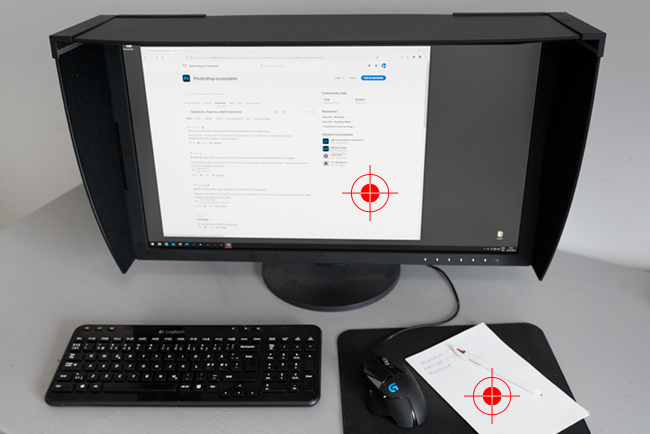
Lower the brightness of your monitor.
The monitor white point should be a visual match to paper white. Then the rest will fall into place.
For most "average" conditions a white point around 100 -120 cd/m² will be fairly close - but this depends on ambient light, print viewing light and general environment up to and including the application interface color. If it looks right it is right.
Copy link to clipboard
Copied
Thanks that makes sense.
So if I lower the brightness of my monitor to match the paper, then I will have to adjust levels/brightness in the psd to make it brighter accordingly?
Copy link to clipboard
Copied
Then you will make correct adjustments in your file. What you see is what you get.
The whole point is that you calibrate your monitor to match the print. You can't do it the other way. The paper color is what it is.
Copy link to clipboard
Copied
Why are my prints too dark?
Why doesn’t my display match my prints?
A video update to a written piece on subject from 2013
In this 24 minute video, I'll cover:
Are your prints really too dark?
Display calibration and WYSIWYG
Proper print viewing conditions
Trouble shooting to get a match
Avoiding kludges that don't solve the problem
High resolution: http://digitaldog.net/files/Why_are_my_prints_too_dark.mp4
Low resolution: https://youtu.be/iS6sjZmxjY4
Copy link to clipboard
Copied
D Fosse and Digitaldog have some great advice there.
The advice I habitually provide is to calibrate and profile the display based on matching the appearance of a good quality printed proof image
(I use this http://www.colourmanagement.net/products/icc-profile-verification-kit)
which should be viewed in good daylight, or, more ideally, a daylight light booth like these: https://www.colourmanagement.net/products/gti-lite/
Since "standard" ideal display viewing environmental conditions (=subdued lighting) differ significantly from the conditions for print viewing (bright daylight) it's important not to expect a match when holding a print "near the screen".
Basing display calibration settings on a visual match allows the user to optimise the (user-adjustable) luminance (brightness) and colour temperature targets in the calibration software.
Now a test image onscreen should match a printed proof of that same image nicely - which means your own images (once re-adjusted to look right on the new calibration) should match when printed.
Of course, you'll also need an accurate output (printer/media/ink) profile as well.
If your Spyder software perhaps doesn’t allow full range numerical control over luminance level and allow white colour temperature to be set anywhere in a numerical range from say 5000K to 7000K then why not download the excellent (14 day free demo) of basICColor display software and test it with your Spyder?
I hope this helps
neil barstow, colourmanagement net :: adobe forum volunteer:: co-author: 'getting colour right'
google me "neil barstow colourmanagement" for lots of free articles on colour management

