 Adobe Community
Colour Correction
Copy link to clipboard
Copied
how to get perfect colour of artwork painting after photographing and correctiong colour in photoshop
Explore related tutorials & articles
Copy link to clipboard
Copied
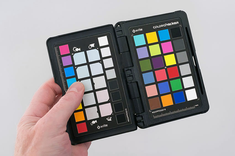
You could photograph with a colorchecker and use software to utilize that.
Copy link to clipboard
Copied
There are some colour management experts who sometimes inhabit this forum, you could ask specific questions.
Also, you could take one of the online video tutorials on colour management on LinkedIn Learning: "InDesign: Color Management" by David Blatner is excellent and includes Photoshop. You can get 30-days free access to all their courses.
Copy link to clipboard
Copied
A colorchecker is absolutely essential. Just get one:
Forget "perfect" - you'll never get there, and even if you did, it wouldn't look good. What you want is equivalent color, not identical color. An absolute colorimetric match in the file (assuming you could achieve that) would not look the same.
There's a million reasons for that, but for one thing, you need to compensate for paper color and max ink density. If you don't do that, it will come out as dull and flat in reproduction. Another common problem is "runaway" color - it may be correct as far as it goes; it just looks as if it doesn't belong there. It's not internally consistent.
The very first thing you need to do is calibrate the monitor so that it visually matches printed output. You can be as generic or specific as you want here, but you need to see paper white on screen. Monitor white needs to be a visual match to paper white.
Equally important is the black point. This is usually overlooked and ignored, but it's critical. Monitor black should be a visual match to maximum ink in that particular printing process. A monitor at factory settings has much deeper blacks than any print can achieve, and this has a huge impact on the visual "punch". A good inkjet print on premium grade glossy paper has a contrast range of at most 300:1.
This means that if your white point is, say, 120 cd/m², the black point should be no lower than 0.4 cd/m², but quite possibly higher. For offset print a realistic black point is 1.0 cd/m² or thereabouts.
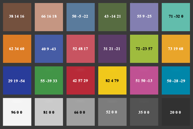
With this set, you know that what you see is what you get. That's the holy grail. From that point, work visually. What you need the colorchecker for is primarily to set the basic contrast curve. Each patch has a standardized Lab value, which can be translated to any RGB color space or even Lightroom %. For instance, the #4 gray patch should be 48% in Lightroom to have a correct basic brightness. The color patches are useful as a visual reference, but don't try to match all the numbers, that will just get you in trouble. Here are the Lab numbers:
Copy link to clipboard
Copied
D Fosse is one of the knowledgeable colour experts I mentioned.
I would add, seeking colour accuracy is a complex task and unless you have a vital need such as those producing fine art prints (which may be your thing) and items like clothing catalogues, where colour fidelity is important, for most of us, near enough, is good enough. Remember RGB screen output depends on the calibration of the viewer's monitor, the browser they are using and so on, and when you print commercial CMYK you lose about a third of the RGB colour gamut anyway!
Copy link to clipboard
Copied
Agreed. Absolute accuracy is simply not a realistic goal, and would very rarely serve any useful purpose. As I said, equivalent color is what you normally need. That's a visual judgement, not a numerical one.
A well calibrated and profiled monitor of good quality will be close enough. As far as CMYK is concerned, yes, the gamut loss can sometimes be a problem, but not an unsolvable one. Again, equivalent is the keyword.
IME, basic brightness and contrast is more important. That's where the "paper white" parameter comes in - even if you only work for screen, it's the only common ground we all have, so it immediately puts us all on the same page.


