 Adobe Community
- Home
- Photoshop ecosystem
- Discussions
- Re: Use colorchecker to improve color in JPG/TIFF?
- Re: Use colorchecker to improve color in JPG/TIFF?

Copy link to clipboard
Copied
Someone has sent me some "uncompressed" jpegs and each image has a colorchecker passport in the image. The images seem very bland to me, and I thought I could use colorchecker software to calculate and apply an appropriate profile to make the images more realistic. But so far I haven't been able to do this.
What I have done is
- Convert jpeg to tiff in Photoshop
- Crop the tiff to just the color-checker passport
- Import that tiff to Lightroom Classic and export as a dng
- Drag the dng to Colorchecker Passport desktop app, and save the profile.
The last step creates a "dcp" file in ~/Library/Application Support/Adobe/CameraRaw/CameraProfiles/
But I can't figure out any way to apply that profile to either the TIFF or dng file.
Can this be done?
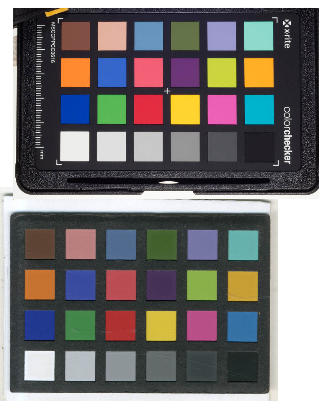
Attached is a comparison of a photo of a color checker and the part of the scan with the color checker in it. The difference in intensity of colors is profound.


 1 Correct answer

The difference here is the tone response curve. Your top example has slightly exaggerated contrast, a curve that is a little too steep, and the bottom example slightly reduced contrast, a curve that is a little too flat. More contrast = higher saturation.
The colors themselves seem to be basically OK.
Each patch in a standard colorchecker has standardized Lab values. Here they are. Note the six neutral patches and the L values:

But here's the tricky part: you can't reproduce the tone curv
...Explore related tutorials & articles
 13
Replies
13
13
Replies
13

Copy link to clipboard
Copied
The first step is to double check colour management...
Do the supplied images have an embedded ICC profile?
Do your colour management policies preserve embedded profiles?
What is your working RGB profile?
What profile is assigned or assumed for these images?
https://prepression.blogspot.com/2014/06/rgb-icc-profile-roulette.html?m=1
Copy link to clipboard
Copied
I don't understand how any of your questions help answer my question, Stephen.
Do the supplied images have an embedded ICC profile?
The jpegs are in sRGB, which is retained when I make them TIFFs. Once they are translated into dngs I can import them into my working profile (or any other).
Do your colour management policies preserve embedded profiles?
Yes
What is your working RGB profile?
ProPhoto
What profile is assigned or assumed for these images?
The same answer as above, the JPEGs and TIFFs are sRGB, the dngs are brought into my working profile when opened in Photoshop.
Copy link to clipboard
Copied
You said the colour looked drab. The logical first place to start looking is with colour profiles and colour management.
Copy link to clipboard
Copied
Have you followed the final steps for applying the ColorChecker-based DNG profile?
If you did and you still can’t find it, web searches turn up a lot of outdated information on the web about where the DNG profile will appear in Lightroom Classic and Camera Raw. If the instructions you’re reading are the outdated instructions, they will tell you to apply the DNG profile from the Camera Calibration panel. That’s outdated because a couple of years ago Adobe upgraded the entire camera profile system in Lightroom or Camera Raw; now you apply that type of profile using the Profile Browser, so you must make sure to follow the current instructions. Here is a link to those:
https://www.xrite.com/service-support/camera_profiles_missing_in_lightroom_or_adobe_camera_raw
Copy link to clipboard
Copied
I have done some more playing around, and I think I didn't state the question adequately. Also, I am completely confused by the interface for Camera Raw in Photoshop, but the interface in Lightroom Classic is sort of making sense to me. So I am going to restate this question in the Lightroom forum. Thanks for the replies, guys, but if an administrator wants to take down this entire thread, it is fine with me.

Copy link to clipboard
Copied
Hi
If you can get access to that profile you made in the "assign profile" list in Photoshop, that’s where it will adjust appearance. You can test the theory of this by opening an image that’s, say Adobe RGB - Heres one you can test https://www.colourmanagement.net/downloads/CMnet_Pixl_AdobeRGB_testimage05.zip
Open it and and go to edit /assign profile. Try assigning sRGB then ProPhoto and observe how the profile alters the way Photoshop interprets the images colour and tonal data.
So this is where you could "apply" a colorchecker generated profile to an image. If you cannot access the type of profile you made then you'll need to make an ICC profile from the colorchecker.
I hope this helps
if so, please "like" my reply
thanks
neil barstow, colourmanagement.net :: adobe forum volunteer
[please do not use the reply button on a message within the thread, only use the blue reply button at the top of the page, this maintains the original thread title and chronological order of posts]
Copy link to clipboard
Copied
The difference here is the tone response curve. Your top example has slightly exaggerated contrast, a curve that is a little too steep, and the bottom example slightly reduced contrast, a curve that is a little too flat. More contrast = higher saturation.
The colors themselves seem to be basically OK.
Each patch in a standard colorchecker has standardized Lab values. Here they are. Note the six neutral patches and the L values:
But here's the tricky part: you can't reproduce the tone curve to these numbers in the file and expect a good result in print. Paper color and maximum ink impose their own limits, reducing the available contrast range and compressing the target. So you have to compensate. How much depends on the print process, but for an average process I'd say your top example is about right. The bottom example is too drab. It'll look flat and dull.
The Lab numbers can be translated to any color space you happen to be working in - even Lightroom % numbers. My working starting point for a flat, evenly lit subject is usually to fix the #4 gray patch to 48 % in Lightroom, the white patch to 96%, and the darkest patch to somewhere between 8 and 15% depending.
Don't underestimate the importance of the black point. It is responsible for most of the perceived visual "punch". Set the black point very carefully, and you usually need to decide on a case by case basis.
Copy link to clipboard
Copied
Thanks, D_Fosse. That is basically the route that I ended up taking. I first thought that "dialing in" the colors would be best, and if I could do it using known tools it would be even better, but I ended up "doing it by eye," mostly with the tone curve and got exactly what I needed.
Copy link to clipboard
Copied
I work as photographer at an art museum and do repro for books and magazines all the time, so I learned this the hard way. You can't go strictly by the numbers, it will look flat and dull in print, and not match the visual experience of the original.
A colorchecker is industry standard in this business. We all use them. But I can always tell the inexperienced photographers this way - they go strictly by numbers. They'll come around eventually 😉
Exactly how much to compensate is difficult to say. Ideally you need to know the print process. If you have a sample print, you can calibrate your monitor to matching white and black point, and work mostly by eye. If it looks right, it is right, and nevermind the numbers.

Copy link to clipboard
Copied
As an aside: there is no such thing as an uncompressed JPEG. By design, JPEG files are always compressed, and it is always lossy. Some people believe that using high quality settings makes it lossless, but this is not the case.
Copy link to clipboard
Copied
That was why I used "scare quotes", Test Screen Name.
Copy link to clipboard
Copied
Hi neil barstow
As I think you guessed, the dcp profiles in ~/Library/Application Support/Adobe/CameraRaw/CameraProfiles/ do not show up in the list of available profiles to assign to an image in Photoshop. You say "you'll need to make an ICC profile from the colorchecker." AFAICT, there is a tool at Sourceforge written in C++, without a Macintosh variant, that was last updated about 11 years ago, which I would have to try to compile to use. Do you know another way to convert a dcp profile into an icc profile? I don't even know what the difference is between these kinds of profiles is, but I suspect the fact that they have different file extensions means that they are not easily (or not intended to be) interchanged.
Copy link to clipboard
Copied
Alanterra
I suspect the fact that they have different file extensions means that they are not easily (or not intended to be) interchanged.
Yes I imagine that’s right, one would need to produce an ICC profile from the colorchecker image, using an "input" profiling application.
I hope this helps
neil barstow, colourmanagement.net :: adobe forum volunteer

 AdChoices