 Adobe Community
- Home
- Photoshop ecosystem
- Discussions
- Re: Composite a Necklace - easy task?
- Re: Composite a Necklace - easy task?
Copy link to clipboard
Copied
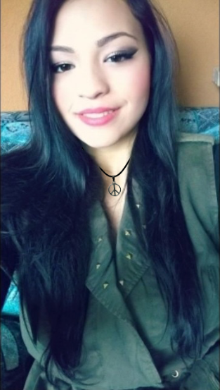
you might laugh hard because this should be the easiest task, believe it or not i tried to make ther necklace look realistic for two hours and didnt succeed, i used everything hue sturation curves othing worked, still looks photoshoped
could you help do it an explain how to do it so i can improve and grow,
thank you very much!
this is the work in progress file where you can see what i did till now thank you!
 1 Correct answer
Hard to tell from this low res image you posted, but the overall image seems to have a blue cast to the shadows, so the necklace seems too black. Also there is really no shadow on the neck from the necklace, and over all the image is soft, so the necklace needs to be softer.
Explore related tutorials & articles
Copy link to clipboard
Copied
Hard to tell from this low res image you posted, but the overall image seems to have a blue cast to the shadows, so the necklace seems too black. Also there is really no shadow on the neck from the necklace, and over all the image is soft, so the necklace needs to be softer.
Copy link to clipboard
Copied
@check uebele the image is low resolution on purpose, i just need to make the necklace look realistic, the picture has to stay low resolution
@trevor.dennis how where you able to add that soft almost invisible shadow? It looks like you didnt do anything, the only way i know you added a shadow is that it looks more realistic!
i went on blending moded and added external shadow and went on filter-guasian blur and worked with that to make the necklace fit in, to me it still looks not very realisitc and the shadow looks too much, what do you think?
thank you very much

Copy link to clipboard
Copied
Lara, this is how it works
The Angle indicates the direction the light is coming from. The shadow will always appear opposite that angle. I tend to default to 135°, which is 45° past vertical, but you need to match the rest of the image.
I have set the shadow to 50% so you can see it. You can also see it is fully hard.

The Size value sets how hard or soft the shadow is.
I
If you go too high with the size, the shadow can bleed out in all directions. That may be what you want, so it's a tool for you to use for best effect.

Spread works with size to set the softness and how far the shadow reaches.
If size is set to zero, then spread does nothing.
If Spread is set to 100%, then the shadow is fully hard, and spread will extend the shadow (a long way if yo like)
I rarely use the spread slider.

You can use Drop Shadow for other effects as well as for shadows.
I have changed the colour to red below, and with distance set to zero px, it has created an out glow. I often use this for outer glow as you get more control — especially if you are looking for a soft glow. Be aware of the blend mode though. If nothing is happening, try setting it back to Normal.

I also gave the Peace Logo a tiny bevel, which needs some some thought with a black object
Being a very small bevel, the standard 'gloss contour' does not show, so I have used one of the two radical W shaped curves.
Here again, you do not _have_ to use white for highlights and black for shadows, but once again, be mindful of the blend modes if you do change the colours.
In this case the bevel & emboss gives the badge some depth, and drop shadow lifts it from the background

A large offset lifts the object away from its background. It's interesting when you think this is a flat screen with different tones and colours, but that's how our eyes and minds work.

Copy link to clipboard
Copied
thank you, the original necklace is grey not black, i turned it into black using curves because grey didnt look visible enough
since you have giving me a lot of steps to do i started working all over again with the original grey necklace trying to apply your advice and this is the results:

comparing this with my first try i think i did a much better job applying your advice and adding blur, now i know i have to work with shadows and i dont have to turn it black just to make it visible, i doubt its 100% realistic but i've made some progress at least
thank you very much
i'll put the work on progress file so if someone wants to look at what i've did and give me some advice on what its holding me on make it 100% realistic you can download the file and look at all the layers
thank you very much
Copy link to clipboard
Copied
It's always easier to work on a high res file, when compositing, then reduce the resolution for the final output. You have more control that way.
Copy link to clipboard
Copied
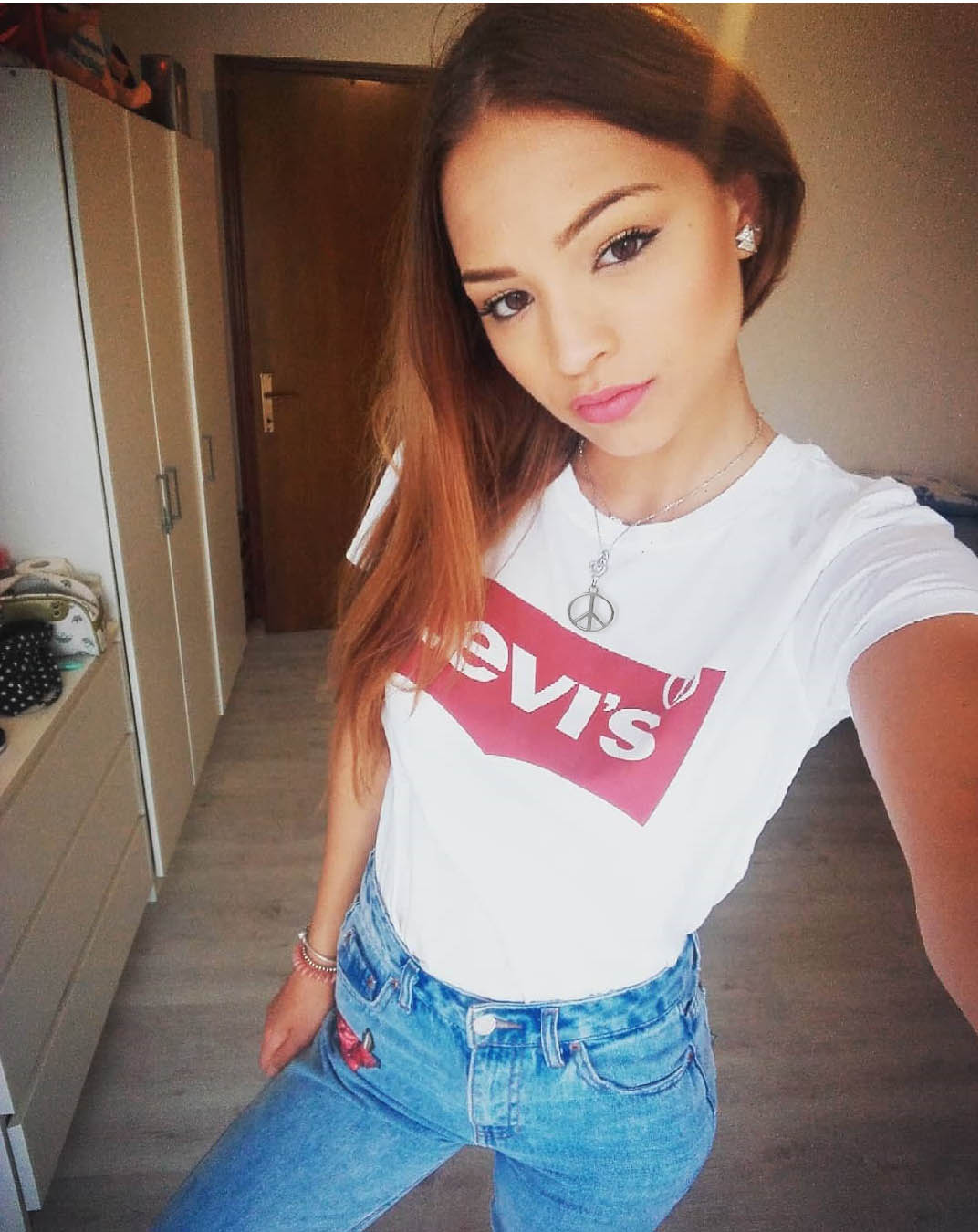
i wasent able to make the first image more realistic so i tried another one with higher resolution
what do you think?
This is the file so you can see what i did

Copy link to clipboard
Copied
HI my name is Urima and i like your photo
Copy link to clipboard
Copied
pretty good photo girl
Copy link to clipboard
Copied
As Chuck says. Shadows make things look like they belong, and the human eye is good at perceiving issues like this even without realising what is wrong. We just know that 'something is wrong. The necklace below has no shadow. It's outline is much to sharp, even compared to the lady whose portrait is much sharper than your example image.

The shadows below are tiny, but as the necklace is so close to the skin, they are about right. There is also a tiny bevel & emboss which has put highlights about where they should be.

