 Adobe Community
- Home
- Photoshop ecosystem
- Discussions
- Re: "I am aware of the need to use the same color ...
- Re: "I am aware of the need to use the same color ...
How To Assign A Color Space In Bridge/Photoshop
Copy link to clipboard
Copied
I am trying to understand color space in PS. When I assign Prophoto RGB to a RAW image in Bridge, it opens in PS with the Mode as simply RGB Color, 8 bits per channel. Does this sound right?
Explore related tutorials & articles
Copy link to clipboard
Copied
A raw file doesn't have a color space until it's encoded into one in the raw converter (ACR/Lightroom). Only RGB files have color spaces. So you can't do that.
You set your color space preference in ACR or Lightroom. Then, when the file opens into Photoshop, it will be in that color space. Not before.
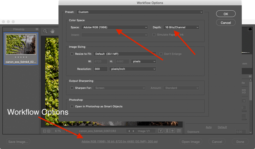
In ACR you click the blue "link" below the main image window. In Lightroom you go to Preferences > External Editing.
You don't sound like you understand color management fully yet. In that case I would not recommend ProPhoto. It comes with a lot of implications that you need to understand, or you can quickly get into trouble. sRGB or perhaps Adobe RGB is a lot safer.
There is no reason to use ProPhoto just because it happens to be the default in Lightroom. Personally I think it's a bad choice for a default. Defaults are for beginners. Experienced users who know how to use ProPhoto will know where to find it anyway.
Oh, one more thing: never "assign". That's only for missing color spaces (or incorrect ones). If you want to change a file's color space, you use "convert to".
Copy link to clipboard
Copied
Hi, You can set the format for opening RAW images in the Workflow Options of Adobe Camera Raw.
Susumu Iwasaki
Copy link to clipboard
Copied
When I assign Prophoto RGB to a RAW image in Bridge, it opens in PS with the Mode as simply RGB Color, 8 bits per channel. Does this sound right?
The Image>Mode menu or the mode listed in the window title bar doesn’t give you profile info. To check a document’s profile either open the Edit>Assign Profiles... dialog, or choose Document profile from the drop down menu in the window‘s lower left corner.
Copy link to clipboard
Copied
Thanks for your replies. I just checked Edit>Assign Profile and it does display the same color-space setting as set in CameraRaw. Re ProPhot, there seems to be a number of differing opinions. I chose it because it was recommended in the tutorial that I was following, however, my major concern at the moment is just understanding color space. I am still confused, though. I am aware of the need to use the same color space for the computer on which I am working as that on my display device, or printer. So far, so good; I can do that without really understanding, but I would like to get a grip on the idea. For example, if color space is an industry standard for a group of available colors, and gamut is "a certain complete subset of colors...within a color space," what is the difference, if they both allow for a predictable color outcome? Sounds like something inside itself.
Copy link to clipboard
Copied
I am still confused, though. I am aware of the need to use the same color space for the computer on which I am working as that on my display device, or printer
The concept of working in a single, large gamut RGB editing color space was developed in the late nineties, when the problem of device dependent color spaces (color tied to a single output or display device) became apparent. Intially the idea was to edit in CMYK mode (relying on the output numbers rather than the displayed color appearance), but that had significant problems if the output was to press separations. It was difficult to deal with press issues like total ink and black generation, which are now accurately managed for indivdual press conditions on the conversion from RGB to CMYK.
Working in a monitor RGB space has its own set of problems. RGB and CMYK spaces actually intersect with each other, so while a good chunk of RGB color is outside of the CMYK gamut, the reverse can also be true with smaller gamut RGB monitor spaces—not all CMYK color can be displayed in a small monitor RGB space.
In the late 90s the only viable highend composite output was dyesub, which has a considerably larger gamut in parts of the spectrum than standard monitor RGB or sRGB. So Kodak came up with the ProPhoto RGB editing space, which can’t be fully displayed, but does include all of a CMYK output space. If you work in ProPhoto you can get at the entire output color on the final conversion—out-of-gamut CMYK colors don't get clipped. However, you have to weigh that advantage against the disadvantage of the out-of-gamut CMYK color not displaying the way it will print. Adobe came up with AdobeRGB, which is somewhat smaller than ProPhoto, but still considerably larger than sRGB.
Copy link to clipboard
Copied
"I am aware of the need to use the same color space for the computer on which I am working as that on my display device, or printer."
No, that's a misunderstanding. The whole point of color management is that profiles don't match! One is converted/remapped/translated into the other. If they all matched, there wouldn't be any need for them at all, would there?
A profile is a description of a color space. The only requirement is that the description is accurate. So the document profile describes the document color space. The monitor profile describes the monitor's native color space, whatever that may be. The print profile describes the color space of a certain printer using certain inks on a certain paper. And so on.
Then the numbers are recalculated from one color space to the other, using the associated profiles. This is necessary to preserve color appearance. Without this remapping of the numbers, the colors would change in a different color space.
Copy link to clipboard
Copied
Thank you.
That was a clear and concise explanation. Once you get it, you wonder why you didn't get it in the first place. What I said in my last post re "use the same color space" was found on a website, so I guess Professor Google is not always correct. Now, to get back to gamut - as I understand so far, it refers only to the limitation on the reproduceable number of colors on a given printer, such as my dot matrix, which may or may not have a different gamut than that of a different brand.
Copy link to clipboard
Copied
The gamut would be defined by the ink set and paper used to print.
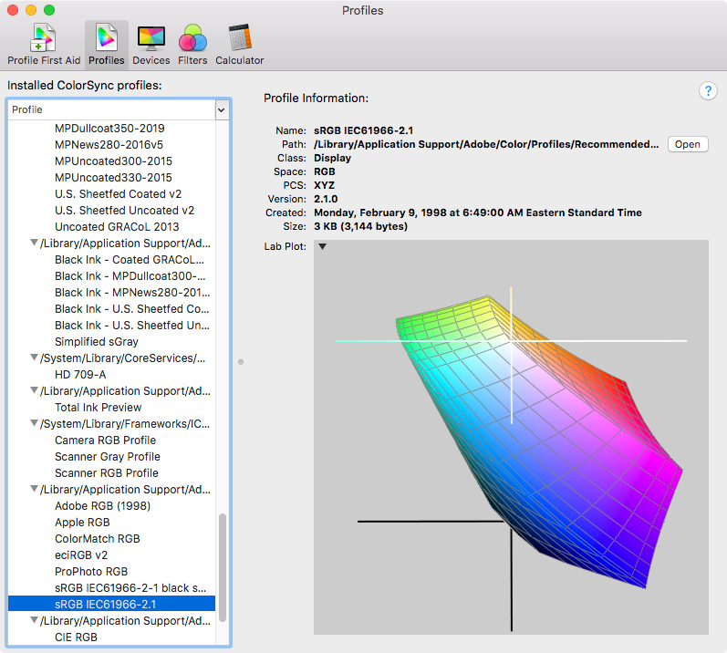
Here's a 3D plot of the sRGB (a typical standard display) gamut:
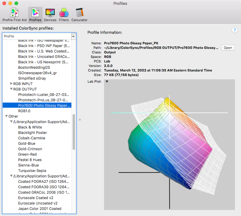
Here's a comparison of sRGB to an Epson inkset printing on glossy paper (sRGB is the white plot), The 2 spaces’ gamuts intersect:
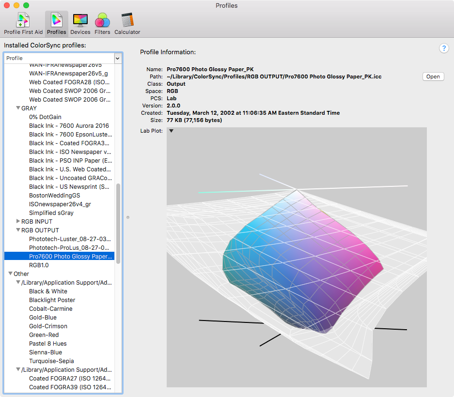
The same Epson profile compared to ProPhoto RGB. The Epson space sits inside of ProPhoto:
Copy link to clipboard
Copied
Yes, the problem is that many overcomplicate it. Functionally it is pretty simple.
Gamut is the extent of a given color space; how far it stretches outwards to more and more saturated colors. A small color space has a small volume and a small gamut. The "surface" is the gamut boundary. That's the most saturated color reproducible in that color space.
The number of steps is still the same, however, from 0 to 255. So a 255-0-0 red in Adobe RGB is a lot more saturated than a 255-0-0 red in sRGB. That's why remapping (profile conversion) is necessary, to maintain the same color in the new color space. That's also why the profile has to describe its associated color space correctly. If it didn't, the remapping would be off, and the wrong color result.
A standard monitor has a gamut very similar to sRGB. In fact, the sRGB specification was originally made to describe the color space of a standard CRT monitor. LCDs behave slightly differently, but it's still pretty close. That's why sRGB is used when color management is uncertain or missing - it will reproduce roughly right when fed directly to most monitors, even without color management.
On such a monitor, all colors outside sRGB will be clipped to the gamut boundary. That's the most saturated color you can see. Wide gamut monitors have a larger gamut; they can display colors within Adobe RGB(-ish). But in fact a monitor could be anything between these, the reason we don't have that is purely for marketing reasons. It would work just as well. All you need is a profile that describes it, such as it is.
Copy link to clipboard
Copied
Just to be clear I think the OP was asking about the printer (not display) gamut, and in the case of output devices it would be the ink set, ink density, and paper that determines the gamut bounderies—i.e., the SWOP CMYK ink set printing on an uncoated sheet has a significantly smaller gamut than the same inkset printing on a coated sheet.
Now, to get back to gamut - as I understand so far, it refers only to the limitation on the reproduceable number of colors on a given printer
The available printer gamut would be where the source editing space and the destination print space intersect. Editing in a small monitor or sRGB space typically shrinks the output space’s available gamut. The Apple ColorSync 3D plot comparisons show the gamut intersections.
Copy link to clipboard
Copied
I received an email, this morning, requesting a "correct" repsponse for one of the answers to my question. The problem is they have all been helpful -- I have read and re-read them and will most likely do so, again, as well as provide this URL to anyone who says that they are having trouble understanding the subject.


