 Adobe Community
- Home
- Photoshop ecosystem
- Discussions
- This requires a good eye and a bit of experience. ...
- This requires a good eye and a bit of experience. ...
Copy link to clipboard
Copied
Hello,
I am a relative beginner -intermediate at Photoshop and I don't understand how to make pastel tones.
All my colours in photoshop panel look harsh to me and none are "super soft" tones.
Even importing a photo and using a dropper based off that image doesn't result in the shade being exactly the same.
I have tried changing the colour settings, and also have tried turning down the computer saturation to lower but it still doesn't show the colours to be soft and how I need them.
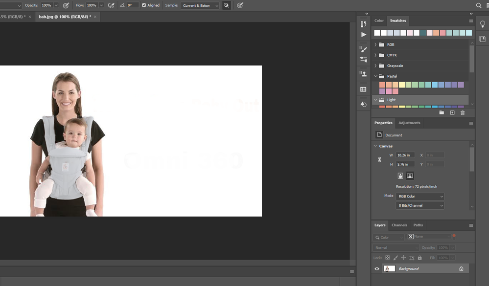
For example, I want to learn how to make image 1 wall pattern to become like image 2 wall pattern.
If I just saturate it more it looks unnatural and I need it to look exactly the same as image 2.
Would anyone have any advice please?
Thankyou very much
 1 Correct answer
If you want to have a lot of tools at your disposal, you can use the Camera Raw filter as a filter.
Select the area with the wallpaper, then go to filter, camera raw.
You might want to convert a copy of the background to a smart object, in order to tweak the settings.
Explore related tutorials & articles
Copy link to clipboard
Copied
Here is some tschnics https://youtu.be/HroNpBxO_f4
Copy link to clipboard
Copied
On no account mess with your monitor settings to get things to look better. Because it means your monitor is out of step with all the other monitors, and will convince you your colours are right, when they are not...
Copy link to clipboard
Copied
Here's a couple of things that may help in creating pastel colours.
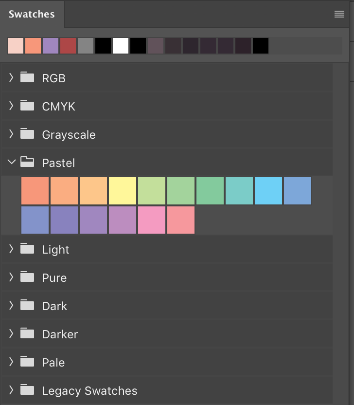
Within the Swatches panel is a Pastel section that can be opened up.
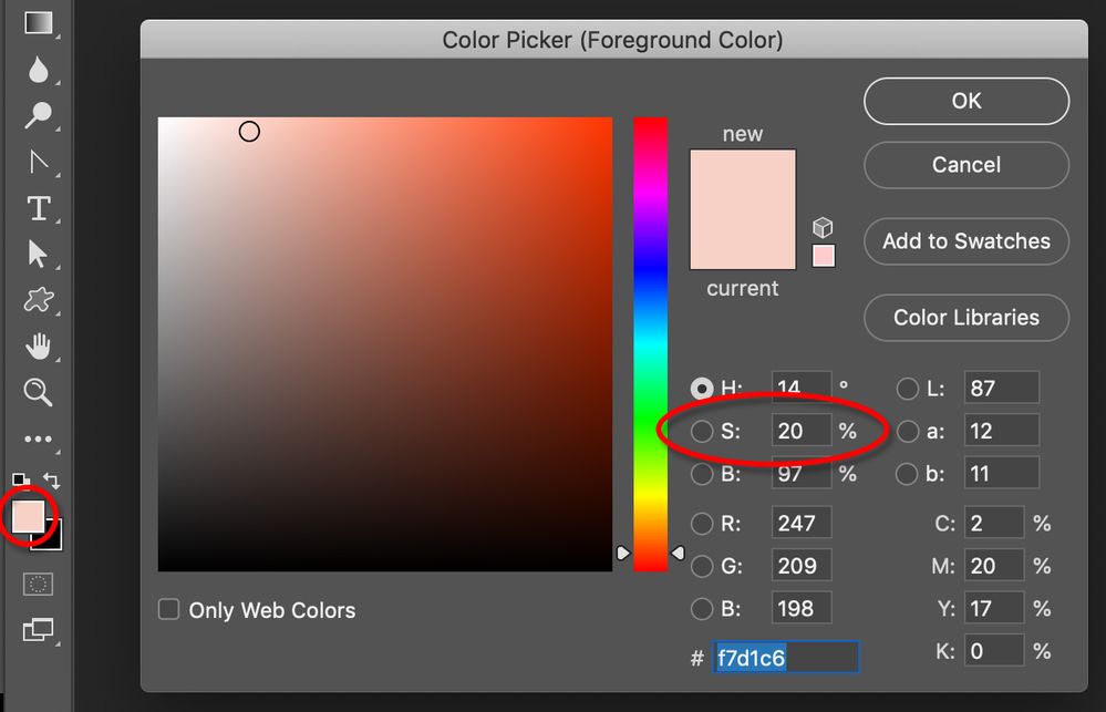
When you open up a colour within the Color Picker keep an eye on the Saturation value. You can manually adjust this number and generally keep it low.
Copy link to clipboard
Copied
THanks Michael.
My colour library looks different - is this the same thing as the swatches panel that you are referring to?
Copy link to clipboard
Copied
Photoshop contains an actual Swatches panel that can be found under the Window menu. This panel recently got a dramatic upgrade in terms of both content and appearance. My screen grab was from Photoshop 2020. What version of Photoshop are you using?
Copy link to clipboard
Copied
I think i am using Photoshop 2020.
I found the swatch panel. From here the colours look more accurate to the swatch when painted with the paint brush but it gives it a very unnatural look because all the texture of the baby harness isn't visible or is only just visible.
I painted the harness blue-grey using a colour from the swatch but with bad results.
Copy link to clipboard
Copied
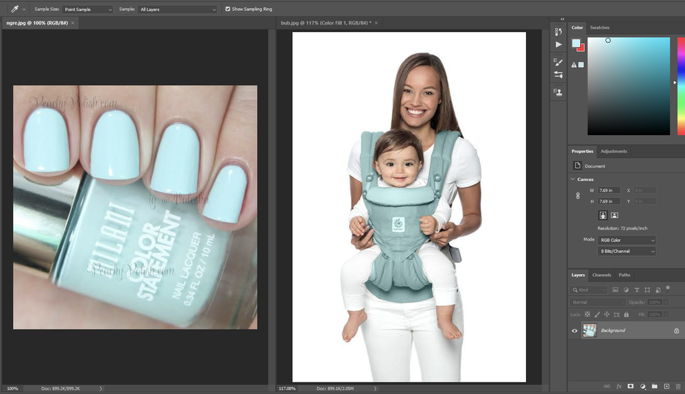
Below is an example of the results I am getting. I used the dropper tool to sample from the pale blue nail polish.
I then made a solid colour layer and put the colour on the baby harness.
As you can see, the shade is nothing like the nail polish shade and looks harsh. When i adjust the hue and saturation etc it just ends up other shades of harsh different colours:(
I am getting these results for most projects i am trying. This one isn't even that pastel but i am producing bad results. Trying with pastel colours end up just as bad with the colour looking harsh and wrong....
Copy link to clipboard
Copied
Attached is also a screenshot of my photoshop 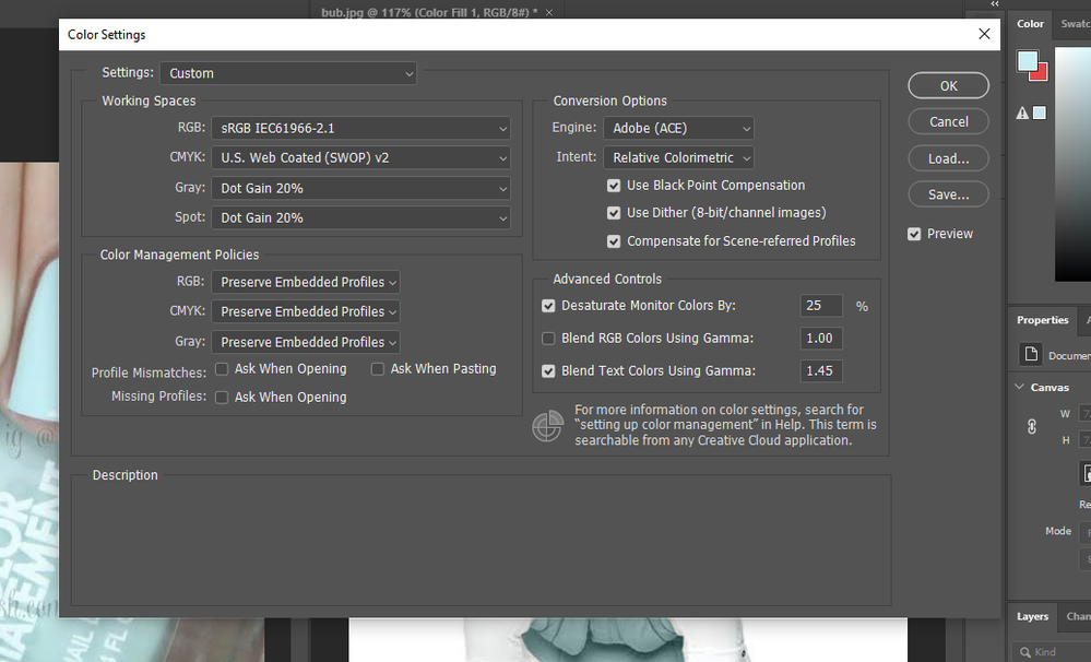
Copy link to clipboard
Copied
This isn't as simple as you think. Color and luminance are two different and independent things.
Different colors have different inherent brightness. Think of a bright lemon yellow, versus a deep blue/purple.
This means that changing the color component implicates a remapping of the luminance component as well. The whole brightness and contrast relationship needs to change along with the color.
The only practical way to get a realistic result is to carefully mask the required area, then put the new color on one separate layer - and a curves adjustment masked to the same area over that. Experiment with the curve until it looks reasonably credible. In this case you'd have to lighten the highlights.
Copy link to clipboard
Copied
Thannks for responding. I feel there has to be a way as other people are able to produce photoshop results with natural/no harsh colours.
Is there anywhere online to watch video/tutorial of how to mask the required area, then put the new color on one separate layer...etc?
Copy link to clipboard
Copied
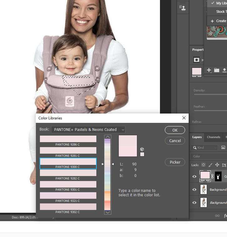
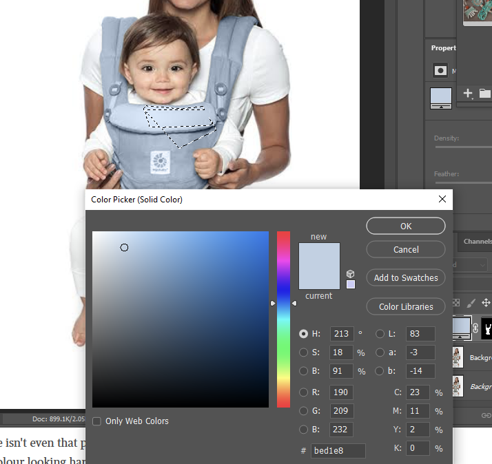
I have below attempted to pick a pastel colour from the library but the end result is not the same shade at all. The picker is light cornflower blue but the end result on harness looks darker and harsher.
The saturation is low at 18%.
If i put it much lower it becomes grey. It i put it just few percentage lower it just heads towards grey but not towards looking like the colour in the picker.
Im not sure if its something I am doing wrong?
Copy link to clipboard
Copied
This requires a good eye and a bit of experience. I normally hate to use the words "it's complicated", but in this case it really is. These are quite complex optical phenomena.
For one thing, highlights tend to be bright regardless of the base color, because they often consist mainly of reflected light. For the same reason, these highlights are lower in color saturation.
Shadows usually decrease in saturation. Deep shadows have very low saturation. None of that means you should go crazy with the saturation slider, it's quite subtle, but subtle goes a long way here.
A black/dark object has low total contrast range, the highlights are very deep - unless it's reflected light. A bright object has a very wide contrast range. In between, the contrast curve itself varies.
In short - this is really a lot more difficult than most people realize, and just putting a solid color layer on top of a white object will never look natural.
Sorry to be the bringer of bad news... 😉
Copy link to clipboard
Copied
Jenny, I noticed that on some occasions, you seem to work directly on the background layer.
I would recommend to work in layers, changing the blending mode, and that way, you can clip adjustment layers. (limit them to affect only the colors you added, by using the ALT key, and clicking between their names in the layers panel)
I'm wondering if it would not be useful to use a black and white adjustment layer below the color layer, to desaturate, and lower the luminosity at the same time, that you would then adjust with the top layers.
Copy link to clipboard
Copied
Thanks PECourtejoie,
I try to not work on background layer if its something important but with practice photos i work on background or sometimes i just forget not to.
Sometimes also when i try to do something like clone on a new layer, i will get the message "canot do as layer is empty" so i feel no choice but to use background image.
"use a black and white adjustment layer below the color layer, to desaturate,"
What would be the purpose of this please?
Copy link to clipboard
Copied
Jenny,
If you can't do anyting else, create a copy of the backgound layer: CTRL+A to select all, CTRL+J to "Jump" it to a new layer.
For the clone tool, click the Sample: "all layers" setting in the Option bar (currently set to "Current layer") in order to clone to a new layer.
The idea of the black and white adjustment layer is that you can control the tonal value of each color, (its "darkness") in order to get lighter tones that you can then convert to the color you want, either with a gradient map adjustment layer, placed on top; or a fill layer set to the color blending mode, for instance, also on top of the layer stack. If the colors are dark, it is harder to make them pastel.
Copy link to clipboard
Copied
Also, with the photos I have submitted to the top of this thread of the wall murals- by what method would posters use to colourise the top image (with the child) to make more vivid llike the one below it please?
Copy link to clipboard
Copied
If you want to have a lot of tools at your disposal, you can use the Camera Raw filter as a filter.
Select the area with the wallpaper, then go to filter, camera raw.
You might want to convert a copy of the background to a smart object, in order to tweak the settings.
Copy link to clipboard
Copied
Thankyou PECourtejoie.


