This is a user forum answered by volunteer Photoshop users - we do not work for Adobe. Adobe closely control their branding across the range of products they make.
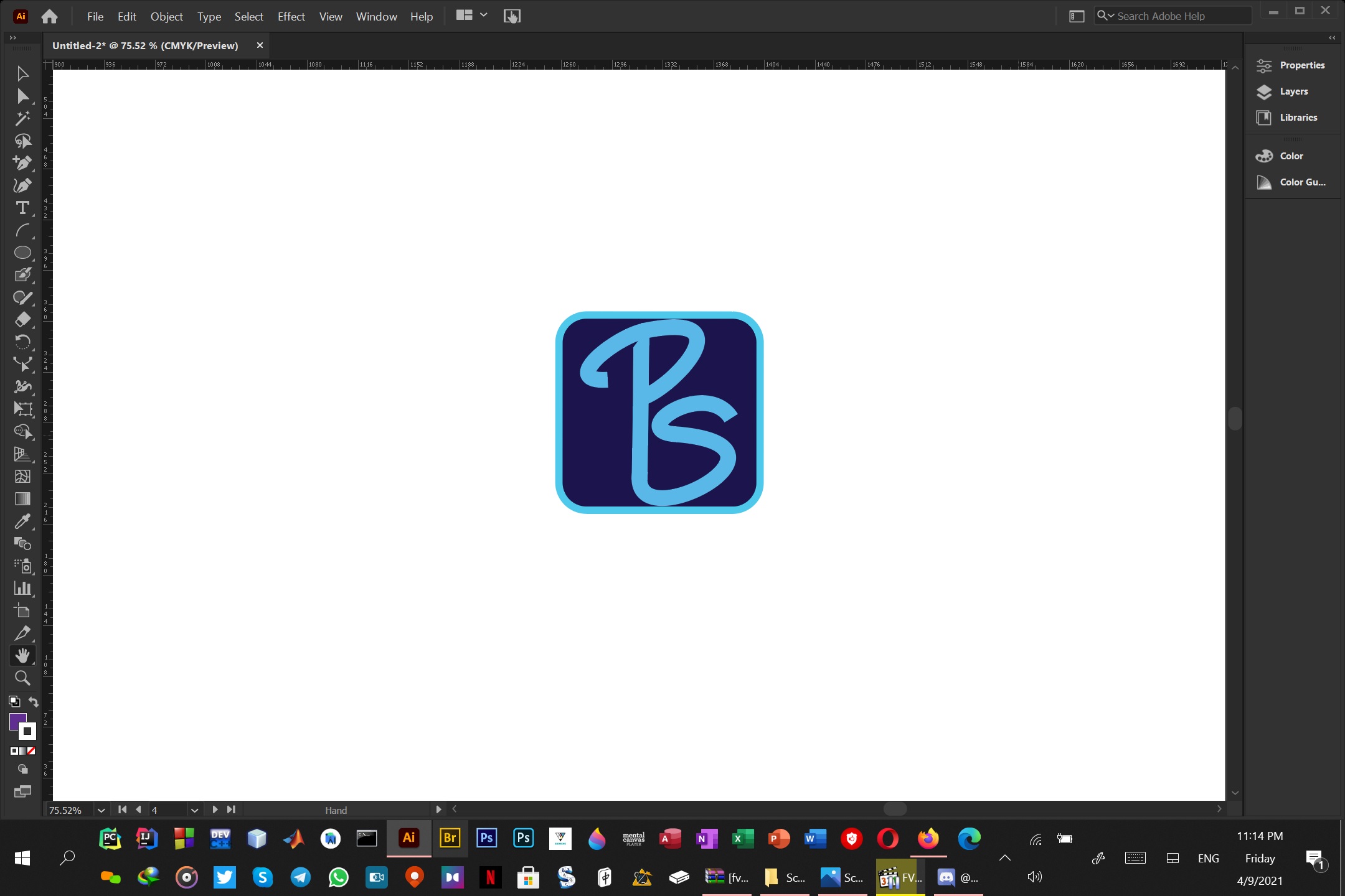
A little feedback, which may help if you are making logos/icons going forward:
1. You have a colour difference between the border light blue and the lettering, effectively turning a two colour icon into a three colour icon.
2. The angled half cut of at the top of the descender on the P jars a little.
3. The start of the curve at the top of the P is angled slighty, it would be better to make it vertical or slant it further to make it look as if it was done on purpose.
4. Your lettering is off centre - the distance between the border and lettering on the left, is less than the distance between the border and the lettering on the right.
5. Logos for screen based use are better made in an RGB colour space (e.g. sRGB)

Dave


 2
Replies
2
Replies


 AdChoices