• Global community
    • Language:
      • Deutsch
      • English
      • Español
      • Français
      • Português
  • 日本語コミュニティ
    Dedicated community for Japanese speakers
  • 한국 커뮤니티
    Dedicated community for Korean speakers
Exit
0

Parts of font being cut off

Community Beginner ,
Feb 11, 2021 Feb 11, 2021

Copy link to clipboard

Copied

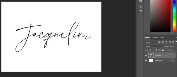
Hi everyone. I am wondering if someone can give me an answer as to why sections of a font I am using are being cut off. I have attached an example. The first image is a screenshot taken from a word file and the second is from a photoshop file. Any suggestions???


 Jacqueline 1.JPGJacqueline 2.jpg

Views

1.4K

Translate

Translate

Report

Report
Community guidelines
Be kind and respectful, give credit to the original source of content, and search for duplicates before posting. Learn more
community guidelines
Adobe
Community Beginner ,
Feb 11, 2021 Feb 11, 2021

Copy link to clipboard

Copied

The 'L' is being cut off in photoshop

Votes

Translate

Translate

Report

Report
Community guidelines
Be kind and respectful, give credit to the original source of content, and search for duplicates before posting. Learn more
community guidelines
Community Expert ,
Feb 11, 2021 Feb 11, 2021

Copy link to clipboard

Copied

Please show a screenshot with the insertion point in the text and the Character panel showing. Which typeface is it and where did you get it?

~ Jane

Votes

Translate

Translate

Report

Report
Community guidelines
Be kind and respectful, give credit to the original source of content, and search for duplicates before posting. Learn more
community guidelines
Community Expert ,
Feb 11, 2021 Feb 11, 2021

Copy link to clipboard

Copied

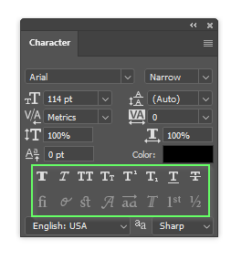
Is this in a Photoshop document, or when saved to PDF?  PDF files can do this.  Adding to what Jane has said, it might be useful to see your layer structure with the Type layer selected.


A couple of thoughts though...

What blend mode is the type layer?

Do you have any options active in the Character panel?

image.png

Votes

Translate

Translate

Report

Report
Community guidelines
Be kind and respectful, give credit to the original source of content, and search for duplicates before posting. Learn more
community guidelines
Community Beginner ,
Feb 14, 2021 Feb 14, 2021

Copy link to clipboard

Copied

I am just new to photoshop, so maybe I have missed something....


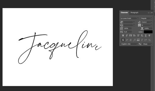
I have attached another screenshot, showing how the font should be displayed and then another screenshot of the photoshop file...


The text has just been added to an A4 template. 


I have just noticed that the 'e' is not showing right either, weird


Jacqueline 01.JPGJacqueline 02.JPG

Votes

Translate

Translate

Report

Report
Community guidelines
Be kind and respectful, give credit to the original source of content, and search for duplicates before posting. Learn more
community guidelines
Community Beginner ,
Feb 14, 2021 Feb 14, 2021

Copy link to clipboard

Copied

And one more showing the character panel..character panel.JPG

Votes

Translate

Translate

Report

Report
Community guidelines
Be kind and respectful, give credit to the original source of content, and search for duplicates before posting. Learn more
community guidelines
Community Expert ,
Feb 14, 2021 Feb 14, 2021

Copy link to clipboard

Copied

Hi


This is just a guess. The only thing in the Character panel that might possibly be it is that ligatures are turned on. Try selecting the text and toggle that button. You don't have an insertion point, though, so try selecting the text to see if any options change.


Not all typefaces are well-made, and it could be a glitch with the typeface itself.


If you purchased it from My Fonts, try emailing their support: 

help@myfonts.com

Votes

Translate

Translate

Report

Report
Community guidelines
Be kind and respectful, give credit to the original source of content, and search for duplicates before posting. Learn more
community guidelines
Community Beginner ,
Feb 14, 2021 Feb 14, 2021

Copy link to clipboard

Copied

LATEST

I will have a look at that now.


The font was purchased on myfonts so I will message them to see if they can help.


Thank you 🙂

Votes

Translate

Translate

Report

Report
Community guidelines
Be kind and respectful, give credit to the original source of content, and search for duplicates before posting. Learn more
community guidelines
Contributor ,
Feb 11, 2021 Feb 11, 2021

Copy link to clipboard

Copied

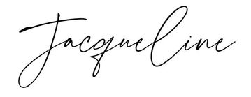
Am curious - exactly why is the spacing between the "l" and the "i" changed from the original file?  It appears that the letter-spacing was changed.  Was that intended?  

Actually, this looks like a really nice signature-logo - not a type-font.   

Sadly, I do not know a fix, off-the-top - but I now really want to know the answer, too!
 

Votes

Translate

Translate

Report

Report
Community guidelines
Be kind and respectful, give credit to the original source of content, and search for duplicates before posting. Learn more
community guidelines