Copy link to clipboard
Copied
Hi. This is my first discussion here. For school I have to make a poster relating to the topic: "Life in the Soil, Dig Deeper." It has to relate to conserving natural resources and beauty, and it is supposed to mainly relate to soil conservation. I tried to go for a paper cut-out look, and I like the top half of the poster, but I didn't really know what to do with the bottom. Please give me any advice you can.Thanks!
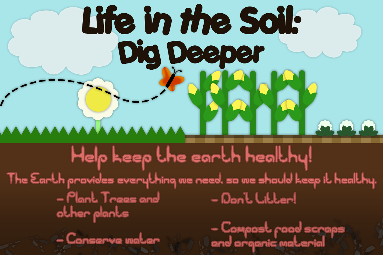
Copy link to clipboard
Copied
A few earthworms & grubs, maybe a gopher or 2?
Copy link to clipboard
Copied
Thanks! That sounds like a good idea. I still don't know what to do about the text though.
Copy link to clipboard
Copied
I like it.
The underground text looks a bit soft to my eyes.Try a little more contrast between the text body and the stroke around it.
Dave
Copy link to clipboard
Copied
That looks a lot better. Thanks!
Copy link to clipboard
Copied
https://forums.adobe.com/people/Nancy+OShea wrote
A few earthworms & grubs, maybe a gopher or 2?
Or how about making the text look like earth worms? You are halfway there with the Comic Sans thread the OP has used.
The black text is too chunky and crowded IMHO and I am not liking the red font, as it is not as readable as it might be. As a whole though, an OK job.