 Adobe Community
- Home
- Photoshop ecosystem
- Discussions
- problem with black point, I guess, all B&W images ...
- problem with black point, I guess, all B&W images ...
problem with black point, I guess, all B&W images look too light in latest photoshop version
Copy link to clipboard
Copied
Recently installed latest photoshop version; now when I open my B&W images they all look lighter then they used to be or when opened with any other programm. As a result, I edit images, send them to people, but they look too black! They look too black on my own computer when opened in any other program/app other then photoshop. How to fix it?
Explore related tutorials & articles
Copy link to clipboard
Copied
Does B&W mean grayscale in Photoshop? In that case you've opened a can of worms and you need to tread carefully.
Grayscale is subject to color management just like RGB or CMYK. There's just one channel instead of three or four. But that channel still has a tone response curve. Photoshop honors that, and will remap the tone curve from one grayscale profile to another, so that the appearance is preserved throughout. Everything will always look correct in Photoshop.
The trouble is, almost no other application on the planet does that. Proper grayscale support is virtually unheard of anywhere else, even in applications that otherwise have full color management. So effectively, your grayscale image is usually rendered as monochrome Monitor RGB.
Except in CMYK-centered applications like InDesign or Illustrator, where it's represented as 0-0-0-K (black ink), in whatever CMYK profile is used.
Neither is very likely to be correct. So you get tonal shifts, often quite severe.
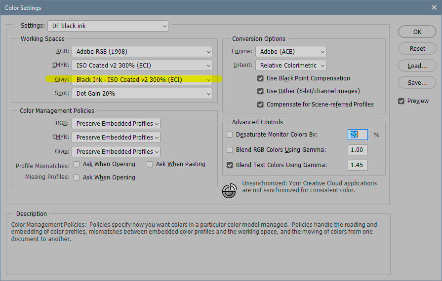
That means you have to use a grayscale profile as similar to the output as possible. For screen, that is usually Gray Gamma 2.2, or even better sGray. In CMYK, it's possible to use a special <black ink> CMYK setting, and convert to that (screenshot below). What makes this a particularly tricky rabbit hole is that the default grayscale profile in Photoshop, Dot Gain 15 or 20%, is pretty useless for anything. The dot gain profiles are basically generic offset print profiles, but really outdated as such, and they don't match any modern print output - and they certainly don't match screen output.
So if you work for screen, set your working gray to Gray Gamma 2.2 or sGray. If offset print, use a <black ink> CMYK profile. If you already have grayscale files with some other profile, convert to one of these.
To get the <black ink> option, click "load gray" in the rolldown and pick the CMYK profile you want.
Copy link to clipboard
Copied
Thanks, I'll try what you suggested.
Yes B&W stands for Grayscale, original images are black and white.
What really puzzles me, that in all previous versions of Photoshop I never had any problems with Grayscale, it only in the latest one, may be you know what was changed? Use same computer, same monitor, so the only difference is new version of photoshop.
Thanks,
Galina
Copy link to clipboard
Copied
I was a little inaccurate in one thing I wrote above. I said that Photoshop "converts from one grayscale profile to another". It does, but that's not the important point. What I actually meant to say is that Photoshop converts from the document grayscale profile into your monitor profile. That's display color management - the crucial point, and why Photoshop always displays it correctly and other applications don't.
The monitor itself has nothing to do with this. The purpose of the monitor profile is just to describe the monitor such as it is, whatever it is. Applications that don't remap from the document profile into the monitor profile, i.e. do not use color management - will never display correctly. This remapping includes the tone response curve.
What it boils down to is that for grayscale, there is no real color management outside Photoshop. And when you don't have color management, it only displays correctly when the source and destination color spaces are identical. The document grayscale profile has to match your monitor's native tone response curve. sGray does that pretty well, Gray Gamma 2.2 almost does it, or usually close enough.
Copy link to clipboard
Copied
What I tried so far - converting my Grayscale image to RGB (mode setting), then editing - looks better. Will try to scan into RGB even the images are B&W, and see how it works. As of now what I see when go to levels - nothing in most black (left) part, then extremly intens narrow peak; same on all images - looks wierd.
Copy link to clipboard
Copied
Yes, RGB is much safer, and the chances are much better it will be handled correctly outside Photoshop.
But rather than Image > Mode, it's a better habit to go directly to Edit > Convert to Profile and pick the profile you want. In this case you'd be best off with sRGB IEC61966-2.1.
Image > Mode makes the assumption that the profile you want is always the one you have as working space. That is obviously not always the case.
Copy link to clipboard
Copied
Thanks for your edvise, will do that from now on.
