 Adobe Community
Text overlay over images
Copy link to clipboard
Copied
I'm wanting to create some poster boards for the rugby club i volunteer at to show part of the clubs history. Over these i want to put player name and heratage numbers that have played for the club over the years. As a lot of the images are black and white, i waning to know what is the best way of overlaying the text on the image, and using up all available space. Any he;lp is greatley appreciated.
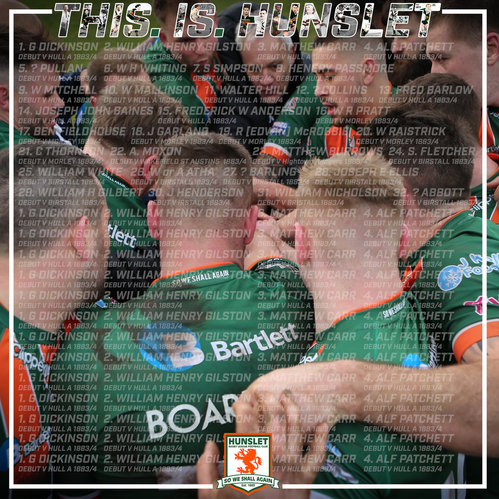
This is my attempt so far,, its very much work in progress, but there must be an eaiser way that what i'm doing at the moment.
Explore related tutorials & articles
Copy link to clipboard
Copied
It sounds like you're making multiple posters using other images. You might consider picking an image to use for the focus of the poster and using the other images and/or names in groupings that make sense. Placing semi-transparent names over an image can make them harder to read. You could use a background color over the image like a green radial gradient that goes from fully transparent in the center to more opaque toward the edges. Or it could be a linear gradient that goes from fully transparent to more opaque toward the bottom. You could try either of those using a Layer Style. Then over that, you could list names in groupings by year, position, or number, or alphabetically by last name. I hope that helps. Feel free to share your progress and ask more questions. 🙂
Copy link to clipboard
Copied
Thanks for the above Myra, I've 12 or 13 of these boards to design. bascliy they are tracking the history of the club and players from day one to present. So each board will have a different image on it showing a famous player or winning a trophy, then player names will be going through each image from player 1 to player 2001 etc. these board will then be displayed around the club to show the history off.
i was hoping there might be an easer way to gewt the text formatted to make sure it fills all available space in the frame i've used. i've just made the names transparent in the example as i don't want them to over poower the image too much. They might not be in the final version or it might be of a different colour, that can all be decided at a later date, i just want to get the formatting right first.
Copy link to clipboard
Copied
If you want an easier way to format the text, you can check out using character and paragraph styles.
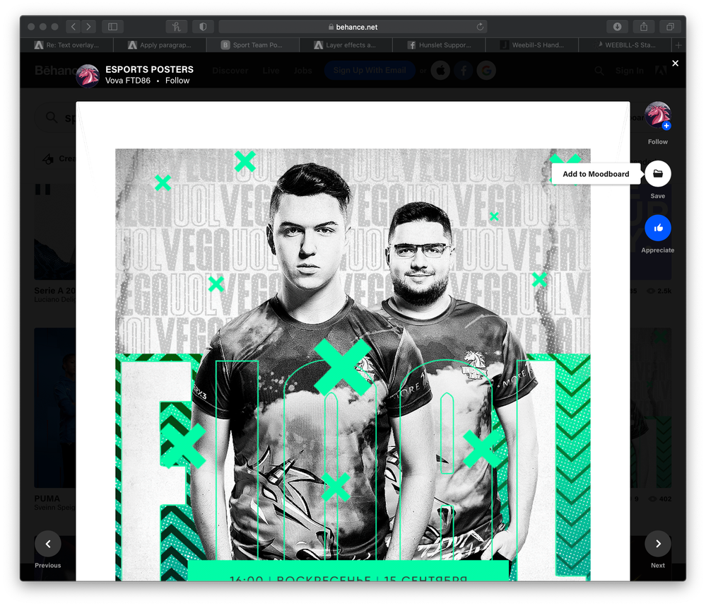
If you're looking for ideas for layout, you could check out Behance for sports team poster ideas.
Copy link to clipboard
Copied
Thanks, I've got a bit of insperation from looking at a few of these posters.
I'm maybe going to change tact a litle bit with the text to make it stand out now. Using this a guide, can you give pointers on how to make text just have the outline so i can have oine name with the outline and one as coloured.
thanks again
Copy link to clipboard
Copied
The current sample certainly is busy. Perhaps it would make sense to review the criteria: A poster highlighting the team over the years.
Poster:
You make no mention of the size but is safe to assume it will be viewed from a distance. As a result, it should have the simplicity of design not unlike a book jacket, not jammed with confusing or distracting elements.
Team Continuity:
Highlighting the team over the years but each year has not been mentioned. A template should be established with the poster year prominently displayed in a position common to all the posters.
Image:
The image in each case is a design element. As such, and since you currently have both color and black & white photographs to deal with, you may consider the images in grayscale or duotone over a bold flat color, perhaps with the flat color changing from year to year so that the set of posters have continuity and variety.
Team Name
Usually, the team name should be as unmodified as the team logo. No outline lettering unless the choice of type face helps it make a statement, no image inside the type. From poster, no change in face, size or color.
The team members:
There is no way the list of members can appear and be readable from a distance. Consider presenting them in an appropriate panel where those interested may move in close to the poster read the names. (Probably only each man on the team will move in to confirm that his name is on the list.)
Bottom line:
Team name element
Year element
Team member names in a suitable panel
Bold photograph generic enough so no single member hogs the limelight.


