 Adobe Community
- Home
- Photoshop ecosystem
- Discussions
- The ProPhoto cyan shadow banding bug
- The ProPhoto cyan shadow banding bug
The ProPhoto cyan shadow banding bug

Copy link to clipboard
Copied
Since Noel is back with us, I thought this header might catch his attention. He was the one who first reported it six or seven years ago.
The reason I'm bringing this up now, is that someone in the Lightroom forum had this problem just yesterday (he was sending ProPhoto files to Photoshop and couldn't understand the cyan cast in his dark grays). There's no doubt it's the same issue.
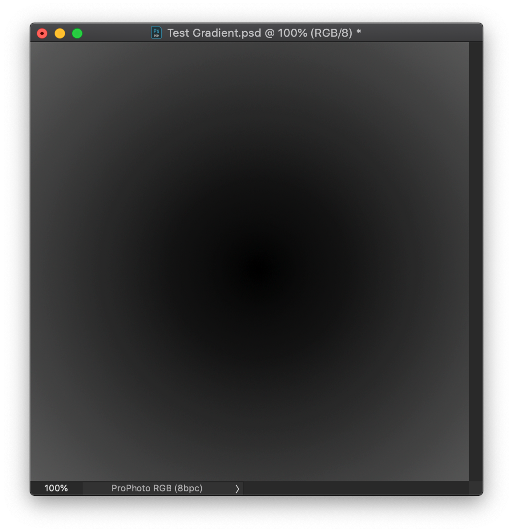
This made me dig up my old ProPhoto test gradient file. I don't use ProPhoto all that much, so I haven't really looked for it in a while. To recap, this is an example of what it could look like (this is an old screenshot that I've kept). Open and view against a darkish background:
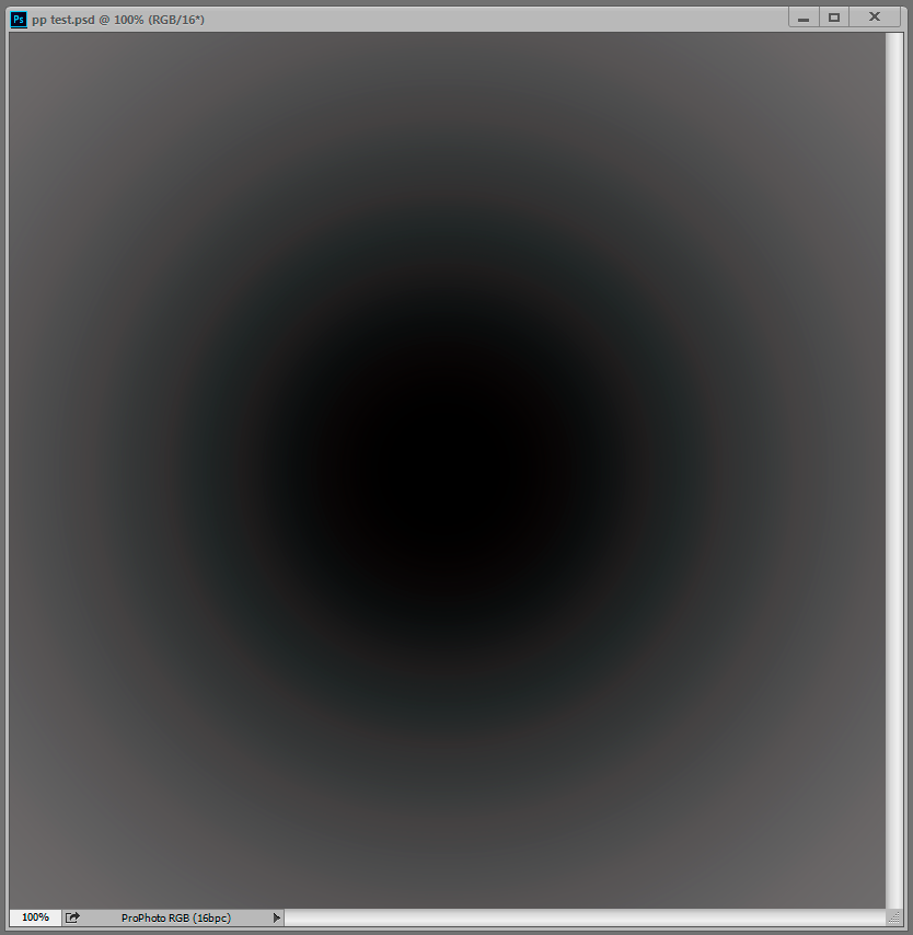
But when I opened the test gradient now, there was no trace of it, zero. The gradient is smooth as silk. That surprised me, because while the effect can vary, it always seemed to be there in some form.
Technically, this is an inaccuracy in the conversion from ProPhoto into the monitor profile. This conversion is performed by OpenGL in the GPU when you have the PS preference set to Normal and Advanced modes. In Basic mode it's shifted back to the CPU, which is more accurate so the problem disappears. And you only see it in ProPhoto files because ProPhoto is very compressed in the shadow values compared to other color spaces. The stratospheric gamut has a price, and that's it. With this compression, inaccuracies get amplified.
So what has changed on my system over the last 12 to 24 months? Not much. I still use Eizo Colornavigator as I did then, still producing similar matrix monitor profiles. But one thing has changed - going from GeForce to Quadro, and with that, 10 bits per ch output.
So Noel, if you're reading this - I understand you have Quadro GPU too, and running displays at 10 bit. Do you still see it?
Anyone else?


Explore related tutorials & articles
 80
Replies
80
80
Replies
80

Copy link to clipboard
Copied
So if I understand you correctly, you are asking why you don't have a problem? 
Copy link to clipboard
Copied
There is a problem, has been for a long time.
The fact that I'm not seeing it now could explain why it happens elsewhere. I'm gathering troubleshooting info.

Copy link to clipboard
Copied
Dag - have you tested with Legacy Compositing checked and unchecked?
Dave
Copy link to clipboard
Copied
Nope, will do.
(Although this is basically a flat file issue, no compositing involved.)
Copy link to clipboard
Copied
I got the impression that the core engine was being updated to make compositing better. So there is a chance that this would be a difference. As discussed in another thread , it is difficult to tell without any firm info on what has been changed.
Dave
Copy link to clipboard
Copied
Negative, Dave, no difference with legacy on or off -
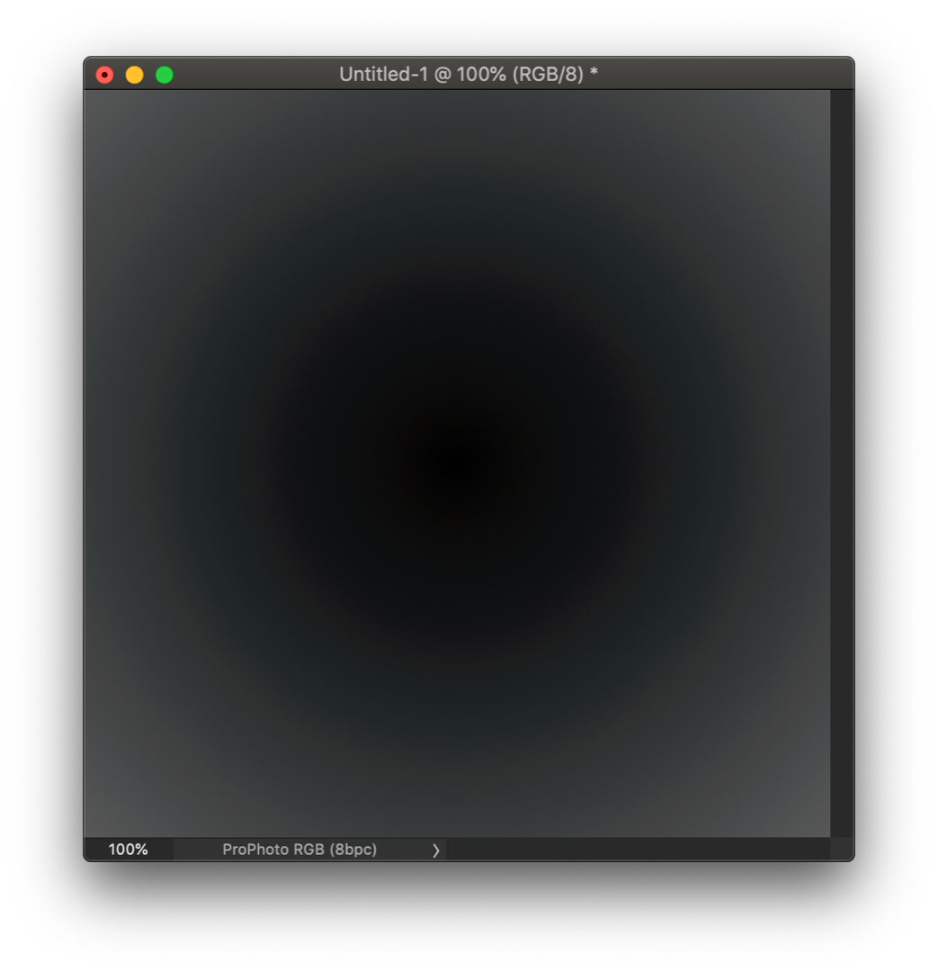
How about you? If you make a radial gradient from 0 to, say, 80, in a ProPhoto file, can you see any cyanish banding?

Copy link to clipboard
Copied
Copy link to clipboard
Copied
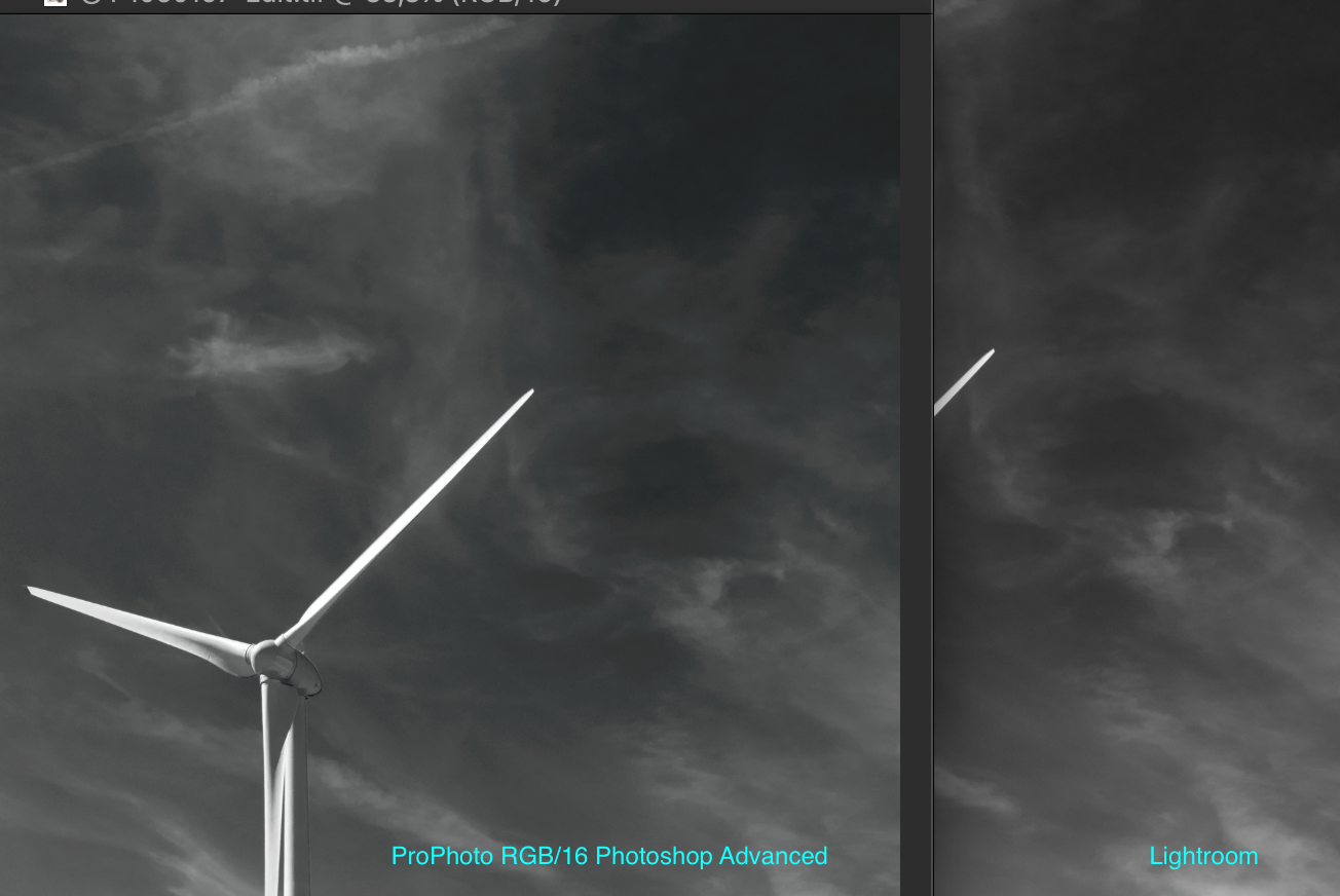
Yep, there it is. That's exactly how it looks.
(although, to eliminate all variables, you should do it with 16-bit files - but I doubt it will make much difference here. The crucial bit depth limitation isn't in the file, but the display system).
Copy link to clipboard
Copied
So this is the same issue as when I export from Lr to Ps via Edit In?
I'll try one in Basic mode and update the previous post.
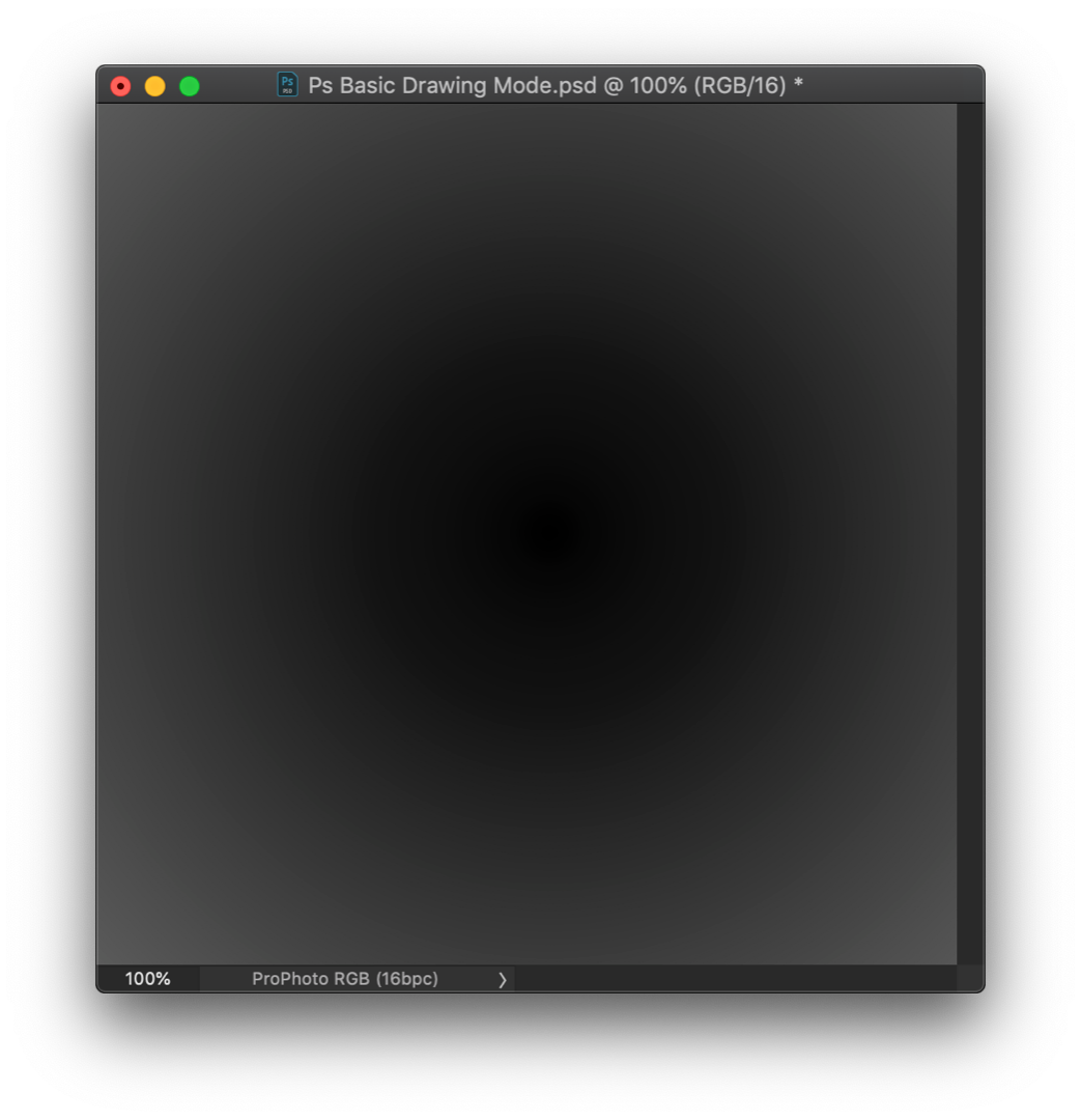
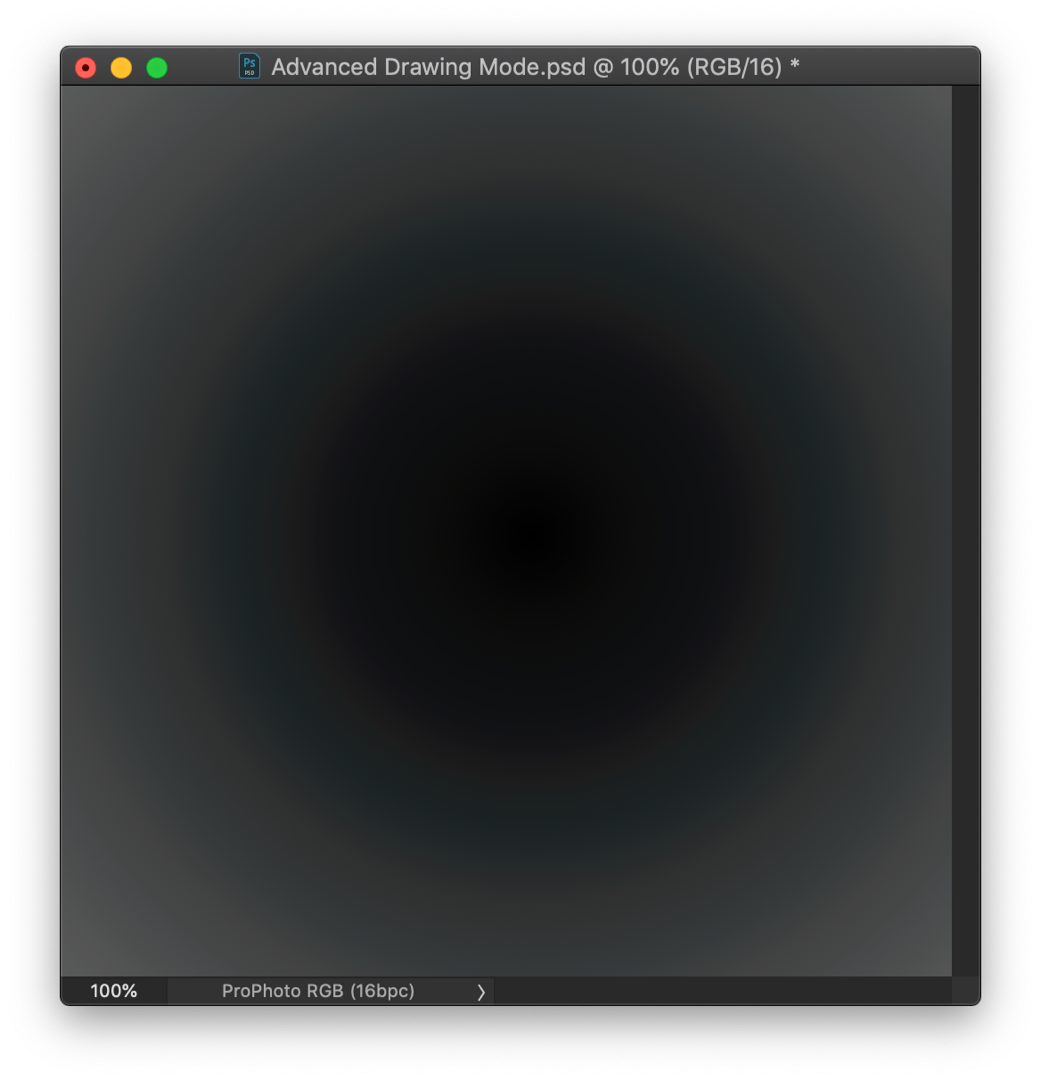
Update, I can't seem to edit the previous post so here's with Photoshop in Basic drawing Mode
And here are the 16bit files. I always work in 16bit but since yours wasn't I wanted to test with the same settings.
Copy link to clipboard
Copied
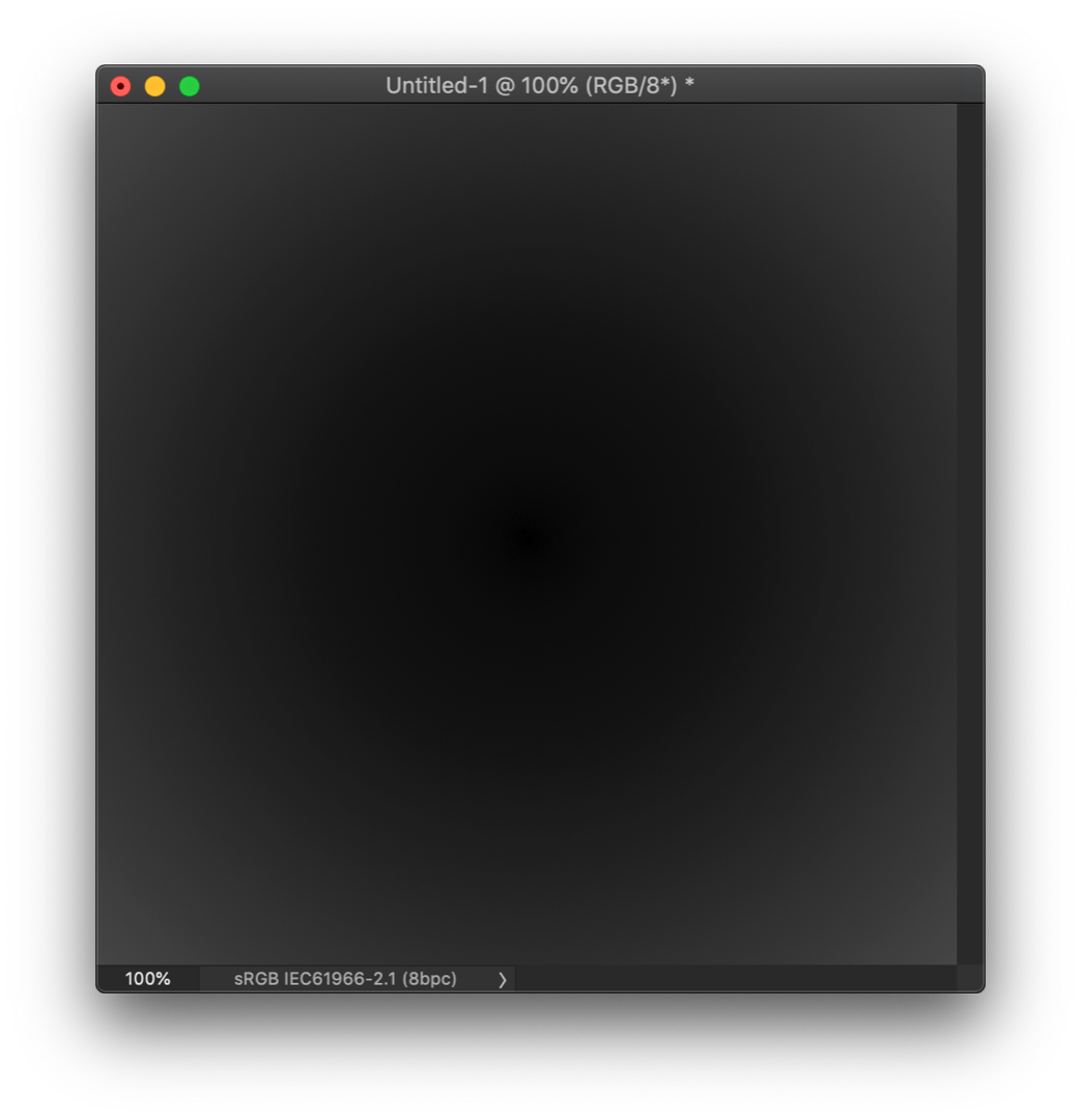
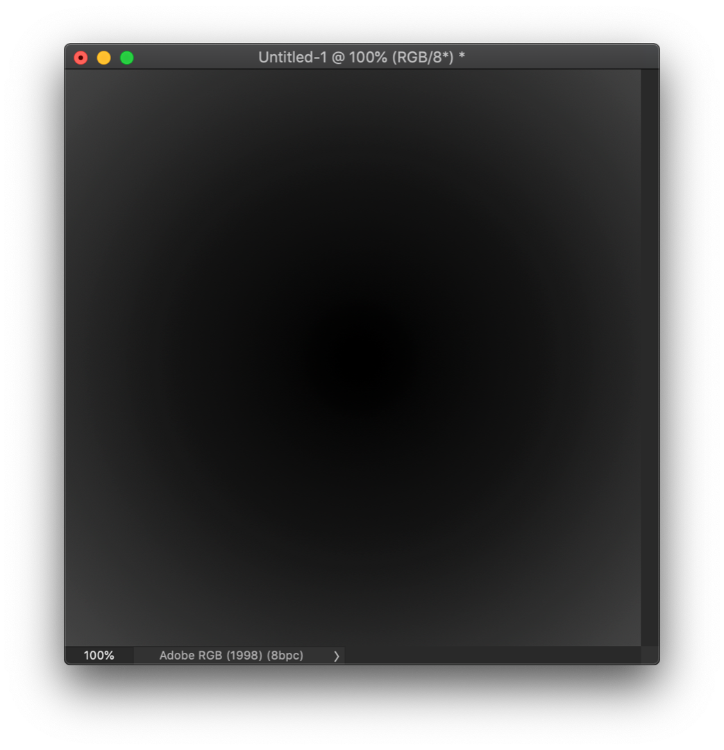
I just tried 6 new documents, each time before creating the I changed the drawing mode. I then used the gradient tool
Results:
Prophoto 16 bit - Basic - Banding Edit : Pro Photo 16 bit Basic No (or at least barely visible) banding
Prophoto 16 bit - Normal - Banding
ProPhoto 16 bit - Advanced - Banding
Switching between the docs prepared with different drawing modes - the banding does not change at all
Adobe 1998 -16 bit - Basic - No (or at least barely visible) banding
Adobe 1998 -16 bit - Normal - No (or at least barely visible) banding
Adobe 1998 - 16 bit - Advanced - No (or at least barely visible) banding
My monitors are not 10 bit - hence the "barely visible" comment
Dave
Edited : I had started new documents but not restarted Photoshop between drawing modes
Copy link to clipboard
Copied
You shouldn't get this in Basic mode. You obviously know that changing drawing mode requires relaunching Photoshop, so I will not remind you about that 
Is the banding cyan colored (that's the smoking gun), or just regular banding? See my original screenshot at the top.
OK. I suppose everyone has more than enough to chew on these days, between color blend bug, constrained scaling and file associations, so I won't stress this too much now. I was just curious. Also, I need to mind my job inbetween...
Copy link to clipboard
Copied
Was thinking the same, this should not happen in Basic mode, if so then it's an even more complicated issue!
We need to work indeed but then Lr and Ps are my main tools for work so I would rather see this issue resolved.
One question D Fosse, you mentioned not using ProPhoto does that mean you use Adobe RGB color space in your workflow? do you work with JPG or RAW files? shouldn't we all be using ProPhoto RGB especially with RAW files to keep as much detail (color, dynamic range, etc..) as possible. At least my experience shows there's a pretty big difference. Same with gradients. Masks I believe though are always 8bit but one can barely notice the difference. Even Lightroom recommends using ProPhoto RGB.
Copy link to clipboard
Copied
I try to avoid ProPhoto if possible, because of the compressed shadows. I'm really bothered by that - it's really difficult to make subtle shadow adjustments. I do use it when I need the extended gamut, but I prefer Adobe RGB if gamut clipping can be controlled in other ways.
Controlling clipping is the main thing, and sooner or later you will have to remap those ProPhoto files into something smaller anyway.
There's no other advantage to ProPhoto than the extremely large gamut. If you don't need that, there's no particular reason to use it. It doesn't give you any more dynamic range.
Copy link to clipboard
Copied
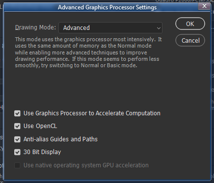
See whether Use Graphics Processor is enabled or disabled in your Performance Prefs, and what Drawing Mode you're set to use. As I recall setting the latter to Basic moved the color-management tasks into the CPU and that worked around the problem.
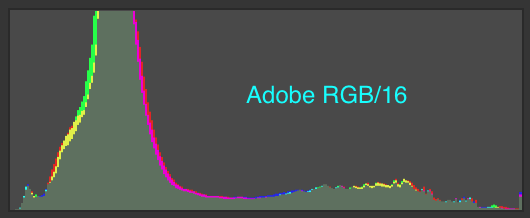
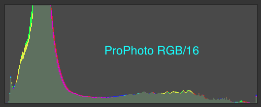
I just reproduced the problem here on 20.0.0, 30 bit color, with the nVidia 391.89 driver. For a gray graident in a ProPhoto RGB document going from levels 12 to about 90 I see concentric rings of cyan and gray. They look nice and smooth with the 30 bit color, but the color inaccuracy is definitely there. Here's a saturation-enhanced screen grab (which necessarily reduces the image to 8 bit color)...
I know you've recently updated your nVidia display driver, Dag, to 4xx.something. I've been meaning to do that myself. I will do so shortly and report back.
-Noel
Copy link to clipboard
Copied
Thanks Noel, so it's still there...dang. Well, try 411.63 when you get to it.
I had a secret hope that the Quadro drivers would prove to be more accurate, and that be the explanation. Not because I would persuade everyone to buy one, but just to have an explanation and a way out for those bothered by this.
Yes, I have GPU enabled and set to Advanced, and no banding whatsoever in ProPhoto files, which is a sensational first. It's always been there before <scratches head>.
Oh well, back to square one. Maybe it's just an inherent problem in OpenGL code, nothing to do with Adobe or any other implementation of it.
Copy link to clipboard
Copied
I cannot believe we're the only ones noticing this issue, this is in B&W....or is it color?
I've been using Basic drawing mode for ages now because of this and even bought a new GPU a week ago to solve this.
Alright I'll do some more testing to see if I can make the switch to AdobeRGB working space (advanced)
Copy link to clipboard
Copied
Hi Dag,
Oops, got nVidia 411.81 here. Apparently released today. I'm still on Windows 8.1 by the way. The problem remains.
Whatever you've got going on, treasure it. In all seriousness, it's good that you've picked this issue back up. Maybe the difference will lead to a discovery.
-Noel

Copy link to clipboard
Copied
https://forums.adobe.com/people/D+Fosse wrote
Yes, I have GPU enabled and set to Advanced, and no banding whatsoever in ProPhoto files, which is a sensational first. It's always been there before <scratches head>.
BTW I'm not seeing any banding either on my Windows 7 system using a Quadro 600 GPU.
Copy link to clipboard
Copied
It looks compressed but isn't this because the image is dark and has more a lot more information in the ProPhoto space?
As you already guessed though I'm not an expert in this, by far, I wish though so I could solve this problem. I certainly know my way around Lr and Photoshop where image editing is concerned but this stuff makes my head spin.
Adobe RGB vs ProPhoto RGB
Now I'm deciding between ProPhoto RGB with Basic or Adobe RGB with Advanced. This is with RAW files, final export to sRGB or aRGB, depends on the library I submit to. Do you think I won't miss much by using Adobe RGB? If I was shooting JPG then sure it would make no sense to work in ProPhoto although.... I've read you can get smoother gradients (or other edits) when converting to 16bit and then save back to 8bit.
Oh and WELCOME BACK NOEL!!!
Copy link to clipboard
Copied
https://forums.adobe.com/people/D+Fosse wrote
You shouldn't get this in Basic mode. You obviously know that changing drawing mode requires relaunching Photoshop, so I will not remind you about that
Embarrassed time. I was thinking it was the same as GPU on off and just needed a new document start. I'll retest later tonight 
Dave
Copy link to clipboard
Copied
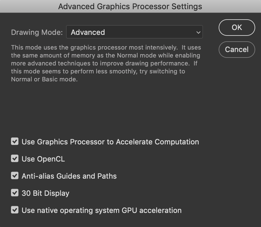
By the way, do you have the Use native operating system GPU acceleration setting available and checked in the Advanced Graphics Processor Settings panel. It's grayed out for me; I imagine it's only available for the very latest OS versions.
-Noel
Copy link to clipboard
Copied
Yup, uses Metal in macOS (Mojave here)
Copy link to clipboard
Copied
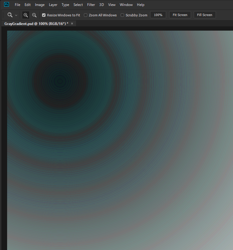
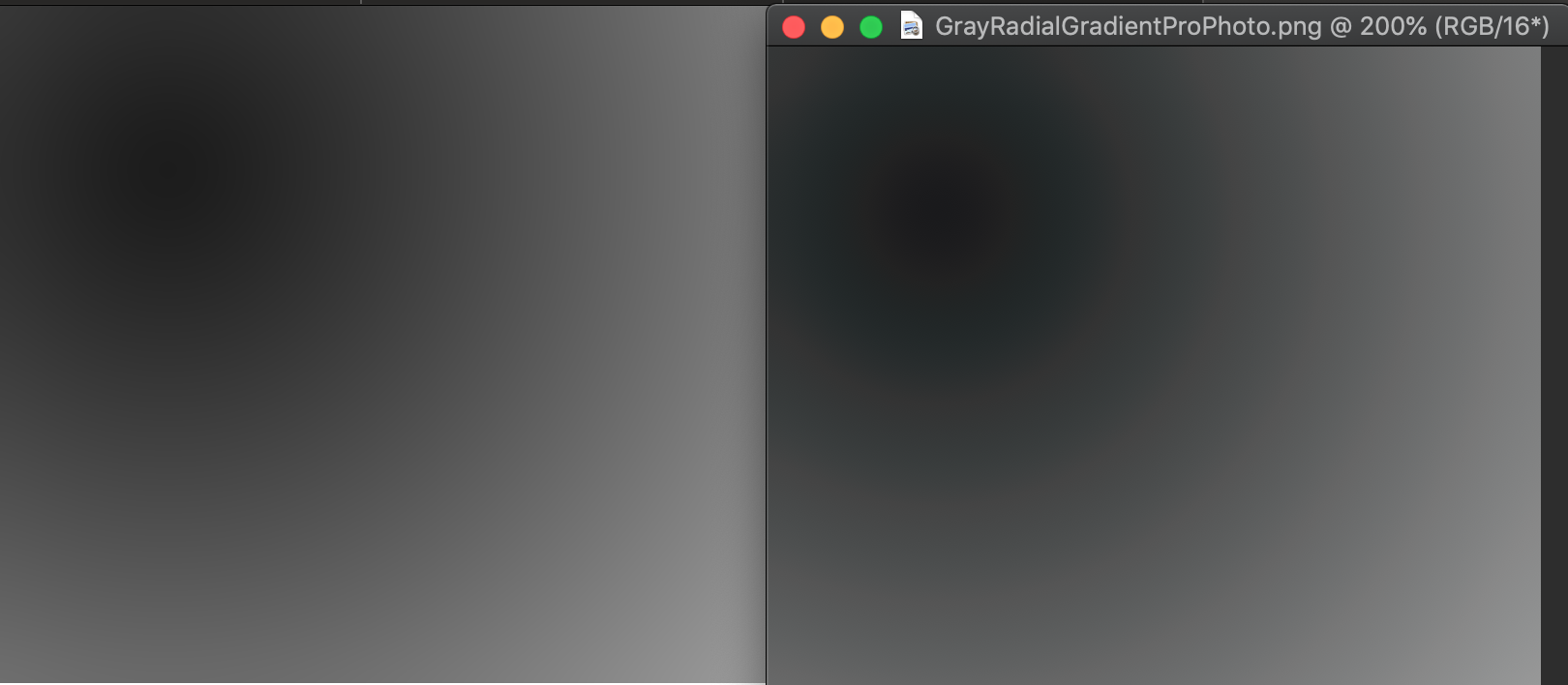
By the way, here's an image that can be used to reproduce the issue directly. Just open it into Photoshop; you should be able to see the circular bands of color if you look carefully. It's a 16 bits / channel PNG file with a smooth radial gray gradient.
Make sure that when you open the file it doesn't get converted to your preferred color space (look in Edit > Color Settings... for the rules for that).
https://Noel.ProDigitalSoftware.com/ForumPosts/GrayRadialGradientProPhoto.png
I'm not sure of the best way to get it from my site to your Photoshop. Maybe right-click, download, or copy and paste the URL into the Photoshop File > Open dialog.
-Noel
Copy link to clipboard
Copied
Indeed, Web (converted to sRGB I suppose) and Ps version side by side
Btw are we in a private room listening to our own echos or are Adobe engineers actually looking into these threads?
We really need to get our hands on one of those engineers asap, I'll bring the chair, you bring the rope, D Fosse can ask the questions!

 AdChoices