 Adobe Community
- Home
- Photoshop ecosystem
- Discussions
- Re: The ProPhoto cyan shadow banding bug
- Re: The ProPhoto cyan shadow banding bug
The ProPhoto cyan shadow banding bug

Copy link to clipboard
Copied
Since Noel is back with us, I thought this header might catch his attention. He was the one who first reported it six or seven years ago.
The reason I'm bringing this up now, is that someone in the Lightroom forum had this problem just yesterday (he was sending ProPhoto files to Photoshop and couldn't understand the cyan cast in his dark grays). There's no doubt it's the same issue.
This made me dig up my old ProPhoto test gradient file. I don't use ProPhoto all that much, so I haven't really looked for it in a while. To recap, this is an example of what it could look like (this is an old screenshot that I've kept). Open and view against a darkish background:
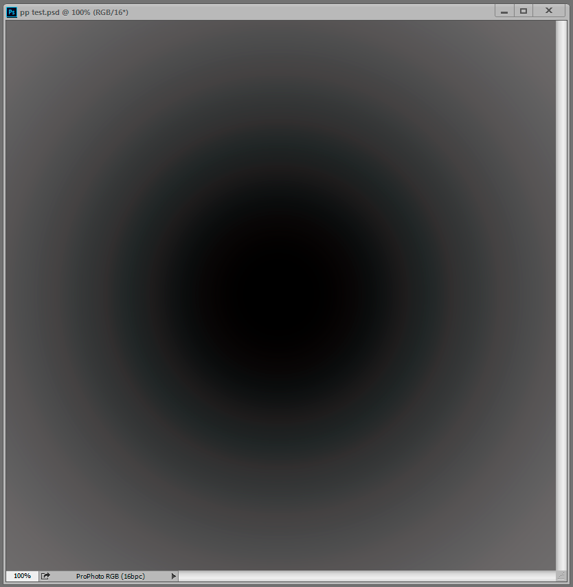
But when I opened the test gradient now, there was no trace of it, zero. The gradient is smooth as silk. That surprised me, because while the effect can vary, it always seemed to be there in some form.
Technically, this is an inaccuracy in the conversion from ProPhoto into the monitor profile. This conversion is performed by OpenGL in the GPU when you have the PS preference set to Normal and Advanced modes. In Basic mode it's shifted back to the CPU, which is more accurate so the problem disappears. And you only see it in ProPhoto files because ProPhoto is very compressed in the shadow values compared to other color spaces. The stratospheric gamut has a price, and that's it. With this compression, inaccuracies get amplified.
So what has changed on my system over the last 12 to 24 months? Not much. I still use Eizo Colornavigator as I did then, still producing similar matrix monitor profiles. But one thing has changed - going from GeForce to Quadro, and with that, 10 bits per ch output.
So Noel, if you're reading this - I understand you have Quadro GPU too, and running displays at 10 bit. Do you still see it?
Anyone else?


Explore related tutorials & articles
 80
Replies
80
80
Replies
80

Copy link to clipboard
Copied
'Convert to Profile' U.S. Web Coated (SWOP) v2 for both produces identical Histograms
Yes, in gamut colors with the same appearance in the different spaces should convert to the same CMYK output numbers. Only colors that are outside of AdobeRGB's gamut, but inside of SWOP (i.e., 90-100% cyan towards green), would show a difference in the conversion to the print space. If your example image is headed for a print destination, it wouldn't benefit from being in the larger ProPhoto space, but it shouldn't be hurt by it either.
with Cyan and Black channels clipped.
The black separation histogram would be affected by the CMYK profile's black ink limit (90% for SWOP), black generation/GCR, and total ink limit (300% for SWOP).

Copy link to clipboard
Copied
https://forums.adobe.com/people/rob+day wrote
'Convert to Profile' U.S. Web Coated (SWOP) v2 for both produces identical Histograms
Yes, in gamut colors with the same appearance in the different spaces should convert to the same CMYK output numbers. Only colors that are outside of AdobeRGB's gamut, but inside of SWOP (i.e., 90-100% cyan towards green), would show a difference in the conversion to the print space. If your example image is headed for a print destination, it wouldn't benefit from being in the larger ProPhoto space, but it shouldn't be hurt by it either.
Thanks Rob. If you look at the screenshot at the bottom of my reply #54 you can see a large difference in color of the red jacket when using Adobe RGB versus ProPhoto RGB. From my experience processing numerous color negative film types ProPhoto RGB provides the most accurate color correction using PS Auto Curves. Its an esoteric process that I don't fully understand, but it works very well. For this specific type of image processing ProPhoto RGB is needed.
If interested you can download an article Mark Segal and I wrote along with my PS Action and a color negative CR2 file for testing here:
https://www.dropbox.com/home/DSLR%20Film%20Copier
Sorry for cross-posting this issue. I just wanted to show that there are some applications where using ProPhoto RGB can make a significant difference.
Copy link to clipboard
Copied
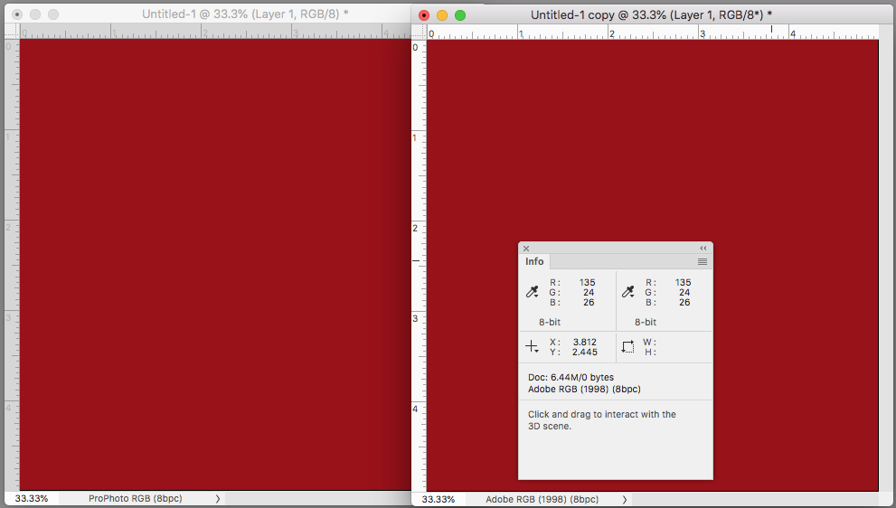
Not sure I'm following how you got the ProPhoto 100|42|22 red to convert to AdobeRGB 148|39|30, there must have been an additional correction after the conversion? I get 135|24|26 and the appearance matches.
Copy link to clipboard
Copied
Rob, the two screenshots show the results after inverting the image and applying an Auto Curves adjustment layer (Find Dark & Light Colors, Snap Neutral Midtones, Shadows & Highlights 0.02%). You can download the original raw file at the Dropbox link I provided. The file is named 'Kodacolor X Color Negative Example.CR2.'
https://www.dropbox.com/home/DSLR%20Film%20Copier
Actually this file demonstrates the profile issue even better (Red Disney Sign) and can be downloaded at the same Dropbox link:
IMG_6426_Fuji Super G100_PS Workflow Example-DSLR Film Copier.CR2
Copy link to clipboard
Copied
Hey Dag, if you're still seeing your ProPhoto documents without the cyan banding, could you please share your copy of the ProPhoto.icm file? I want to see if there could possibly be a difference.
-Noel
Copy link to clipboard
Copied
https://forums.adobe.com/people/Noel+Carboni wrote
Hey Dag, if you're still seeing your ProPhoto documents without the cyan banding, could you please share your copy of the ProPhoto.icm file? I want to see if there could possibly be a difference.
-Noel
I sent a copy to the PDSdotcom mail - let me know if you don't get it.
Copy link to clipboard
Copied
Ah well, the file is identical to what I have.
I'm out of ideas for the moment, except perhaps that the disappearance of the bug has to do with planetary alignment...
-Noel
Copy link to clipboard
Copied
Well, whatever can be eliminated is useful.
Let's think about black point compensation in monitor profiles. sRGB - which also shows this cyan banding when used as monitor profile - has its own twist on that, with the near-black linear "toe". Could that mean something? Just throwing darts blindfolded here...but maybe try Adobe RGB just for the heck of it? I know it's wrong for standard gamut displays, but just to test.
Copy link to clipboard
Copied
At this point I'm convinced there's something special about the ProPhoto profile itself.
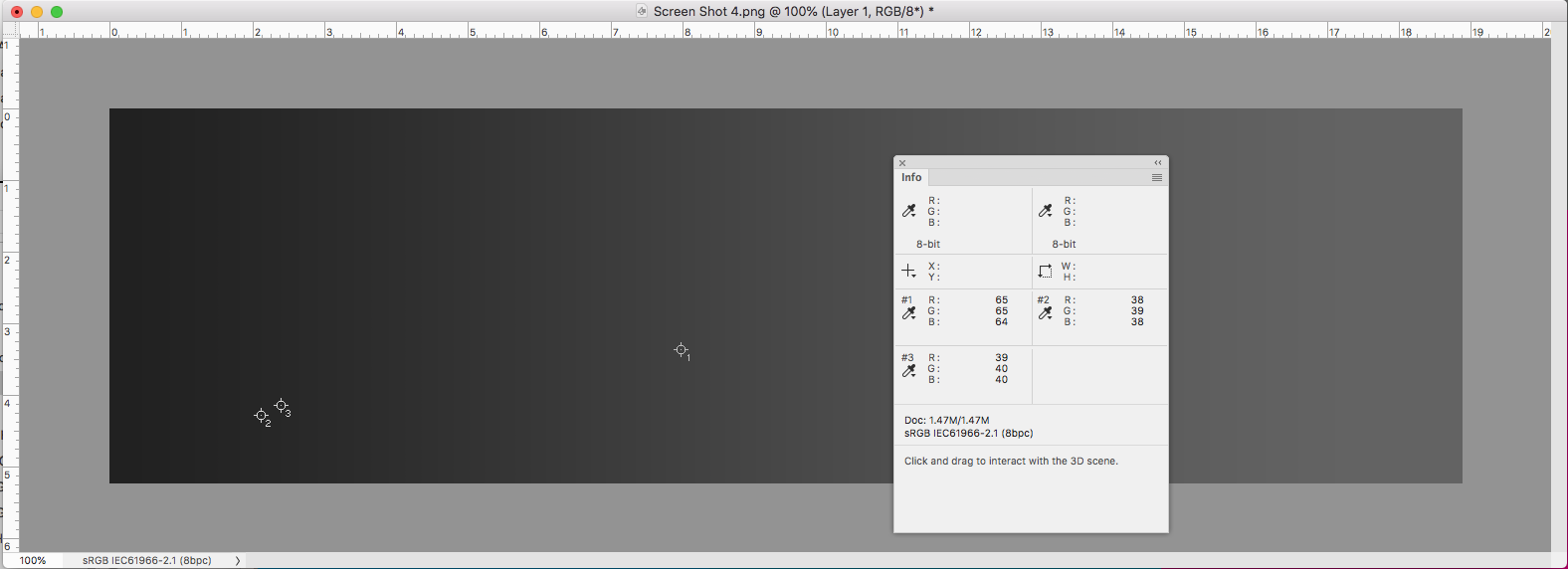
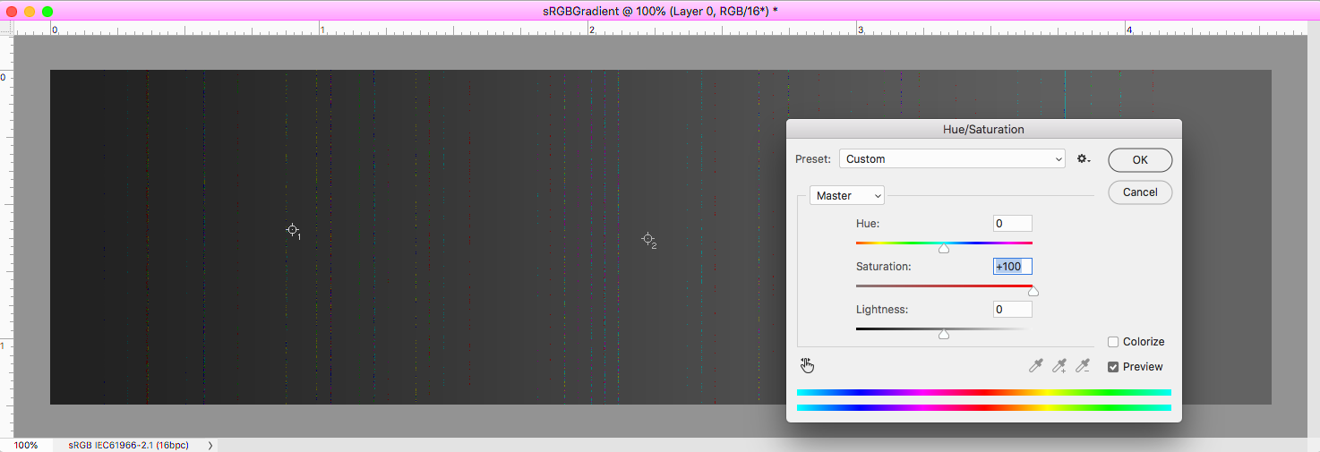
A (small) new piece of info. I had thought that my own software was rendering the grayscale completely as gray, but lo and behold (and this is something I see in @rob day's post above as well) with extreme saturation there are tiny color errors in single pixels right at the transitions between adjacent levels (in the 8 bit screen grab world). That probably made no sense. This hyper saturation-enhanced comparison may help (Photoshop display on top, what I *thought* was a correct rendition on the bottom, but look closely):

Those tiny lines show up in @rob day's screen grabs above if you push the saturation way up.
Dag, please do a screen grab of the gray gradient as displayed on your system, hyper-saturate it, and post it here.
I wonder if these color inconsistencies are just a matter of magnitude, always there (because of something about the ProPhoto profile) but being (mostly) covered up by roundoff error in some cases and not in others.
-Noel
Copy link to clipboard
Copied
I had thought that my own software was rendering the grayscale completely as gray, but lo and behold (and this is something I see in @rob day's post above as well)
My (OSX) capture is monitor RGB with my monitor profile assigned. Before I uploaded it I converted it to sRGB, so the values are no longer perfectly equal after the multiple conversions.
Copy link to clipboard
Copied
https://forums.adobe.com/people/Noel+Carboni wrote
Dag, please do a screen grab of the gray gradient as displayed on your system, hyper-saturate it, and post it here.
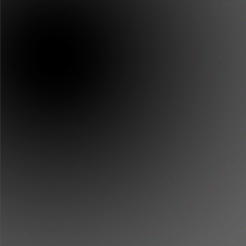
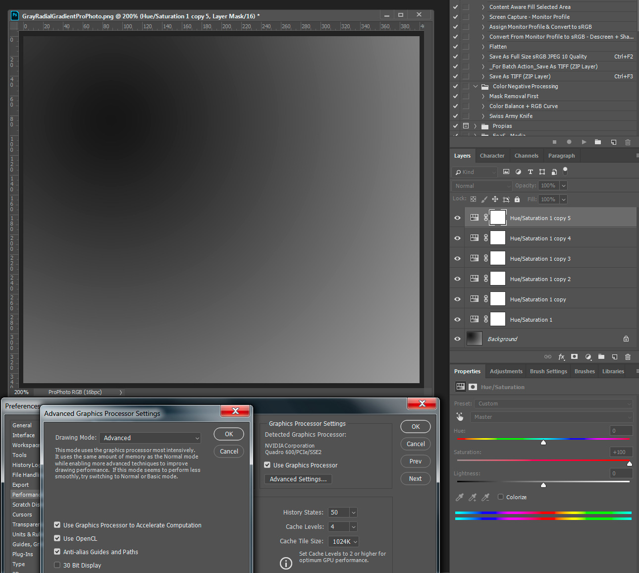
OK, this is a screenshot of the original ProPhoto file as displayed.
Then I put 6 hue/sat layers on top, cranked them all up to 11 on the dial, and flattened.
To minimize random errors in post-conversions, this is a 10-bit screenshot pasted into a 16-bit file, monitor profile assigned > converted to sRGB, then converted down to 8 bit and saved as PNG. Phew.
My own sneaking suspicion, echoing Noel's, is that ProPhoto is simply too large for its own good. Insert a dust grain of a tiny imperfection, and bam - it blows up.
Copy link to clipboard
Copied
ProPhoto is simply too large for its own good
But I get the screen capture artifacts with sRGB—no conversions. Here's the gradient created from scratch in a 16-bit sRGB doc and then captured:
Copy link to clipboard
Copied
Yes, but here I thought mostly of the full-blown cyan banding, often coupled with severe luminance banding, which is particular to ProPhoto. Like the example up there in my original post. You never see that in Adobe RGB.
The random edge pixels that you and I both get are curious, but not something of any practical significance.
Copy link to clipboard
Copied
The random edge pixels that you and I both get are curious, but not something of any practical significance.
I assumed they were being introduced via the screen capture? I get similar capture artifacts no matter what the profile assignment is, but they never show in the file that's being captured, either in appearance or the numbers. I'm not doubting that it's a problem, I just can't reproduce it.
Copy link to clipboard
Copied
https://forums.adobe.com/people/D+Fosse wrote
https://forums.adobe.com/people/Noel+Carboni wrote
Dag, please do a screen grab of the gray gradient as displayed on your system, hyper-saturate it, and post it here.
OK, this is a screenshot of the original ProPhoto file as displayed.
Then I put 6 hue/sat layers on top, cranked them all up to 11 on the dial, and flattened.
To minimize random errors in post-conversions, this is a 10-bit screenshot pasted into a 16-bit file, monitor profile assigned > converted to sRGB, then converted down to 8 bit and saved as PNG. Phew.
I followed the above procedure and see no artifacts other than normal banding due to 8 bit display path.
WIndows 7, PS 19.1.6, Quadro 600 GPU, No 30 bit mode
Copy link to clipboard
Copied
https://forums.adobe.com/people/rob+day wrote
I get similar capture artifacts no matter what the profile assignment is, but they never show in the file that's being captured, either in appearance or the numbers. I'm not doubting that it's a problem, I just can't reproduce it.
Curiouser and curioser... Yes - I also see that with any profiles that don't match my reference sRGB monitor profile only when CPU-based color-management is being done, not when GPU-based color-management is being done. This is a surprise to me; I've always assumed the grayscale was pure, because without so much extra saturation the errors are not perceptible.
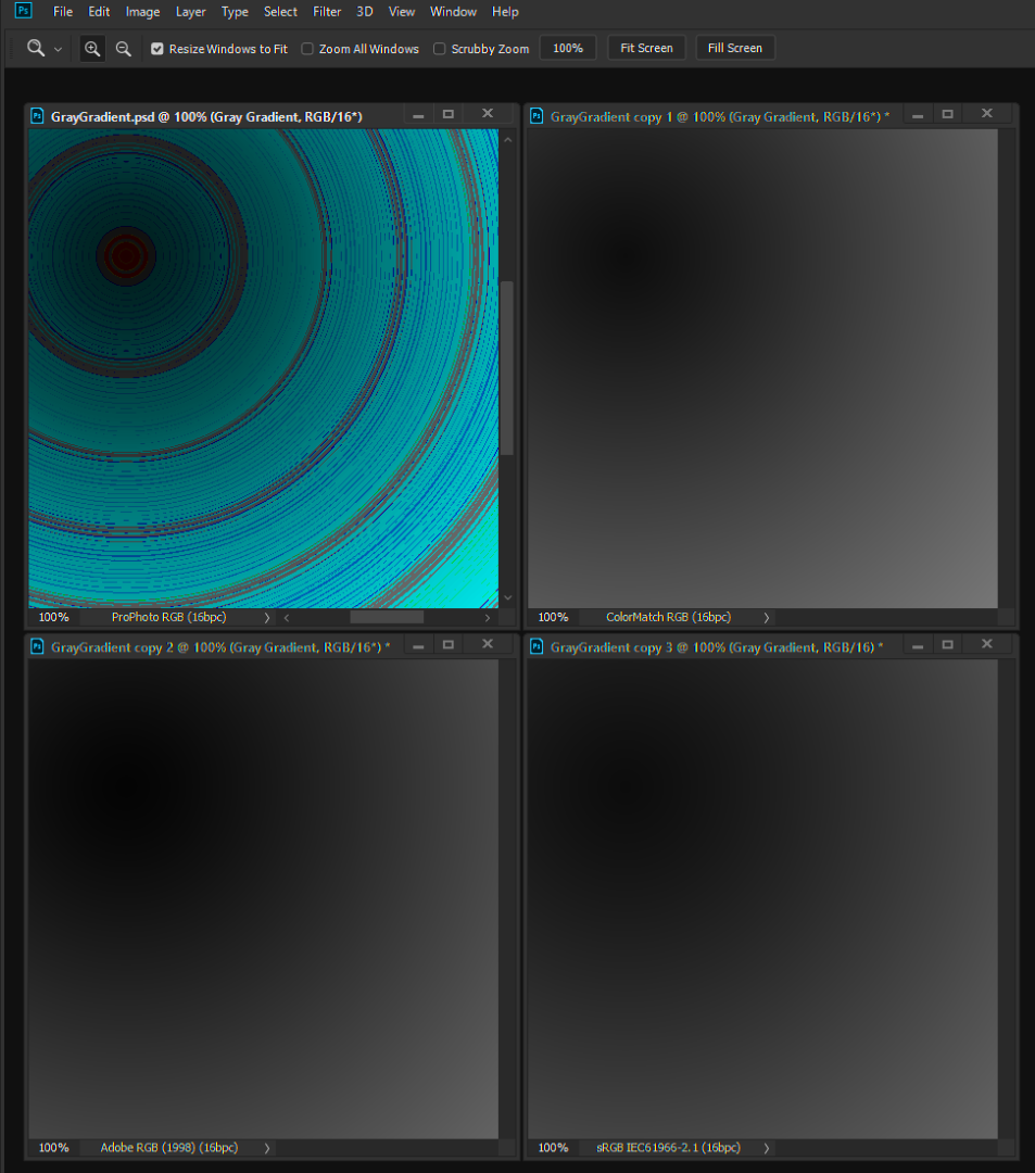
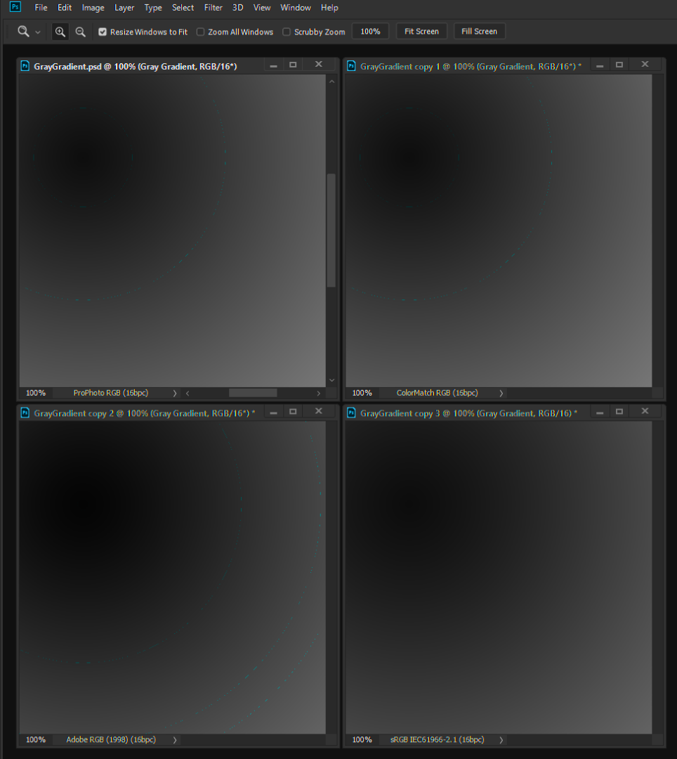
Each of these are gray gradient fill layers expressed in the listed profiles, displayed on my monitor, screen grabbed, and saturation of the screen grab increased to +100 twice.
This forum botches up image attachments, but note the major color inaccuracy in 1 of the 4 images in the first set, and tiny pixel-width lines in 3 of the 4 images in the second set.
As displayed in Photoshop CC 2019 with GPU color management:
As displayed in Photoshop CC 2019 with CPU color management:
-Noel
Copy link to clipboard
Copied
Further experimentation reveals the results are changed by the choice of color engine one makes in the Edit > Color Settings... If for example I choose the Microsoft ICM color engine instead of Adobe (ACE), I see a noticeable shift in the color inaccuracy and brightness of the dark parts (they're brighter with the Microsoft ICM). I don't see a difference by tweaking the 3 checkboxes, but I haven't done an exhaustive test.
Here's what I've got for color settings:
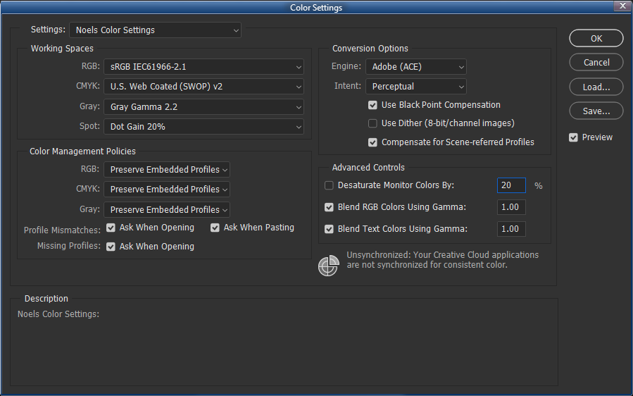
Note that closing and restarting Photoshop is required to see the change take effect.
-Noel
Copy link to clipboard
Copied
Curiouser and curioser...
Have you checked that your monitor profile is ok? What happens if you calibrate and create a new profile?
Copy link to clipboard
Copied
This is the one I have; looks to match yours, Todd, though of course we're not seeing all the detail in the tables.
-Noel
Copy link to clipboard
Copied
Hi, yeah, thanks, I've tried a bunch of different monitor profiles. The error seems to follow the image profile. And as we've learned here, changes nature occasionally depending on other as of yet unknown factors. It's really encouraging that on some of your systems it's working AOK.
A workaround is clear - if the on-screen color accuracy with ProPhoto RGB is of high importance, use Basic GPU mode.
Otherwise, with virtually every other profile the GPU Normal and Advanced modes (i.e., color-management by Adobe GPU software) are fine. I personally don't use the ProPhoto RGB profile much, though I have occasionally set it as the conversion target for Camera Raw, then done software conversions once the image is opened into Photoshop and processed a bit. This can be helpful if subject material with brilliant bright reds (e.g., Christmas flowers) are photographed.
-Noel
Copy link to clipboard
Copied
Yeah, that's how I use ProPhoto too. Sometimes it's necessary to open into ProPhoto if gamut clipping can't be easily controlled in ACR/Lightroom. Then I do more elaborate and targeted gamut remapping in Photoshop, but I prefer to get it into Adobe RGB as quickly as possible, without clipping.
Very often these high-saturation areas coming out of ACR are processing artifacts, not "realistic" colors. The image will usually improve by "taming" them.
Discussions about ProPhoto are often reduced to "yes, but there are printable colors outside Adobe RGB". Yes there are, a very marginal set of neon-bright colors with little practical significance. My reply is, as always, that good color is about relationships, not max total saturation.
The main thing is to avoid areas of gamut clipping in the end result. Nothing can kill an image as effectively as that. For that, ProPhoto has its place as a useful tool, to be used when needed. But it won't solve all color problems.
Copy link to clipboard
Copied
Discussions about ProPhoto are often reduced to "yes, but there are printable colors outside Adobe RGB". Yes there are, a very marginal set of neon-bright colors with little practical significance. My reply is, as always, that good color is about relationships, not max total saturation.
But there seems to be an implication that ProPhoto could create an output problem with a "typical" in-gamut image, which could be avoided by defaulting to a smaller space. I'm not seeing that. Any colors I check with the same appearance in the two RGB spaces, which are also in the destination CMYK gamut, convert to matching destination CMYK output numbers.
It's fair enough to argue that ProPhoto has no advantage in that case, but if there's a downside we should see a meaningful variance in the output numbers.
Copy link to clipboard
Copied
By the way, I did a little more research on the ProPhoto RGB profile. According to this page, there's actually a linear section of the tone curves very close to black:
ProPhoto RGB color space - Wikipedia
The cutoff for the linear section is 1/512, or 0.001953125. The designers clearly envisioned it being used with high bit depth data.
No particular reason for mentioning this, though it's food for thought... If a particular color-management implementation forgets to account for that section (or approximates it) it would introduce inaccuracies near black...
-Noel
Copy link to clipboard
Copied
it would introduce inaccuracies near black
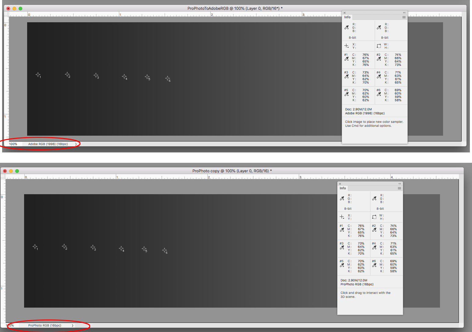
Shouldn't that show up in the print output numbers? I'm not seeing any problems in my #45 test. With six color samples in the shadow end. Bottom is ProPhoto, top is the ProPhoto file converted to Adobe RGB, the info panel is showing GRACol CMYK:
Copy link to clipboard
Copied
You're not seeing it on screen either, so no reason to assume it automatically shows up in print output.
The whole thing seems unpredictable, that's why it's so puzzling. Clearly there is some marginal "butterfly effect" that goes this way or that depending on some unknown initial circumstances.
Maybe we need to dive into chaos theory to explain it...

 AdChoices