

- Home
- Premiere Pro
- Discussions
- Encore CS6, Photoshop CC, Black DVD menu Highlight...
- Encore CS6, Photoshop CC, Black DVD menu Highlight...

Copy link to clipboard
Copied
I am using the latest version of Photoshop and Adobe Encore CD6 (because they bailed on it after this). Regardless, am having trouble creating dvd menus.
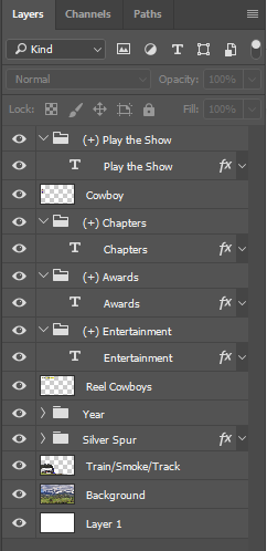
I create my menus in Photoshop and they work fine. I make sure to name the button layers as you see in the attachment. As you can see, I have no button highlights right now. Yet, when I preview the menu, you can see that the the buttons have this orange highlight. Where is the color for this highlight set in Encore?
Next Question: When I set a highlight in Photoshop (see the 3rd attachment), I have a simple white arrow next to the buttons. Yet, in he preview option in Encore, it changes the words of the button to black (even though the highlight layer does not cover that area) and the white arrow is black (see the 4th attachment).
Ideas?


 1 Correct answer
Highlights must be one color (8 bit) per type, but up to 3 colors (=1, =2, =3).
They do not have to be smart objects, but a variety of problems occur if they include more than just what you see. The button size is what it takes to hold all ogjects in the button group.
http://helpx.adobe.com/encore/using/button-subpictures-highlighting.html
 10
Replies
10
10
Replies
10
Copy link to clipboard
Copied
See this:
http://help.adobe.com/en_US/encore/cs/using/WS59BED893-683B-492e-847C-254257E34581.html
However, you'll save a lot of headaches if you start your menu from an Encore library template.
You can add multiple layers to make the background, but you will get odd results in some circumstances if you don't leave the bottom layer named "Background."
Are you sure you didn't convert the text to a button in Encore? Do you get the same appearance if you add the arrow to the other buttons in PS?
Copy link to clipboard
Copied
I just re-did my menus. I did not convert the text to buttons in Encore. I just used the naming conventions on specific layers.
What I did find out was this:
- Highlights can only be in one color. PERIOD. If there is more than one color, it all turns black.
- Highlights Must be smart objects or it all turns black.
- Highlights cannot have any Photoshop effects on them or it all turns black.
Copy link to clipboard
Copied
Highlights must be one color (8 bit) per type, but up to 3 colors (=1, =2, =3).
They do not have to be smart objects, but a variety of problems occur if they include more than just what you see. The button size is what it takes to hold all ogjects in the button group.
http://helpx.adobe.com/encore/using/button-subpictures-highlighting.html
Copy link to clipboard
Copied
Thank you for this answer. I am also having other strange problems.
I have a button that is just a piece of text with no highlight. When previewing the menu and hovering my mouse over this button, a line appears across the text.

When I use a highlight that just changes the color of the text, the preview offsets the text so the highlighted text is to the left of the button text and still leaves the line.

Again, there are no effects on the highlight layer and the layer is named (=1) highlight.
Ideas?
Copy link to clipboard
Copied
Probably all in the details! I sent you a PM so you can send me the psd to look at if you'd like.
Copy link to clipboard
Copied
Thank you for the offer. I figured it out. Actually, I just deleted the Photoshop file and re-created it from scratch. The problem resolved itself.
Thank you all for your time on this.
Copy link to clipboard
Copied
Excellent!
Copy link to clipboard
Copied
Actually, it seems I did not figure it out. The single line is gone, but the (=1) highlight is offset. See the picture. In the Photoshop layer, they yellow is dead-on over the white. This happens on each and every highlight and on on each and every one of the six menus that this dvd has. I I only realized this after I burned a dvd and put it in my player.
I will pm you one psd of the main menu.

Copy link to clipboard
Copied
Encore may or may not be forgiving with HD menus in a DVD. You are making a DVD, right?
As a test, make a DVD sized menu and add one button.
I'll look at this further later tonight or tomorrow.
Copy link to clipboard
Copied
I don't think it is offset. In preview, the highlight does not follow the 8bit limit and gives an exact shape; once built, it no longer follows the exact shape (think antialiasing type issues). I don't have the font, so can't play with that. It is possible that a slight change in font size could improve it, but the angles in the corners may be a problem. You can't put the text on top of the highlight, because it is white inside.
I am not fond of changing the text color as a highlight, so I would just use your other highlights.
I also don't think that in this case it is a problem with using an HD size menu. That seems to be working okay.

Find more inspiration, events, and resources on the new Adobe Community
Explore Now
 AdChoices