 Adobe Community
- Home
- Premiere Pro
- Discussions
- Re: Essential Graphics combines lowercase letter "...
- Re: Essential Graphics combines lowercase letter "...

Copy link to clipboard
Copied
Even though i hate it, it seems like this phenomena is a feature and not a bug, though I would much appreciate if someone could explain what this concept is, why it's happening and if there's a way to have it NOT happen.
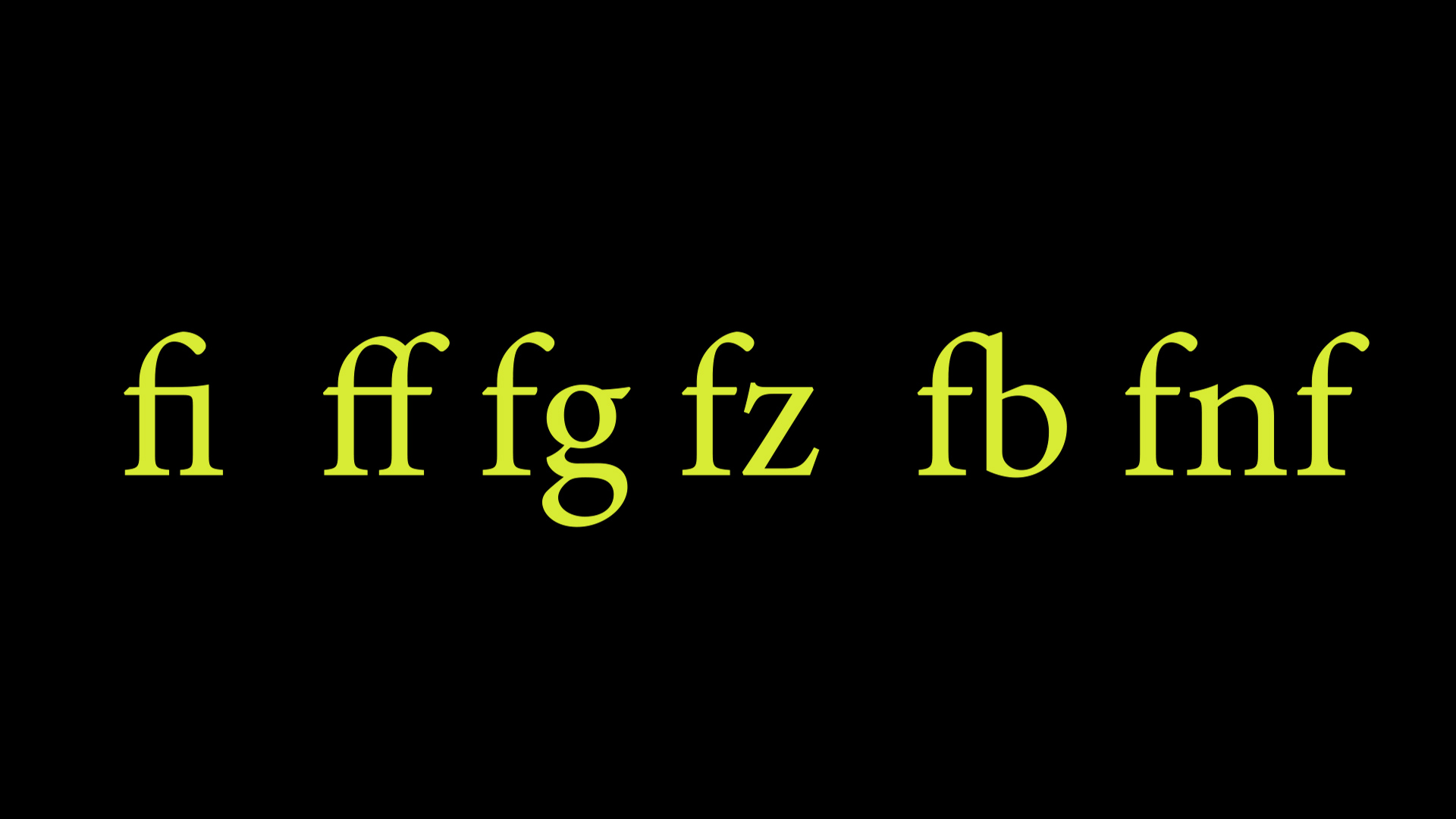
When typing in text with Essential Graphics, I'm seeing it combine letters (most often a lowercase "f" but it does it with other letter combinations) and it turns it into one letter unit. there is essentially no gap in between the letters and when keying through the text, the cursor goes over and you are unable to press space bar and key in a space. In image 1 you can clearly see the i, f, and b combined in with the upper tip and/or cross bar of the first letter f. I'm guessing this is just a stylization and letter spacing/kerning compensation thing but I sort of hate it and would love to know what this is and if it can be turned off. In image 2 you see that it is inconsistent across different fonts with white arrows pointing tot he instances:
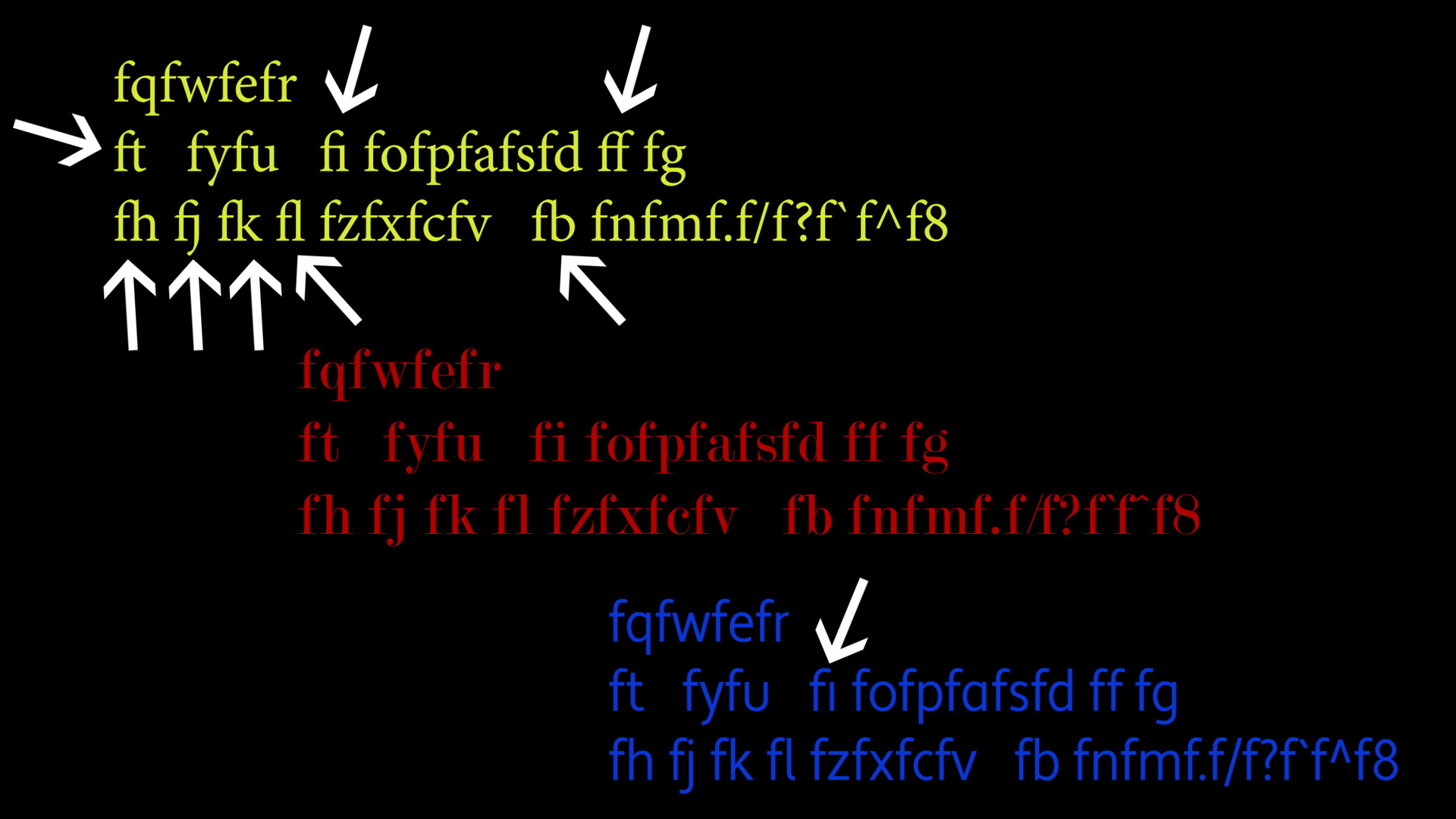
Yellow font = Minion Pro
Red font = Modern No. 20 (no letter combining)
Blue font = Apertura (sans serif)


 2 Correct answers
It is called a "ligature" font. Here are a couple threads:
Solved by Alex Elkins
Go to Edit > Preferences > Graphics.
Under Text Engine select "South Asian and Middle Eastern"
Under Text Styling, remove the checkmark next to "Ligatures"
Now this will be your default for all Essential Graphics text boxes going forward. I'm curious if changing the Text Engine from "European and East Asian" will weirdly affect something else with text in Essential Graphics, hopefully not...
I haven't poked around too much with the settings lately but this seems like a new thing
... 12
Replies
12
12
Replies
12

Copy link to clipboard
Copied
I only use old version of PPro so don't know what setting you have on new versions.
As someone who worked doing graphics photo typesetting and copy camera ( kodaliths etc. ) for print advertising agencies in youth after art school etc. I do know something of what you are concerned with.
In my own experience the ONLY program for digital print that works the way I like it to work is Quark Xpress ( re: fine adjustments for leading, kerning, etc. )
But I'm old person.
As you know different fonts are designed by humans and they are all, like, uh, DIFFERENT. And the old days of having fonts that are specific in size and style ( like the original digital adobe fonts used with offset print work ) have given way to fonts that can be changed in size and style via new ways ( maybe look up vector, raster, bitmap true type, etc. ).
Unfortunately, knowing this stuff doesn't help you make the adjustments you want. Nor will it help to use in- design or photoshop, illustrator etc., to do stuff fast in PPro.
The bottom line is, unless there's some new stuff in your new version of PPro that presets some kerning thing that fits your needs, you just have to use fonts that are happy with what you can DO at the size and style you want.
A long time ago there was some thing called adobe type manager that let people with windows ( typically stuck with true type ) to use adobe fonts. Maybe something like that is still available and can give you more choices for font(s) similar to what you want to use, and have no conflicts with those stupid letters combining like those you posted ??
Copy link to clipboard
Copied
About a gazillion years ago I made a spiral bound notebook of fonts on my computer. I had lots of fonts from windows and adobe and so on. Basically I took some program like quark or something and made a heading like " Rhonda Lite" or "Helvetica" or whatever...and then typed lower case a through z, and then uppercase A through Z.
Then the laborious process of going through every single font on computer and changing heading to match font name, and pasting the font into those letters. I forget exactly how I did it but it took forever and I printed the pages, punched holes in paper, and put into notebook. This became my "quick reference guide" to choose fonts. And it did NOT include italic, etc. Just plain.
Otherwise it's like a guessing game scrolling through tons of fonts on screen.
Copy link to clipboard
Copied
I hope you don't mind me dwelling on past, as it might give you some ideas how to solve what you want ??
Adobe Type Manager - Wikipedia
The old stuff ( postscript type 1 adobe fonts ) was basically for offset cmyk printing ( not rbg stuff like we all use at home now )
maybe there's some systemic thing available that can give you control over the way your fonts behave ( don't know what computer you use etc. )
Copy link to clipboard
Copied
It is called a "ligature" font. Here are a couple threads:
Copy link to clipboard
Copied
Thanks for this, helpful info BUT this thread should NOT be marked as solved. This is still an on going issue/a feature that has not been implemented yet. Correct me if I'm wrong...

Copy link to clipboard
Copied
It is the correct answer, it has the information asked about.
That does not mean the issue with the software has been fixed ... that is different.
Semantics? Yea, but again, accurate.
The ligature option does STILL need to be added. In that, you are most correct.
And this is the UserVoice request. PLEASE go over there and upvote this.
https://adobe-video.uservoice.com/forums/911233-premiere-pro/suggestions/35256394-ligature
Neil
Copy link to clipboard
Copied
It no longer is the correct answer. There's a Ligature setting in Grpahics Preferences that can be turned off, but for some reason you have to select South Asian and Middle Eastern as the Text Engine
Copy link to clipboard
Copied
Solved by Alex Elkins
Go to Edit > Preferences > Graphics.
Under Text Engine select "South Asian and Middle Eastern"
Under Text Styling, remove the checkmark next to "Ligatures"
Now this will be your default for all Essential Graphics text boxes going forward. I'm curious if changing the Text Engine from "European and East Asian" will weirdly affect something else with text in Essential Graphics, hopefully not...
I haven't poked around too much with the settings lately but this seems like a new thing that just became available via the Adobe CC updates. FYI, my current PrePro version is v14.0 (Build 52)

Copy link to clipboard
Copied
You can't do that anymore. You can't change the text engine anymore. I am using Premiere Pro 2023 version 23.2.0 (build 69). There is no Text Engine option anymore. The engineers made this bug fix redundant. We are stuck with Ligatures. There is no way to avoid them. It's not a bug anymore, it's a feature.

Copy link to clipboard
Copied
The ligatures have not gone away. Just remove the jackdaw and that's it. Here is a screenshot.

And the assumption that this behavior depends on the choice of font. Some fonts have a built-in function of combining some letters to style the font for certain design tasks. Keep this in mind. Just choose a different font and the problem will be solved.
Copy link to clipboard
Copied
Thanks. I had done that, but then I tried editing the same line of text with no success. You have to create a new text layer in the graphics after removing the check from the Ligatures checkbox for the effect to take place. it seems the text layer remembers the settings with which it was created.
And with the choice of font part I don't agree. Sometimes I need to use a particular font (for branding purposes). I should be able to use it normaly.
Copy link to clipboard
Copied
George,
Here's a newer thread/post where I update my experiments with Ligatures.
You can change an existing text layer. Select the layer in the EGP, then the wrench icon, and deselect Ligatures. You can change multiple layers in ONE EGP block by selecting all the layers. But, you CAN NOT select multiple EGP blocks in the timeline and have access to the changes. So yes, it is a pain to change this if you have a lot of it in multiple parts of the timeline.
Captions are different; you can change all the captions in a stream at once.
Stan

 AdChoices