 Adobe Community
- Home
- Premiere Pro
- Discussions
- Problems with contour (applied to captions and sub...
- Problems with contour (applied to captions and sub...
Problems with contour (applied to captions and subtitles)

Copy link to clipboard
Copied
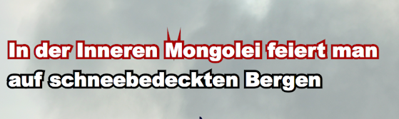
When I add contour to fonts, often there is a problem with the letters M and W. The contour just looks so weird when applied to sentences that have M and W characters. Is that some kind of bug? I need to figure out how I can solve this problme because like this I just can't use those fonts at all.
The problem arises with fonts like arial and bebas new and many others.
Please have a look at the screenshot (it adds that crazy contour to the letters M and W every single time. I need to get rid of that!). Some help would be highly appreciated!


 17
Replies
17
17
Replies
17

Copy link to clipboard
Copied
What application(s) are you using to create this example?
The problem(s) could very well be in the fonts themselves.
- Dov
Copy link to clipboard
Copied
I am using Adobe Premiere Pro CC, latest version! many fonts seem to have
that problem! cant imagine that popula fonts like these have this kind of
problem?!?
Dov Isaacs <forums_noreply@adobe.com> schrieb am Do. 7. Dez. 2017 um 17:04:
Problems with contour (applied to captions and subtitles) created by Dov
Isaacs <https://forums.adobe.com/people/Dov+Isaacs> in Type & Typography
- View the full discussion
<https://forums.adobe.com/message/10024727#10024727>
Copy link to clipboard
Copied
Moving thread to Premiere Pro forum since this appears to be application-specific.

Copy link to clipboard
Copied
I have this same issue. The only answers I can find in the forums is to reduce the outline amount. I need thick outlines as I have a lot of high contrast backgrounds. And what's the point of having the option to increase the outline if this is the result? Is there a way to set the corners to round or bevel like the stroke function in AE?

Copy link to clipboard
Copied
From the 3-bar menu at the top of the EGP tab, there are options for Text and Shape properties.
Select the Text property ... and try the various options.
Neil


Copy link to clipboard
Copied
Thank you for your response! I'm so happy it's been fixed. I can't find this panel though. Perhaps I need to update Premiere. I'm using 14.0.1
Copy link to clipboard
Copied
The EGP tab ... right at the top, the 3-bar menu ...
Neil

Copy link to clipboard
Copied
Aha, that is perhaps for text and titles whereas what I'm working with is captions. Changing that setting doesn't seem to affect the captions.
Copy link to clipboard
Copied
Ahh ... captions are different, true.
Neil
Copy link to clipboard
Copied
This thread is from 2017. This issue ("miter limits") was fixed in regular (graphics) PR text. (It is still an issue in PR captions.)
Stan
Copy link to clipboard
Copied
I tested 14.0.0, and this appeared fixed then. I cannot find a release note that mentions this, so unsure what version fixed it.
This can vary by font: what font, size, and stroke (contour?) size are you using?
Neil, my notes indicate that this problem was due to "miter limits." In the final version of 2019 (PR 13.1.5), these selections are there, but miter limits appeared to be uneditable - and I do not get the spikes. Are these global settings that apply to all selections in project?
Stan
Copy link to clipboard
Copied
I'm using Helvetica. At first I had it on the default size which was 38 with an edge of 8. It's mainly on the Ws and Ms in helvetica although on other fonts it's a lot more haywire. When I increased the font to 50 with an edge of 8 it was less noticable but definitely still present. It's actually there even when I put the edge back to 5 but just faint enough not to notice.
Copy link to clipboard
Copied
But ideally I could increase the edge to 8 or even 10. I have a lot of white on white or on very high contrast and the thicker line helps a lot.
Copy link to clipboard
Copied
Sorry; I got confused with the earlier thread (not captions) and forgot that your question is about captions. As noted, the problem in captions is not fixed (as of 2020 - 14.3.2).
Copy link to clipboard
Copied
I don't have Helvetica. But I just set up both cap and small M and S, in large type, and with stroke up to 20 ... I could scroll down through the available fonts, couldn't replicate this at all.
Wonder ... what's up there that this is plaguing you?
Neil
Copy link to clipboard
Copied
Here are some screen shots
1. Helvetica with exaggerated settings to show what it's doing.
2. Helvetica with the settings I'd like to be able to use.
3. Arial with the settings I'd like to use.


Copy link to clipboard
Copied
Know issue with Captions. Please vote here to give the issue more priority: https://adobe-video.uservoice.com/forums/911233-premiere-pro/suggestions/35384491-captions-with-spik...

 AdChoices