 Adobe Community
- Home
- Premiere Pro
- Discussions
- "Why does my footage look darker in Premiere?" Col...
- "Why does my footage look darker in Premiere?" Col...

Copy link to clipboard
Copied
Courageous community member Matt Johnson made a video based on this document. Watch here for a visualization of the solution, and read on to understand why the color shift is happening in the first place.
1. What's the issue?
a. "My exports look washed out when I view them in QuickTime player"
b. "When I post my video on YouTube it looks less saturated and the blacks are raised"
c. Footage appears darker after imported into Premiere Pro
d. Help!! Premiere Pro CC is changing the color of my imported footage
When importing footage into Premiere Pro, the display of the video looks more saturated than when it is played back on other apps such as VLC, QuickTime, After Effects, or a number of web browsers like Safari or Google Chrome. When played back on YouTube through those web browsers, the video also appears less saturated than it does in Premiere. As far as we know, this is a Mac-only issue. If you're experiencing this behavior and you're on a Windows machine, please send me a private message!

Side by side, you can see that video in Premiere (left) is displayed with more saturation than the video displayed in QuickTime (right).
(Screenshots provided from this forum post)

Quicktime on top, Premiere on bottom
(Screenshots from Boots Riley's "Sorry to Bother You")
2. Why is it happening?
a. Premiere displays video based on the assumption that your monitor is set to Rec709 color space and that your footage was recorded in reference to gamma 2.4, because that's the gamma standard for broadcast television. Gamma 2.4 displays with higher contrast — blacker blacks and whiter whites. It was chosen for broadcast television because the people who were deciding playback standards figured that people were watching TV in their dark living rooms, and they thought increased contrast levels looks prettier in that setting.
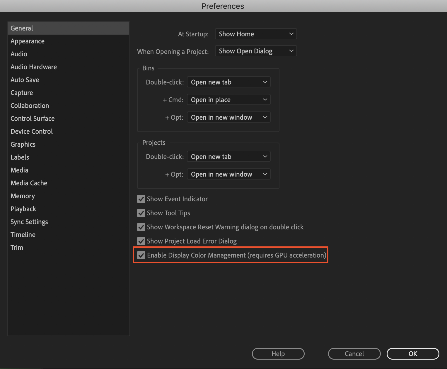
i. Premiere has a feature called "Display Color Management" that will coordinate with your monitor's display settings in order to correctly display in a Rec709, gamma 2.4 profile.
Premiere Pro > Preferences > General > "Enable Display Color Management (requires GPU acceleration)"
It's the last box on the list and it should always be enabled! For more detailed instructions, go here.
b. Monitors have become fairly standardized over the years, but apps haven't. Other apps like QuickTime, Final Cut Pro, and web browsers like Chrome and Safari display video in a scene-referred gamma 1.96 profile despite what your monitor is set to. Gamma 1.96 profiles play video back in a way that looks closer to what you see in real life — lighter blacks and softer whites.
c. This gamma shift is completely dependent on what app you play your video back in, as most users have figured out on their own. FCP 10, QuickTime, and certain web browsers all play video back in the same way, so people assume that they're displaying the video "correctly" when in reality, it's just that they're displaying the video under similar standards. Your video files are fine! The actual color codes within the pixels of your video are not changing in between apps. The miscommunication is happening between the apps and the monitor they're being displayed on.
TL;DR Premiere uses the same display standards as broadcast television does. Other video playback apps like QuickTime have begun to adhere to different video playback standards. This is what causes videos to display differently in between each app.
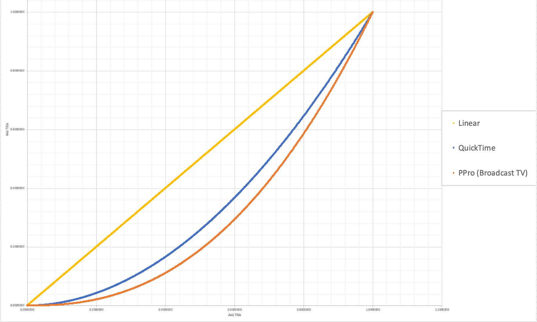
The graph above is a visual representation of the gamma display standards of Premiere Pro (orange), which dips into the darker end of the spectrum, compared to the gamma display standards of QuickTime (blue), which don't have the capability to display those dark colors and therefore QuickTime displays video with less saturation which gives it that "washed out" appearance.
(Graph and data by franciscrossman-J6rJng)
3. But why is it worse on my new iMac monitor?
a. Newer Mac displays are wide color gamut (close to P3) and can display more vibrant colors than Rec709 is capable of reproducing. Without any conversion, your Rec709 colors will be displayed as if they were P3 and will appear much more saturated than intended. Display color management is designed to fix this. It maps the Rec709 values to the appropriate P3 values so that the colors look the same.
i. Scroll up for instructions on how to enable Display Color Management, or go here.
b. Again, this is a matter of display and playback. Your actual video file is fine and if it's played back on a different monitor, it'll display correctly!
4. Is there a way to get all my playback apps on the same page?
a. Yes! One of our engineers created a LUT that will darken your video the appropriate amount so that when you play it back in a different app, it will look as it did in Premiere. Technically speaking, the LUT will correct the mathematical difference between gamma 1.96 and 2.4.
i. Download the Gamma Compensation LUT here!
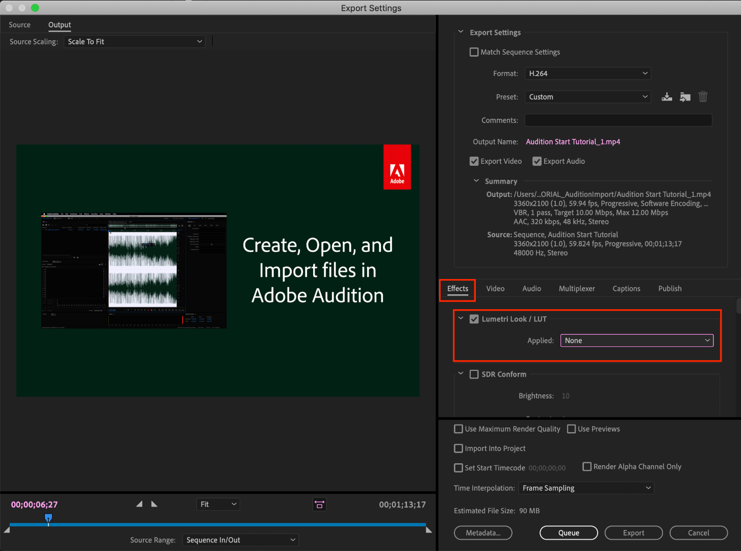
ii. After downloading the LUT (.cube file) and saving it somewhere accessible, prepare to export your sequence!
File > Export (Command+M or CNTRL+M) will pull up the Export Settings window, pictured below.
About halfway down the window, there's a few tabs to adjust encoding settings. Go to the tab marked "Effects" and you'll see an option to enable a Lumetri Look/LUT. Check that box, open the drop-down menu, and click "Select..." to navigate to the space you saved the LUT in.
iii. After you've selected the LUT, Premiere may display that there is "None" selected. That's a common glitch, the LUT has been applied. Sorry for the confusion!
b. However, this needs to be the last thing you do to your video! Either that or you need to save a backup of your video without this LUT on it. Because this LUT is darkening the color code of the video, in some cases, it will darken to the point where you can't get the detail back.
c. If you want to take the LUT off and you don't have a LUT-less backup, you can apply this reversal LUT that will return your video to the color levels you had before you applied the LUT. Perform the same steps listed above with the "Undo Gamma Compensation" LUT!
If you have any other questions about this issue, feel free to send me a private message.
For other support issues, you can check out our company contact options here! Contact us | Adobe
Thank you all for your collaboration and discussion so we could better investigate this issue! You help us to help you.
-Caroline
[DOWNLOAD LINKS]


 1 Correct answer
Hi all!
Thank you so much for your patience! We have a new solution for this available in Premiere 24.0. You can follow the workflow in this YouTube video to accommodate the QuickTime gamma shift between operating systems. Your image will look the same in QuickTime as it does in Premiere.
 262
Replies
262
262
Replies
262

Copy link to clipboard
Copied
I think this is a really well done post with wonderful information. Thank you.
I would, however, use a different side by side frame comparison of the properly saturated and the not so great saturated images.
They look like Penguins, in human form in a junkyard with tarps and stuff. It might be nicer to see another sample with more compelling dramatic and story-telling elements. Like maybe Romeo looking at Juliet in a medium two shot ?

Copy link to clipboard
Copied
Ask and you shall receive! I've added a couple of more visual examples to the document.
-Caroline
Copy link to clipboard
Copied
thank you ! those images are nicer than the Penguins in human form.
This article is interesting...
https://app.spectracal.com/Documents/White%20Papers/BT.1886.pdf
Now, on a personal note: I have a primary monitor that can be color calibrated. I also have a BM card ( SDI out to a video monitor). The video monitor has been set up (it has lots of controls on it that can be adjusted manually ) to show people on a shooting set what the camera is seeing ( like part of a DIT station ).
My primary monitor is set to rec 709 gamma 2.2. I guess the video monitor is also set to 2.2 or thereabouts.
My color in resolve ( source, timeline and export) is set to default of rec 709 2.4...
This thing in resolve changes once you sorta TELL it to change via choosing various sources and so on ( managed color ).
For the kind of stuff I do I'm happy as a clam just leaving things the way they are right now. It took a long time and some $$ to just get THIS close, so I'm not going to go bonkers about stuff at the level I work at.
If I use my laptop ( instead of editing computer ) I have basically NO CLUE what I am seeing on the screen. Oddly enough if I import a project from editing computer to laptop it looks very close to me as long as it's a rec 709 thing. If it's bmpcc or S log or something I color managed on editing computer it looks like something some alien might see if they had x ray vision ( like PREDATOR ).
Nobody will EVER get all this stuff standardized for everyone, cause everyone is using different source stuff, editing stuff, export settings, and delivery VIEWING stuff.
I have one suggestion... although it is a bit sexist these days to say it ...
If the audience seems unhappy with the technical issues of the screen and story they are watching, just take off the actresses shirt !
Copy link to clipboard
Copied
I would go so far as to say ( check out the lounge and 'what you got cookin' thread ) that some people might complain about the type of fork they just got at Nancy's house deck party, to eat the most delicious meal ever cooked to perfection by the host.
Don't sweat the small stuff.
Copy link to clipboard
Copied
===========
If I use my laptop ( instead of editing computer ) I have basically NO CLUE what I am seeing on the screen. Oddly enough if I import a project from editing computer to laptop it looks very close to me as long as it's a rec 709 thing. If it's bmpcc or S log or something I color managed on editing computer it looks like something some alien might see if they had x ray vision ( like PREDATOR ).
=======
I have resolve on the laptop too, so I'm talking about moving the project to laptop, not some video exported file
Copy link to clipboard
Copied
this isn't making any sense... the laptop uses intel mobo chip and not discreet nvidia card and it's the thumbnails and so on that look like alien stuff, and the nodes can be adjusted easily.. you have to see it to believe it...just forget I said anything...

Copy link to clipboard
Copied
Nobody will EVER get all this stuff standardized for everyone
Which is why the following exists, and should be on the short list for PP.

Copy link to clipboard
Copied
I've voted for the request, Jim ...
But ...
I spend most of my time with others in the trade being around colorists. Who live in Resolve and Avid, Mistika, "places" like that. Frequently all of the above, of course. A fair number work in ACES any time then can, another large group avoids ACES like the plague. As with anything else, it adds some nice things ... and makes other nice things unusable.
And those that in general push and teach ACES can point out that even they can't use it on every job.
The Big Problem is the viewing environment is already fractured, and only going to be getting worse. Talking with folks from major colorists, the Flanders people, the calibration companies, the screen companies ... no one sees a common denominator coming anywhere.
Colorists are more frequently getting requests for doing the 'main' grade in either Rec.709/2.5 or a theater or cinema P3, AND ... a separate 'trim' grade in either HDR, web, or "YouTube" emphasis. Or two or three trim grades for different use.
Ok, between HDR and SDR, that's a known quantity, if not always a simple change.
But ... "web" ... ? What the heck is that? Is it for those watching a streaming service via their TV in a moderately lit room, their Android tablet in bright sun, a new Apple "P3-Display" with the wider P3 colors and that odd 1.96 gamma, PCs running a semi-but-not-correct sRGB/Rec.709 with over-bright whites ... what?
It's a totally and completely fractured viewing environment. And the screen providers in general rebel against the entire concept of ACES, as every single one of them builds their entire market base on how their screens provide "an enhanced viewing experience for every user" ... which adopting ACES would of course obliterate.
If the screen makers ... the folks creating the monitors and TVs ... won't cooperate on a common viewing environment, and the one of the two main computer systems insists on creating their own in-house viewing environment that is WAY different from everything else anywhere, well ... no, there isn't a magic bullet to cure all ills.
Neil
Copy link to clipboard
Copied
It's a totally and completely fractured viewing environment.
I guess I'm old school. We never could account for the specific display, outside of the established standards like 601 for SD, 709 for HD and now 2020/1200 for UHD.
Copy link to clipboard
Copied
Yea. And that that was with the vast majority of screens within a fairly narrow range for possible colors and tonal ranges.
But with wider gamut screens coming in not only for the Macs but to Windows screens, and of course HDR racing down at us which is both higher dynamic range and wider gamut ... it's quickly becoming far more fractured.
And difficult to serve.
For colorists, that for years only needed to give one deliverable, they now are routinely asked to give two or more different "trims". For different spaces/gamuts/uses.
Neil
Copy link to clipboard
Copied
But are they creating different deliverables for the specific screens?
Is it your contention that Sony Studios uploads a slew of differently colored movie trailers, one for Windows screens, one for mac screens, one for tablets, one for HDTV's and one for UHD TV's, all under the same YouTube listing, and that YT is somehow able to 'know' what screen is in use and adjust accordingly?
If so, I'm astonished.
Copy link to clipboard
Copied
Most colorists are not "Sony Studios" ... they work in either boutique shops or medium/small shops handling a variety of clientele.
No ... they aren't delivering for different screens ... but different forms of marketing by the corporations buying the work. Some times, there needs to be an HDR broadcast, SDR broadcast, plus a version for web use. As so much corporate work gets used in whole here, part there ...
It used to be they just delivered either a broadcast version (vast majority of jobs) or a theatrical version if long-form. And the "web use" one ... that one can be nuts to get approval for depending on what kind of screen Miss/Mister Bigshot will see it on.
Neil
Copy link to clipboard
Copied
OK.
So how are they determining what standard to use for the "web"?
I watch YouTube pretty exclusively in the Home Theater. (The content and delivery method aren't relevant, moving pictures are always better on a bigger screen with good sound.) I also know that it's just not possible for me to accommodate the variety of different ways for watching YouTube, so my habit is to produce to 709 for HD, and 2100 for UHD, whether it gets delivered via thumb drive, Blu-ray, YouTube, Instagram, Facebook, etc.
Are they doing something different?
Copy link to clipboard
Copied
Very good question. How their system handles such matters is not something they share.
Neil

Copy link to clipboard
Copied
Caroline... can you please ask the guy who made the LUT to have a 50% version of it as well- as I noticed that premiere doesn't have an option to change the intensity of the lut on export or shall I apply it before export and change it like that instead?? I really dig the way it comes out... but it makes it too dark... for my mac laptop retina 2015 edition once I check it out in quicktime and iphone. patlealfilms@gmail.com.
Copy link to clipboard
Copied
You can apply that LUT in the Creative tab, use the Intensity slider to back it off some, then use the export as LUT option. Which is the 3-bar menu when you right-click on the Lumetri panel tab.
Neil

Copy link to clipboard
Copied
Updated 06/24/2022
Premiere Pro 2022
Why do we continue with this problem?
I add layers of a simple text and it lowers the color?
If the compensation of the .cube file helps, they should include it in the updates.
It is supposed to be a service that we pay for and we should not have that kind of problem since it causes inconvenience.
Before text layer:

With the text layer:

Copy link to clipboard
Copied
Francis Crossman, color engineer, did a marvelous job tracking this down ... thank him for all of us out here!
Neil
Copy link to clipboard
Copied
huh ? tracking what down ?
Copy link to clipboard
Copied
The answer to The Eternal Question of course. Which is ... why do Premiere and QuickTime/Chrome/Safari (and even FCPx) "show" video exported from Premiere so differently?
Neil

Copy link to clipboard
Copied
Unfortunately the "enable display color management" only makes matters worse on my iMac Pro, colors become even more dark & saturated. Although I appreciate the detailed explanation about the issue, the issue is still the same. When working in premiere your exports are a completely different look making it nearly impossible to color correct or "grade" anything. Why wouldn't Adobe acknowledging that technology and display environments are changing and not support these monitors in their program?
I'll give the LUT a try and I appreciate you including this information but ultimately it just feels like more of a band-aid.
Copy link to clipboard
Copied
Premiere Pro has been built for the only game in town for many years ... the worldwide broadcast standards ... video sRGB, Rec.709, D6500 at 100 nits, gamma 2.4. And just works perfectly as long as one sets up that system. They have added some HDR capabilities recently, but you must have exactly the right gear to do so. (I presented on that in the Flanders/Mixinglight booth at NAB, and will have a tutorial up at mixinglight.com in the next couple days on that ... outside their paywall for all to view.)
When Apple decided to start shipping Macs with P3 monitors and hard-wiring their systems for a gamma of 1.96 ... that threw quite a wrench into the system. And as Francis had to run this down by reverse engineering and testing, I'm guessing Apple didn't exactly share the details of this with their vendor ... partners. (Which is a totally normal, historic, Apple behavior.)
Why in the world, a gamma of 1.96? I've no clue. Not saying it's "wrong" or anything, just ... an odd number. Especially to start using without informing either their users or other vendors that they were doing so.
Had Apple shared that with others before shipping, this would probably have all been a non-issue past what, a few months?
So you're working on a system that is by intentional design not set to broadcast standards, and ... they don't tell you. And that's Adobe's fault?
Again, not criticizing their choice, but ... the lack of communication from Apple on this matter.
So ... you now have the data. Your system is set for a gamma of 1.96, and the world of broadcast is still set for gamma 2.4. How you handle the interface is your choice of course, as it goes hand in hand with the gear you chose. As it does for all of us. Within your system set to stock settings, you can produce media that will look good ... for those using P3 Mac gear and QuickTime Player, Chrome, or Safari.
What you may not be aware of is material produced in a wide-gamut P3 color space and that 1.96 gamma ... may not look very good in a full b-cast setup. The two aren't even close to the same standards, regarding how various tones and hues are mapped to screen. What looks ... perfect ... in your system, imported to mine, may look ... rather ... hmmm. Definitely not "perfect".
I've been pushing for user-controllable color management settings in Pr for some time of course. As there are both wider gamut (such as P3) and wider dynamic range (HDR) needs coming racing down on us. The Premiere team is working on that, but ... it's not here yet. If Pr could remap the internal monitors to account for the P3 space and 1.96 gamma, that would be a major help.
But ... it would still only work correctly on a calibrated and profiled P3/gamma monitor. One of the regular folk here has done a ton of testing on this, and in his work ... he found each different sized Mac P3 monitor had a different character curve grouped by screen size. The user would still need to calibrate & profile their system first, or there's no way the settings for color management in any app will actually perform as expected.
And this is not going to become easier for those of us in video post as the type of screens keep changing. How do you make content when it will be seen on everything from a phone or tablet in bright daylight to a TV in a darkened room? On a variety of screen types, with settings and color/tonal issues all over the place?
Neil
Copy link to clipboard
Copied
Thanks for breaking that down Neil. It's good to hear that there are people working on it & potentially a fix in the future. I also wish I would have known this before purchasing this computer, I would have definitely reconsidered.

Copy link to clipboard
Copied
Is this the kind of racing coming down on us R Neil Haugen ? :
Wide Color Gamut Coverage of TVs: Rec.709, DCI-P3, Rec.2020 - RTINGS.com

 AdChoices