 Adobe Community
- Home
- RoboHelp
- Discussions
- Re: Adding image to header in Robohelp 2017
- Re: Adding image to header in Robohelp 2017

Copy link to clipboard
Copied
In RH2017 (13.0.0.257), Responsive HTML5 layout, is it possible to add an image to the header? I have the logo and the project title on the left and want to add the company logo to the right, and link the logo to the home page of our website. (I added the Globalscape logo to the image below as an example of what I want to do.)
I've played around with layout.css and Topic.slp, to no avail.
Thanks,
Karla Marsh


 1 Correct answer

The template you downloaded is based on an Adobe Template for RH11. This one isn't much different. But you'll need a slightly different CSS.
The following works:
- background-image: url(https://image.freepik.com/free-icon/apple-logo_318-40184.jpg);
- background-repeat: no-repeat;
- background-position: right center;
- background-size: contain;
}
The other devices are similar. There are 4 media queries if I remember correctly. But the CSS should carry
...
 23
Replies
23
23
Replies
23

Copy link to clipboard
Copied
I can't help you with right aligning the company image, if it is possible then Willam is the person for that.
I wonder if creating a single image combining the product logo and company logo top left would work?
Which layout are you using?
See www.grainge.org for RoboHelp and Authoring information
Copy link to clipboard
Copied
You can add a background image to the header with CSS:
div.header {
background-image: url('my_image.png');
background-repeat: no-repeat;
background-position: right center;
}
Copy link to clipboard
Copied
I'm using your Theme1_Standard_TOC_Only, added the text above to main.css, change the file name to the name of the graphic I'm using, pasted it into the same folder, generated the help---nothing.
Copy link to clipboard
Copied
I suspect this change is required in the layout.css.

Copy link to clipboard
Copied
@meKarla - "I'm using your Theme1_..." - you realize that we're NOT Adobe employees on these forums, right?
Copy link to clipboard
Copied
Sorry, let me clarify--I'm using William Van Wheeldon's theme (I was replying to him).
Copy link to clipboard
Copied
Ah, sorry, thought you were using one of the "factory" layouts in RH.
Copy link to clipboard
Copied
If you are replying to him, you should probably call him by his correct name. 
It's Willam, not William. He's a bit persnickety about that. I made that mistake early on myself.
Additionally, if this is one of his layouts, I'm guessing you downloaded it from his web site? And if so, you likely have contact information there for him. Because it's something he offers on the side, it's confusing to ask for help generically here in the Adobe forums where others aren't exactly familiar with his stuff.
Cheers... Rick 
Copy link to clipboard
Copied
Wow, sorry I asked. How does one delete a discussion here?
Copy link to clipboard
Copied
LOL, I was just giving some information about Willam in a funny way. He actually did express to me some distaste when I personally initially referred to him as William. He replied with something along the lines of "Why does everyone call me William?  So I was only trying to be helpful on that aspect.
If you really want me to delete this thread I can make it happen as I'm one of many of the forum moderators here.
Apologies if you feel we are too harsh in our advice. I'm simply being honest. When you post here, it's fair game for anyone to answer. But that makes an assumption that we are dealing with something supplied by Adobe. Hopefully you realize that.
If you still want this thread deleted, just reply back and I'll be happy to delete it for you.
Cheers... Rick
Copy link to clipboard
Copied
That fact that I am using a template that was massaged by someone else shouldn't matter. I just want to put the company logo in the upper right corner and have it link to the company home page. Something I did easily in earlier versions (e.g., EFT v6.5). Then I went to the multiscreen output, and it was on the left EFT v7.1.x , but not linked. Now I'm trying to use the Responsive layout with Mr. Weelden's template (which is not THAT different from the Adobe templates), but I can't find where it to make that happen.
I've have gratefully used your tips and tricks before (Rick and Peter), but dang, it's SO hard to just get a straight answer. A simple "IDK" is fine.
Happy Monday. 😕
Copy link to clipboard
Copied
Sure, the template is only slightly modified. But the unfortunate truth here is that when it comes to making changes, it's just not simple unless you have the skills that it seems mostly only Willam has. That means we are all dependent on him for anything beyond what is offered by Adobe as part of the general package.
One of the mystifying aspects of this stuff is that it's very difficult to decipher. Sure, Willam knows it off the top of his head and I believe that he has actually contracted with Adobe to provide most of it. This is exacerbated a bit by the fact that he has apparently used something called "Koala" to kind of compress it. I guess it makes it download faster but it's a real bear to try and make sense of.
So sure, I'll be happy and the first to admit that I'm mostly lost and IDK when it comes to the Responsive HTML 5 stuff.
So I'll easily and openly apologize for not knowing what I simply don't know. The world of compressed HTML 5 and CSS3 is mostly a big black box as far as I'm concerned and I really Really REALLY wish there was an easy way to decipher it. I've tried. I've watched his webinars with Adobe in attempts to enlighten the rest of us. I came away mostly confused after each one.
So maybe I'm just getting too old to understand it any more and I should just be put out to pasture. Then again, if it were all that simple to achieve, I suspect you would have already made the changes yourself and you wouldn't be as dependent on the central focal point known as Willam as the rest of us seem to be!
Sorry... Rick
Copy link to clipboard
Copied
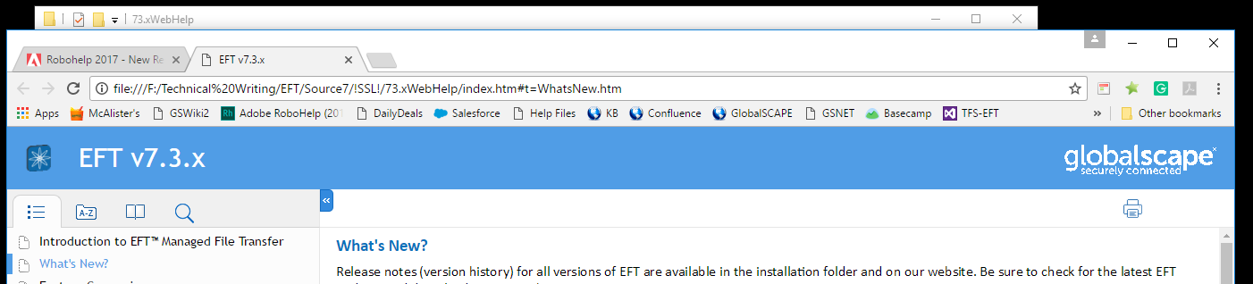
Well, bummer. If you guys don't know, there's no hope for me! What I have is satisfactory EFT™ v7.3.x.
Copy link to clipboard
Copied
The template you downloaded is based on an Adobe Template for RH11. This one isn't much different. But you'll need a slightly different CSS.
The following works:
- background-image: url(https://image.freepik.com/free-icon/apple-logo_318-40184.jpg);
- background-repeat: no-repeat;
- background-position: right center;
- background-size: contain;
}
The other devices are similar. There are 4 media queries if I remember correctly. But the CSS should carry over.
Copy link to clipboard
Copied
That worked! I changed background-size: to auto, because contain stretched out the image. I figured out how to make the image clickable to go to our home page, but not which file to put it in. But this is a big step forward.
Thank you very much!
==Karla==

Copy link to clipboard
Copied
@meKarla: I am trying add images to the header like you have managed to do. Could I ask for some advice on achieving this please? I have tried following this thread, but had no success.
Best wishes,
Mark
Copy link to clipboard
Copied
Hi, sorry, MDennetti--been busy at work!
What I did was download Willam van Weelden's "Theme1_Standar_TOC_Only" and I edited the CSS named main.css to add/edit this section:
@media screen and (min-width: 81em) div.header {
background-image: url(https://image.freepik.com/free-icon/apple-logo_318-40184.jpg);
background-repeat: no-repeat;
background-position: right center;
background-size: contain;
}
Obviously, the image would have be swapped out and I change contain to auto.
If you're not using that CSS, he originally sent me a different fix:
div.header {
background-image: url('logo_test.png');
background-repeat: no-repeat;
background-position: right center;
}
If none of that works, make backups off EVERYTHING you want to edit, the play with different stuff in CSS until you get what you want--if you have time. Then report your findings to the rest of us!
Karla
Copy link to clipboard
Copied
Willam advised me the second piece of code you quote needs a small
correction but I can't access that until next week.
Peter Grainge
www.grainge.org
@petergrainge
Copy link to clipboard
Copied
I'd appreciate it if you could send me that please. Perhaps this will add some spacing to right side of the image. At the moment the image is hard against the right side of the header. Best wishes,
Mark
Copy link to clipboard
Copied
I also noticed that the "Home" icon increases in size when you make the browser wider, but my added image stays the same size. It would be great if you could advise how to address that problem. Thanks
Copy link to clipboard
Copied
The two issues I raised above have both been fixed now. Thanks again, Mark
Copy link to clipboard
Copied
Heya Mark
Often, when you have resolved an issue it's helpful to indicate what exactly you did to resolve it. That way if someone else comes along (as you did in the beginning of the issue) they might benefit from your travels down this specific road.
Cheers... Rick
Copy link to clipboard
Copied
Good point, apologies.
When the browser is made bigger, I got the new image to increase in size, similar to the "Home" icon, by adding the following line to the existing content that MeKarla advised me to add to the layout.css file:
div.header {
background-image: url('logo_test.png');
background-repeat: no-repeat;
background-position: right center;
background-size:auto 80%;
}
As for the lack of padding at the right side of the new image, I just created another image file with some space on the right side. This seemed to be the simplest way of getting round the problem.
Cheers,
Mark

 AdChoices