 Adobe Community
- Home
- RoboHelp
- Discussions
- Re: I need the TOC in HTML5 layout to be in "Book ...
- Re: I need the TOC in HTML5 layout to be in "Book ...
I need the TOC in HTML5 layout to be in "Book view" like the webhelp..Is there a RH 2015 layout that supports that?

Copy link to clipboard
Copied
The TOC navigation behavior in RH 2015 HTML5 is confusing to some of our application users. I need the TOC to be in "Book" view like "Clean Tangerine" in WebHelp. Is there another layout other than Azure Blue & Charcoal grey that support Book-view TOC?


 9
Replies
9
9
Replies
9

Copy link to clipboard
Copied
Have a look at Willam’s helpessentials.com site – you might find something there.
Copy link to clipboard
Copied
Hi there
Hopefully you realize that in 2015 you are able to substitute whatever images you want that represent the books and pages. Just edit the layout.
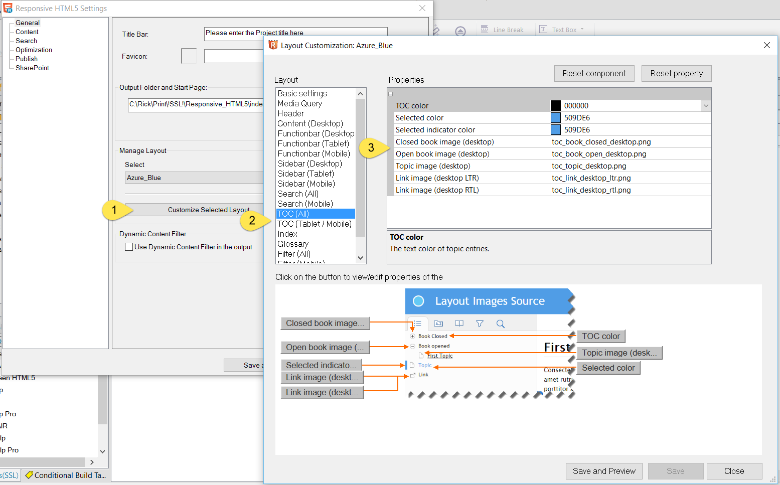
Cheers... Rick 
Copy link to clipboard
Copied
Yes, actually but does changing icons, will change the behavior ..I need this view in HTML5
Copy link to clipboard
Copied
As these are simple images that are pulled in and presented, I'm unaware of anything that would be disrupted or behave differently by substituting images like this.
All I can say is try it and see!
Cheers... Rick
Copy link to clipboard
Copied
If behavior is different, it's because of the way Responsive HTML 5 is coded. I suppose it may be coded differently than WebHelp.
Copy link to clipboard
Copied
Yes, actually when I open the HTML5 help file with different resolution (90% zoom), the TOC is displayed better. But in 100% view, when I open a topic, it expands the sub topics with hiding the rest topics.
I'm trying to find a way to make it in the same behavior in the normal view. Any device?

Copy link to clipboard
Copied
By default, in the mobile and tablet view, the TOC is changed to a 'drill down' that only shows 1 level at the same time. So you have 2 options:
- Change the behaviour of the TOC on mobile and tablet
- Change the media query so that your readers will see the desktop view on more resolutions.
For option 1, there is a setting Mobile TOC drill down in the TOC (Mobile/Tablet) section that toggles the regular and drill down TOC. Setting it to false will get the regular TOC on mobile as well.
For option 2, you can change the breakpoints in the media query section. By default, the tablet breakpoint is 1295 pixels. So only displays with a width of >= 1296 pixels will get the desktop view. Setting a lower resolution, will get the desktop view on more devices.
Copy link to clipboard
Copied
Thanks a lot Willam..I got this different level even between different zooming (90% to 100%) in Desktop. So, please which option do you recommend to unify view in Desktop?
Copy link to clipboard
Copied
I would change the maximum tablet with in the skin to something like 1024 to show the Desktop view for more devices. That is the most proof option.

 AdChoices