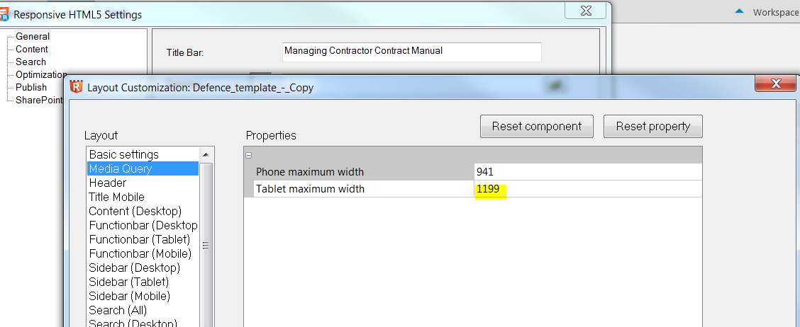
I am trying to change at pixel width at which desktop view changes to tablet and therefore when the sidebar switches to icons.
It seems Javascript is used to remove sidebar-opened class from various divs when screen is reduced below 1300px. I need to change this value to 1200px.
I could add responsive CSS to do this but it would be much easier to update the JS. I narrowed this down to the one of the scripts responsible for this to script \Responsive_HTML5\template\scripts\rh.min.js but I couldn't understand how it adds/removes 'sidebar-opened' going between desktop/tablet.
Anyone have any strategies or options?
Thanks,
Daniel
RoboHelp 2015


 1
Reply
1
Reply


 AdChoices