 Adobe Community
- Home
- RoboHelp
- Discussions
- Re: Responsive HTML5 Layout Not Displaying Desktop
- Re: Responsive HTML5 Layout Not Displaying Desktop
Responsive HTML5 Layout Not Displaying Desktop

Copy link to clipboard
Copied
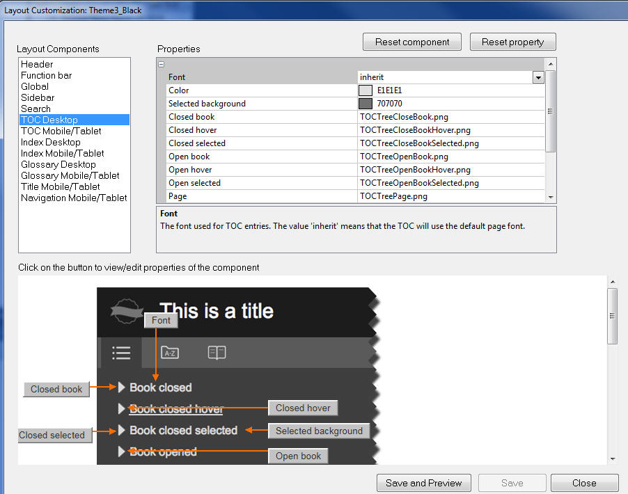
I've searched the forums but didn't find anything on this. I'm running RoboHelp 11. I was looking into using a Responsive HTML5 layout instead of my current WebHelp layout. I like how the desktop version looks when I choose Theme3_Black and edit:
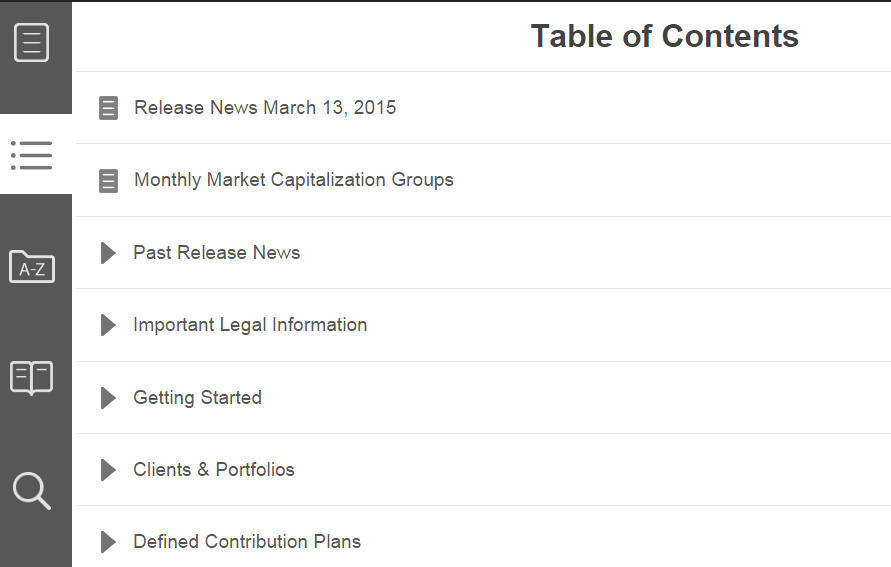
However, when I compile and preview, I see only the tablet version:
Any idea why the desktop version isn't displaying? It does it within RoboHelp and when I choose to preview in a browser.


 6
Replies
6
6
Replies
6
Copy link to clipboard
Copied
Hi there
It sounds to me as if you are perhaps presenting it in a window that is sized to be smaller than your desktop?
That's the point of responsive. Items on the screen rearrange according to what are known as "breakpoints". Once a breakpoint has been reached, items rearrange to suit that breakpoint definition. The thought is that the new placement and size of the items works better on a device that would be using that breakpoint.
Cheers... Rick 
Copy link to clipboard
Copied
I get what you're saying, but the tablet layout displays even when I open the start page from the !SSL! folder and maximize the browser window to the size of my monitor, which is 1280 x 1024. It looks like the minimum size for the desktop screen profile is 1024 x 768.
Copy link to clipboard
Copied
See if this quick and dirty video does a better job of explaining it.
If you want the breakpoints adjusted, I do believe it's possible. But you will have to muck about with the code. Hopefully Willam will see this post and pop in to advise more.
Cheers... Rick
Copy link to clipboard
Copied
I did find that if I resized the window to wider than my primary monitor (I have two), it did show the proper desktop navigation. However, I don't really want the user to have to maximize the window that much. I haven't figured out a way to fix this yet. Adjusting the size of the desktop screen profile didn't seem to do anything.
Copy link to clipboard
Copied
Adjusting the size of the desktop screen profile didn't seem to do anything.
Nor would I expect it to. If you are using Responsive, these screen profiles are ignored. Those are intended for use with Multiscreen output. 
Cheers... Rick

Copy link to clipboard
Copied
What does responsive mean. This is the approach that provides an optimal viewing and interaction experience, easy reading and navigation with a minimum of resizing, panning, and scrolling across a wide range of devices. It can be mac, desktop, laptop or any mobile device. It will fluidly change and respond to fit any screen or device size.
If you want to see how the content appears in a certain screen layout, map the screen layout to a screen profile in Multiscreen HTML5 or Responsive HTML5 layout settings and click Preview in the toolbar. To preview a screen layout while editing the screen layout, do the following:
Press Ctrl + W.

 AdChoices