 Adobe Community
- Home
- RoboHelp
- Discussions
- Re: RH 2017 - tiles cut off in Indigo output, shif...
- Re: RH 2017 - tiles cut off in Indigo output, shif...
RH 2017 - tiles cut off in Indigo output, shifted by back button?

Copy link to clipboard
Copied
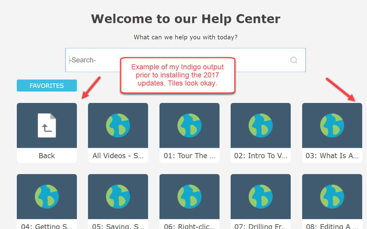
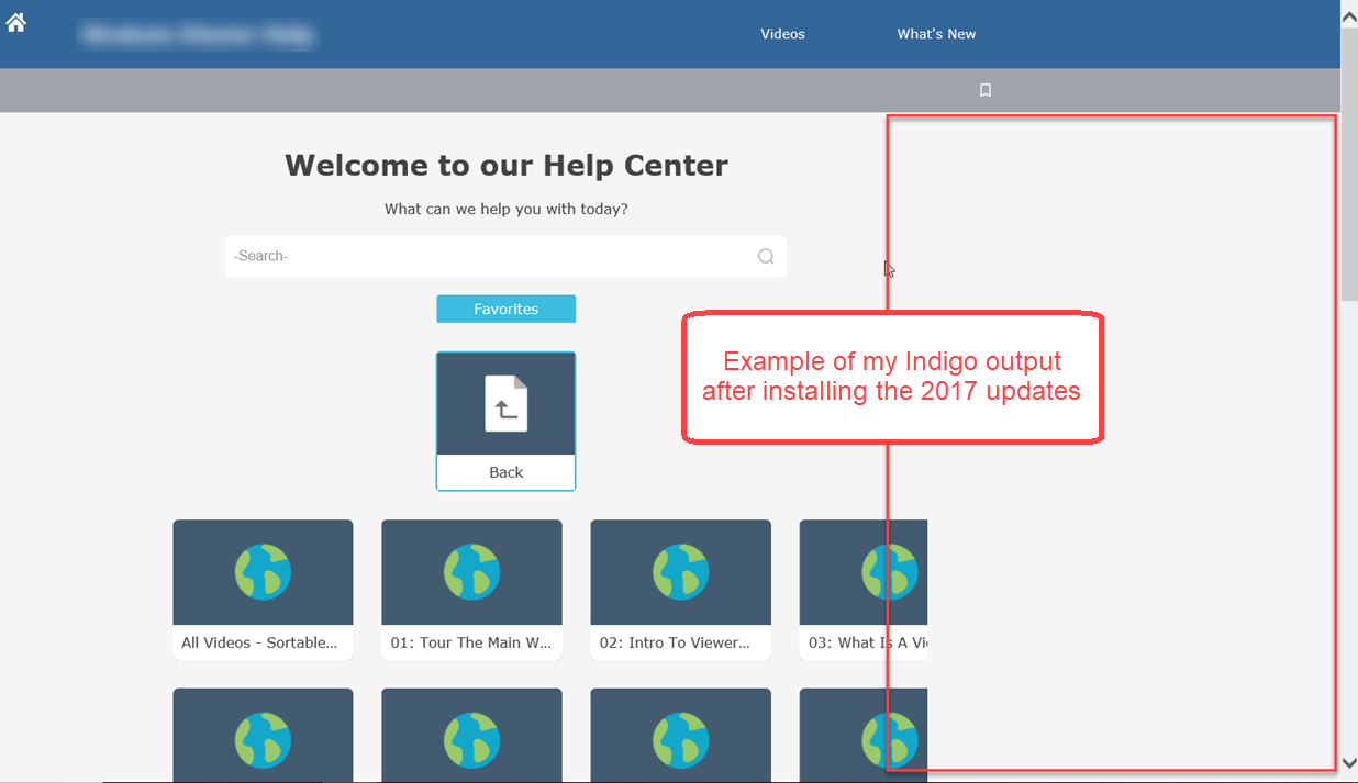
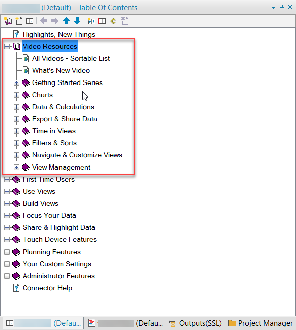
Has anyone experienced the following in Indigo output for responsive help? I have a book in table of contents which has a list of topics underneath it. In the Indigo layout, when I click the tile that corresponds to this toc book (named Video Resources in my example images), I see tiles for each topic but those topic tiles are cut off on the right side of the browser. This 'cut off' issue didn't happen in RH 2017 prior to my installing Updates released by Adobe. Prior to the Updates, the Back button used to be in line with other tiles and all topic tiles fit in browser window. After the updates, the Back button displays on its own line above other tiles. It seems like the Back button being on it's own line created a shift in the tiles below it or caused something to be off with how the page renders?
I have read some other discussion threads about dissatisfaction with the Back button in the Indigo layout and with limitations around being able to customize it (size, position, etc.). I have voted for the bug https://tracker.adobe.com/#/view/RH-1510https://tracker.adobe.com/#/view/RH-1510 which was logged as a result of discussion https://forums.adobe.com/message/10258240#10258240.
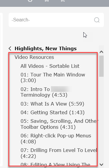

Sub tiles for topics under Video Resources (examples below show pre and post installing the Updates):


 3
Replies
3
3
Replies
3

Copy link to clipboard
Copied
There are a few structural changes in the grid layout that is being used in the Indigo layout. You see this in the behaviour of the Favorites button as well. In the new version, it is center aligned. Changing this back would mean going back to the old grid structure of the layout. But as this was changed for a reason, you may introduce additional issues.
I don't see the gray overlap that you see on the right sight of the screen. Is that something coming from the screen shots? Or something different?
Copy link to clipboard
Copied
The gray area shown in my last image is the 'cut off' aspect of the browser. The grey shows up live in the actual browser, and I merely outlined it in red when marking up the screenshot in my image editor. Not sure what the grey is, but it's not a clickable area and it's what cuts off the tiles in the 4th columns of tiles in this particular scenario. Today, I sent an email to Adobe support to see if this scenario is a known bug. Today, I also noticed that the issue is occurring in IE but not in Chrome. Those are the only browsers I have tried the output in so far.
Agree about not wanting to go back to the pre-Update 2 state of RH 2017. I applied Update 2 due to some other issues and also applied the fix for RH-960 to correct some things caused by Update 2. The tile cut off issue was happening before I applied RH-960 fix, so it appears unrelated to the issue described in this discussion.
Copy link to clipboard
Copied
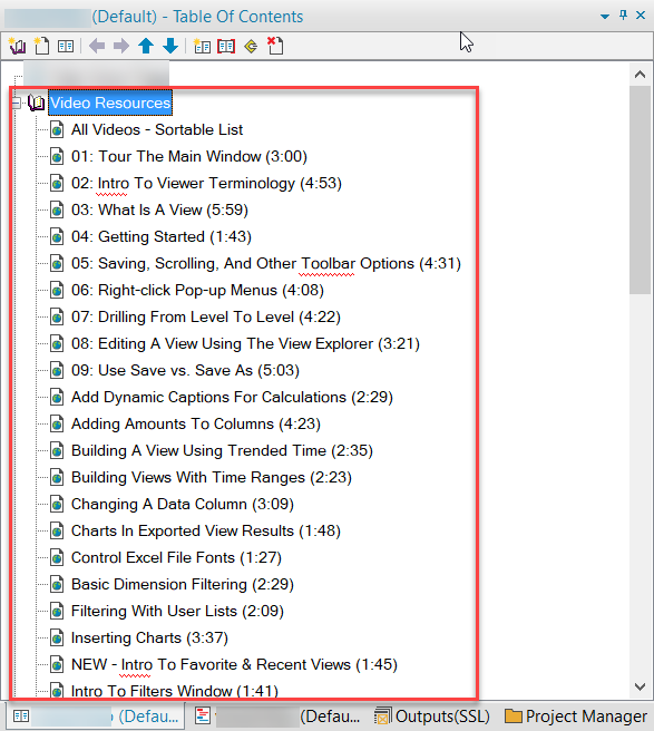
While waiting for advice from Adobe on my issue, I implemented some changes in the section of my table of contents that originally yielded the odd display when rendered in the Indigo layout. Previously, the book in the table of contents had 30 or more pages that were all links to videos. I took those pages and grouped them under child books -- grouping together like videos under common book categories. The corresponding tiles in the Indigo output look ok now and nothing is cut off in the tiles on the right side of the help.
Old toc structure for the section in question:
New toc structure for that section:

 AdChoices