 Adobe Community
- Home
- RoboHelp
- Discussions
- Re: RH2015 - Responsive HTML5 Layout is not correc...
- Re: RH2015 - Responsive HTML5 Layout is not correc...

Copy link to clipboard
Copied
After generating my project using 'Responsive HTML5', the desktop and tablet layouts work perfectly in Google Chrome and Firefox, however there is a problem with Internet Explorer (I am using IE9). In IE when the content is viewed on the desktop it is always shown with the Phone layout and on occasions the TOC fails to populate when opened. I have also tried the sample projects with the same results.
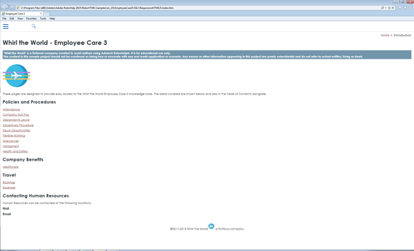
The image below shows the IE9 layout on the full size desktop:
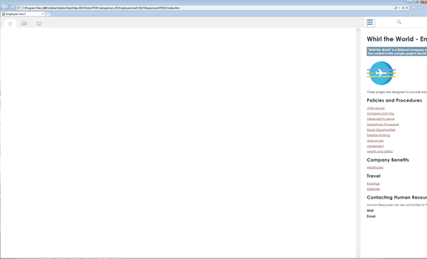
The image below shows what happens when the TOC button is selected.
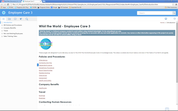
The image below shows the same project using Google Chrome on the same desktop. This is the correct desktop layout.
However, when I use RH11 all layouts, including IE, are correct!!
Is there a setting that I am missing somewhere in RH2015, or is there a file from RH11 that I can copy over to RH2015 that might correct the problem?
Thanks,
Chris


 1 Correct answer

I did a quick check: IE9 does not support the JavaScript matchMedia property. This is the property being used by the RoboHelp output to switch the break points for mobile devices. That is the cause of this issue. According to the help, IE9 is still supported for Responsive HTML5 (http://help.adobe.com/en_US/robohelp/2015/robohtml/#t=book%2Frob_layouts_la%2Frob_layouts_la-11.htm) Either this help is incorrect, or it is a bug.
Please log an issue with Adobe at Home
 9
Replies
9
9
Replies
9
Copy link to clipboard
Copied
I did a quick check: IE9 does not support the JavaScript matchMedia property. This is the property being used by the RoboHelp output to switch the break points for mobile devices. That is the cause of this issue. According to the help, IE9 is still supported for Responsive HTML5 (http://help.adobe.com/en_US/robohelp/2015/robohtml/#t=book%2Frob_layouts_la%2Frob_layouts_la-11.htm) Either this help is incorrect, or it is a bug.
Please log an issue with Adobe at Home
Copy link to clipboard
Copied
Thanks for the analysis William.
I will log an issue with Adobe today.
Chris

Copy link to clipboard
Copied
I just happened to see this issue in the forum history and this will definitely affect our project since the user help we've written is to be inserted into the web-based interface of my company's software which is compatible with IE8 and above. Thankfully, we still have one machine using the previous version of RoboHelp, but this means we won't be able to employ the new DCF feature in our user help until this issue is resolved by Adobe and that is very disappointing.
Is there a way I can be notified by Adobe when this issue has been resolved, or is there a particular website where I can check the progress of this issue's resolution? Thank you.
Copy link to clipboard
Copied
If you are supporting IE8, you can't use the Responsive HTML5 from RoboHelp 11 either. You need IE9 at minimum. You may want to look to WebHelp.
I don't believe there is a notification available. You will have to keep an eye out for release notes.
Copy link to clipboard
Copied
Hi Willam
To me this sort of begs the following question.
Aside from personal knowledge and experience, where does one obtain such information? Does a handy infographic of some sort exist that assists one in determining what one is able to use without issue on what browsers and versions?
The whole browser and version world seems rife with caveats. One wonders how folks are supposed to cope and know what works where so they can just focus on developing content.
Cheers... Rick 

Copy link to clipboard
Copied
There are a few sites for checking which browsers support what.
This site is good: http://caniuse.com/
The W3 Schools site will also tell you the browser support for individual "things": W3Schools Online Web Tutorials
Copy link to clipboard
Copied
Thank you for the information; I was not aware of that. What is the version minimum for the other web browsers as it pertains to the use of Responsive HTML5 layouts?
Copy link to clipboard
Copied
For everyone's information I have received the following response from the bug report that I raised with Adobe:
"Yes you are correct IE9 does not respond to Responsive layout from RH2015.
However i have two solutions for you:
1. If you are viewing it on desktop then you can set the default layout as Desktop which is set to mobile by default.
Steps: open ...\template\<layout_name>\usersettings.js in published output.
add rh.model.publish(rh.consts('KEY_DEFAULT_SCREEN'), 'desktop'); line after line 168 @
rh.model.publish(rh.consts('KEY_FEATURE'), features);
rh.model.publish(rh.consts("KEY_LAYOUT_VERSION"), "2.0");
rh.model.publish(rh.consts('KEY_DEFAULT_SCREEN'), 'desktop');
This will set your default layout as desktop but it will not solve the "being unresponsive" issue.
2. RH 11 layouts are supported in IE9 so you can import the RH11 responsive layout in RH2015 and use it. It will work fine.
We will update our Help soon. Feel free to query in case there is any confusion.
Thanks for highlighting this oblivious mistake in Help file."
I haven't tried these 'work arounds' as yet, but will do so as soon as I get a chance.
Chris
Copy link to clipboard
Copied
Gah! I was just telling my boss we should move to RH2015 to use the DUCC in HTML5, but we only just upgraded to IE9. :S
Does anyone know if we use a RH11 layout whether we can plug just the new DUCC feature into it, or if that feature is the reason RH2015 responsive isn't compatible with IE9 any more? (I've also made the assumption that DUCC is only available in Responsive, not Multiscreen...)

 AdChoices