 Adobe Community
- Home
- Stock Contributors
- Discussions
- Re: Can anyone help with why this was rejected?
- Re: Can anyone help with why this was rejected?
Can anyone help with why this was rejected?

Copy link to clipboard
Copied


 5
Replies
5
5
Replies
5

Copy link to clipboard
Copied
You got a rejection reason and I suppose it is ip rights. There is (at least) one logo visible on one of the ships. Logos need to be photoshoped out!
When posting here, please include the rejection reason. You do not need to post the whole text, the reason is OK. That makes guessworking less time consuming.
Copy link to clipboard
Copied
Thanks for the reply. The rejection reason was technical issues, so I don't think it was the logo.
Copy link to clipboard
Copied
bobukiah wrote
(...) so I don't think it was the logo.
So that will be next!
Saturation is a tick too much, contrast to less and the ramming people are problematic: too dark because of the water reflection. But if you lighten them up, they may be recognisable and you need a model release. I'm also not quite sure about the trees. They seam to be washed out, but as you did not post the original quality picture, I can't say if that is also present in the original file. And may be you also need a slight colour correction.

Copy link to clipboard
Copied
Hello, I think the white balance is a bit out. Perhaps a bit too yellow. The water has a yellowish cast to it. So, decrease the colour temp - take out some yellow and increase the tint just a wee bit. Also, contrast can be increased a bit. And decrease the highlights a bit. I doubt you'll need a model release for the canoers, I think they are too small to be a problem. I don't think they need to be lightened up, a silhouette form is fine - I think.
Eg.
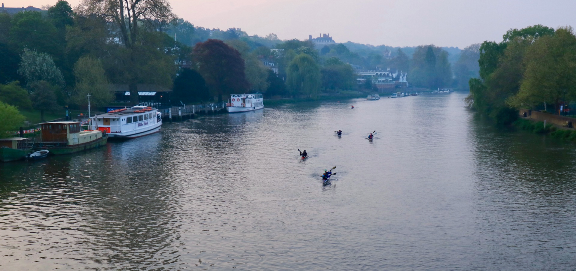
Take out the logo on the boat as well. I don't think the trees are a problem either. The main issue I think is the white balance.
Changes are very subtle.
Copy link to clipboard
Copied
Thank you very much - your comments are very helpful. I'll give it a go and resubmit as I like the picture.
 AdChoices