 Adobe Community
- Home
- Stock Contributors
- Discussions
- Image declined do to technical reasons
- Image declined do to technical reasons

Copy link to clipboard
Copied


 1 Correct answer

Quite a good analysis. Both pictures are giving problems, 2 could be better framed and one has this disturbing highlight spot. So instead of accepting one and refusing the other, why not to refuse both?
OP needs to understand, that quality assessment is complex, and moderators do a good job most of the time. I would have, indeed, refused both.
Lack of transparency is just because the moderator does not point out the exact portion of the picture he sees in error. But it is not the aim of Adob
... 12
Replies
12
12
Replies
12

Copy link to clipboard
Copied
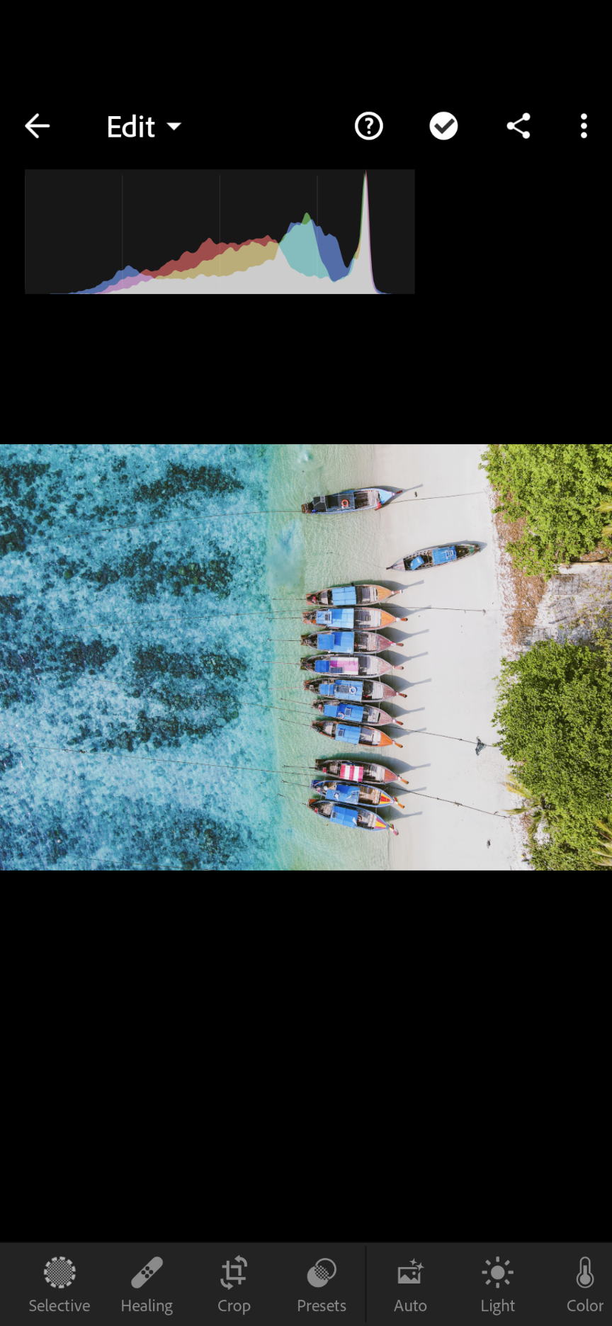
The first image seems to lack sharp focus on the boats; the second image seems to have a white balance issue, and the 3rd image - I'm not sure. Was the 3rd one rejected for technical issues or IP violation? Uploading low res images makes it impossible for the Community members to properly evaluate the quality of the image and provide an opinion.

Copy link to clipboard
Copied
Greetings!
Resolution could be part of it. I spotted a few things.
The one of the boats struck me as being overexposed, having washed out colors, and in need of some sharpening. I think it would be worth giving this another once over and resubmitting personally.

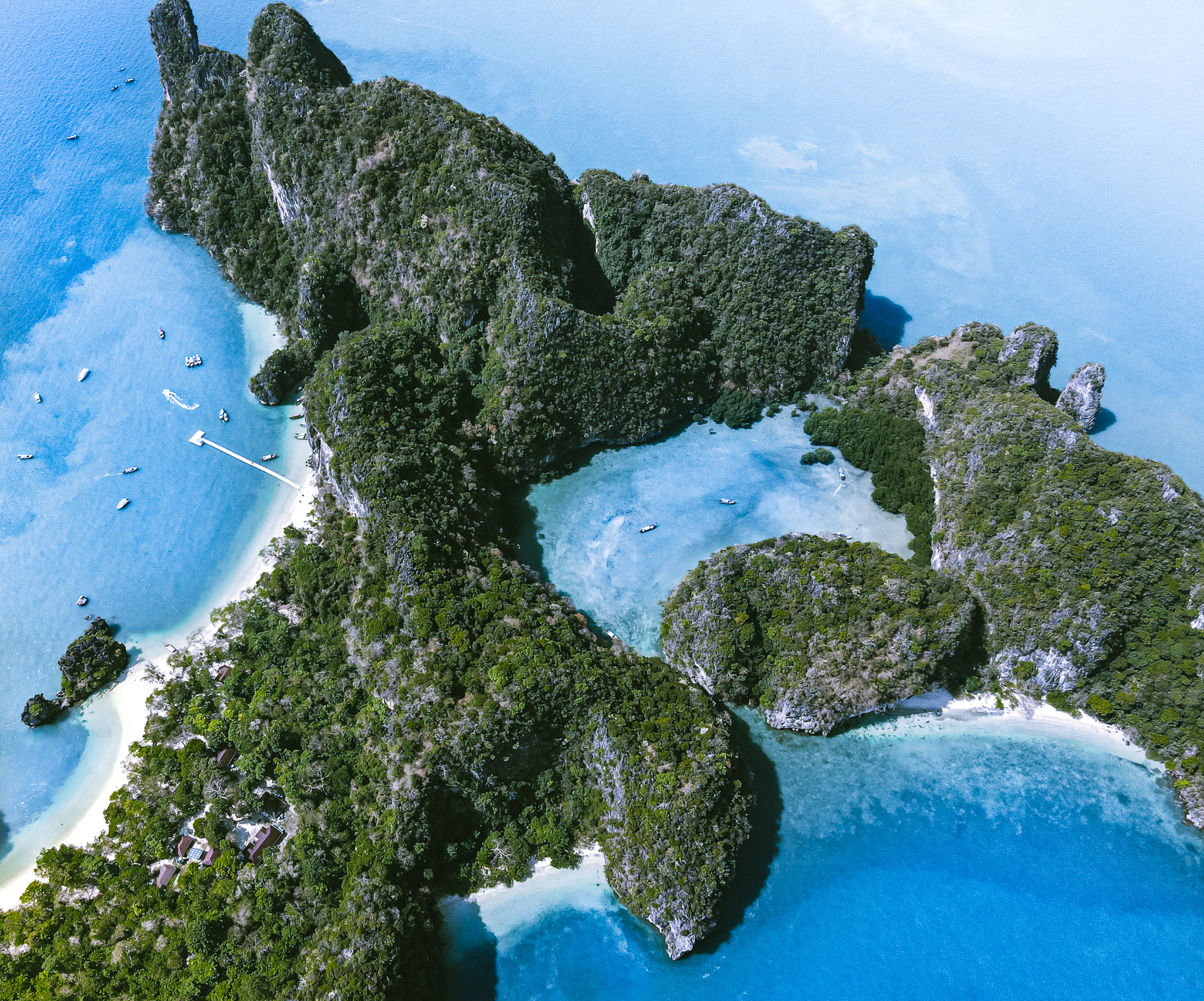
The one of the island had a blue color cast and some noise.

I noticed there details in the boat in the foreground appeared pretty soft here. Not sure if that was it or not.

I hope that helps!
-George Folster
George F, Fine Art Landscape Photographer

Copy link to clipboard
Copied
See links below:
- https://helpx.adobe.com/stock/contributor/help/reasons-for-content-rejection.html
- https://helpx.adobe.com/stock/contributor/help/quality-and-technical-issues.html
- https://helpx.adobe.com/stock/contributor/user-guide.html/stock/contributor/help/photography-illustr...
- https://helpx.adobe.com/stock/how-to/tips-stock-image-acceptance.html
Alt-Web Design & Publishing ~ Web : Print : Graphics : Media

Copy link to clipboard
Copied
In the first photo, there are incomprehensible cut wires. It is better to remove them. The colors are unnatural, Adb doesn't like that. The buyer will decide for himself with the colors in accordance with the design of the publication.

Copy link to clipboard
Copied
The colors of the images are not looking natural. I cannot imagine drought so bad to make all big tree totally brown. In addition to the unnatural color, all three images have white balance issues that produce an aqua color cast.
Best wishes
JG
Photographer and Nutrition Author
Copy link to clipboard
Copied
Thanks everyone for the feedback. I don't really agree the colors look unnatural (I was there), or the boats lack sharpness, or there is problem with the white balance, but there is not point to argue 🙂 In actual fact, 2 weeks ago I got several images accepted and as you can imagine they were edited in the exact same way, shot with the exact same camera/drone. I find it extremely funny that all picture in the first batch i uploaded were accepted, and all were rejected in the second batch (30+ pics) with no reason.
Copy link to clipboard
Copied
Technical reasons are reasons. If you are new to stock, you should consider these resources: https://helpx.adobe.com/stock/contributor/tutorials.html
Please read the contributor user manual for more information on Adobe stock contributions: https://helpx.adobe.com/stock/contributor/user-guide.html
See here for rejection reasons: https://helpx.adobe.com/stock/contributor/help/reasons-for-content-rejection.html
and especially quality and technical issues: https://helpx.adobe.com/stock/contributor/help/quality-and-technical-issues.html
Vetting is done by humans, it may be that the first one did let pass, abd the second one thought that the editing was too strong.
Copy link to clipboard
Copied
Copy link to clipboard
Copied
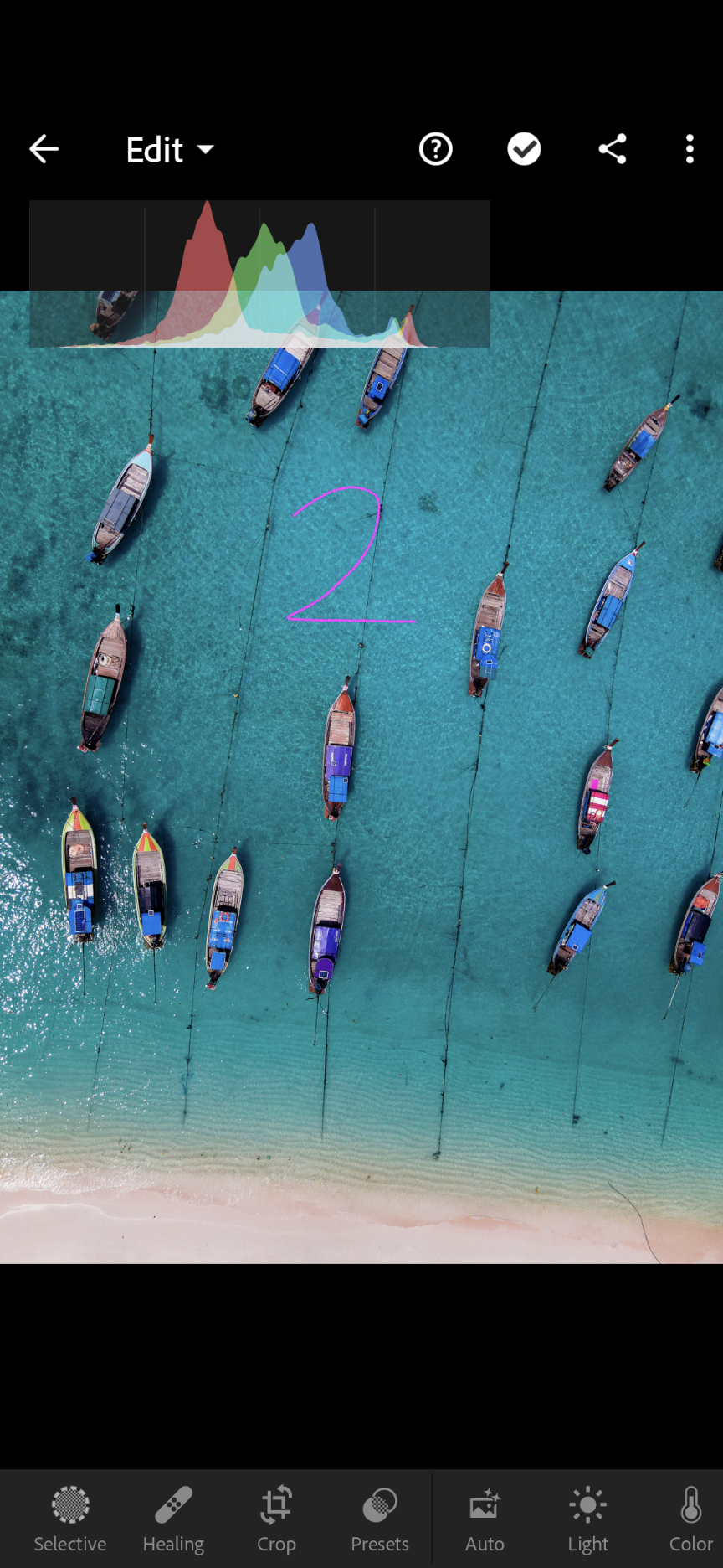
I'm away from my workstation and won't be able review these in detail, but I thought it was worth noting the differences in the histogram between the original overhead boat photo and both of these. Both of these show on the histogram that the exposure is more or less correct, and the original shows overexposure.
I think it could go either way on these, but my gut is telling me that 2 is the one that was rejected. In my opinion, 2 needs straightening and some of the boats are only half in the frame. But the sun spot in 1 appears prominent and distracting and could be considered a composition issue.
Thanks for letting us review your photos!
George F, Fine Art Landscape Photographer
Copy link to clipboard
Copied
Quite a good analysis. Both pictures are giving problems, 2 could be better framed and one has this disturbing highlight spot. So instead of accepting one and refusing the other, why not to refuse both?
OP needs to understand, that quality assessment is complex, and moderators do a good job most of the time. I would have, indeed, refused both.
Lack of transparency is just because the moderator does not point out the exact portion of the picture he sees in error. But it is not the aim of Adobe stock to provide accurate feedback to the contributors, but to provide high quality pictures to the buyers. If the buyer is not happy, Adobe has a problem. If the contributor is not happy, there is no damage done.
Copy link to clipboard
Copied
It''s multiple people that do reviews. Different people has different experience levels and see different levels of details. If you are new, you will not identify errors that easily. As your experience grows you will see more of the flaws. I am of the opinion that new photographers might get some images that has flaw accepted based on the discretion of the reviewer to give a chance for development bases on perceived potential. For example it might just be about 2 of my first 500 uploads that got sold. Some of what was accepted I wonder why. But this is not unique to Adobe, I make the same observation on other platforms. Lets face it, we don't upload our images just for display. We expect sales. Adobe does not accept them just for display, so they choose what in their own discretion is good for their customers. It's not a pleasant experience to see photos get rejected, but it is a part of the process. You can either learn from them, or not.
Best wishes
JG
Photographer and Nutrition Author
Copy link to clipboard
Copied
I've looked into your pictures 1+3. They have problems with overexposure at least. as you submitted here only small images, I could not really look into other problems, but I suspect some other troublemakers as I've detected hints of noise in the shadows and artefacts around hard borders.


 AdChoices