

If we determine your file to have technical issues other than focus, exposure, or artifacts, which we call out specifically or if the file is determined to not meet our overall quality standards the "Image Quality" rejection reason is selected by moderation.
 Adobe Community
Turn on suggestions
Auto-suggest helps you quickly narrow down your search results by suggesting possible matches as you type.
Exit
- Home
- Stock Contributors
- Discussions
- Re: Image rejected for technical issues
- Re: Image rejected for technical issues
0
Image rejected for technical issues

New Here
,
/t5/stock-contributors-discussions/image-rejected-for-technical-issues/td-p/10871478
Jan 21, 2020
Jan 21, 2020
Copy link to clipboard
Copied
Community guidelines
Be kind and respectful, give credit to the original source of content, and search for duplicates before posting.
Learn more

 2
Replies
2
2
Replies
2

Community Expert
,
/t5/stock-contributors-discussions/image-rejected-for-technical-issues/m-p/10872726#M3687
Jan 22, 2020
Jan 22, 2020
Copy link to clipboard
Copied
Well, in getting rather used to Adobe's colour preference, I would say the problem here is white balance. It is a bit yellow, has a yellow cast. Perhaps this was intentional, but probably for Adobe's criteria, it is rather on the yellow side - it's too warm. I would suggest correcting this.
This splurge is from Adobe:
Image Quality
Note:
When you shoot in raw formats, you have great flexibility to adjust the white balance in your post-processing workflows.
Contrast: There may be too much or not enough contrast.
Saturation: Oversaturation may give your file an unnatural look, but under-saturated or spot color can also result in technical decline.
Note:
You may want to try the Vibrance slider instead of Saturation in Lightroom.
Selections: Editing must be done inconspicuously. Selecting objects out of their backgrounds (or masking) to composite into new images requires time, patience, and care. Do not submit images that have been poorly selected or look like they are not a natural part of the scene.
Chromatic aberration: Refers to color fringing around objects in the image.
General composition: Is your horizon straight? Have you cropped the image too much? Consider leaving a designer room to add their own text or objects.
https://helpx.adobe.com/stock/contributor/help/quality-and-technical-issues.html
Community guidelines
Be kind and respectful, give credit to the original source of content, and search for duplicates before posting.
Learn more

Community Expert
,
LATEST
/t5/stock-contributors-discussions/image-rejected-for-technical-issues/m-p/10877278#M3688
Jan 23, 2020
Jan 23, 2020
Copy link to clipboard
Copied
Hi Vincent,
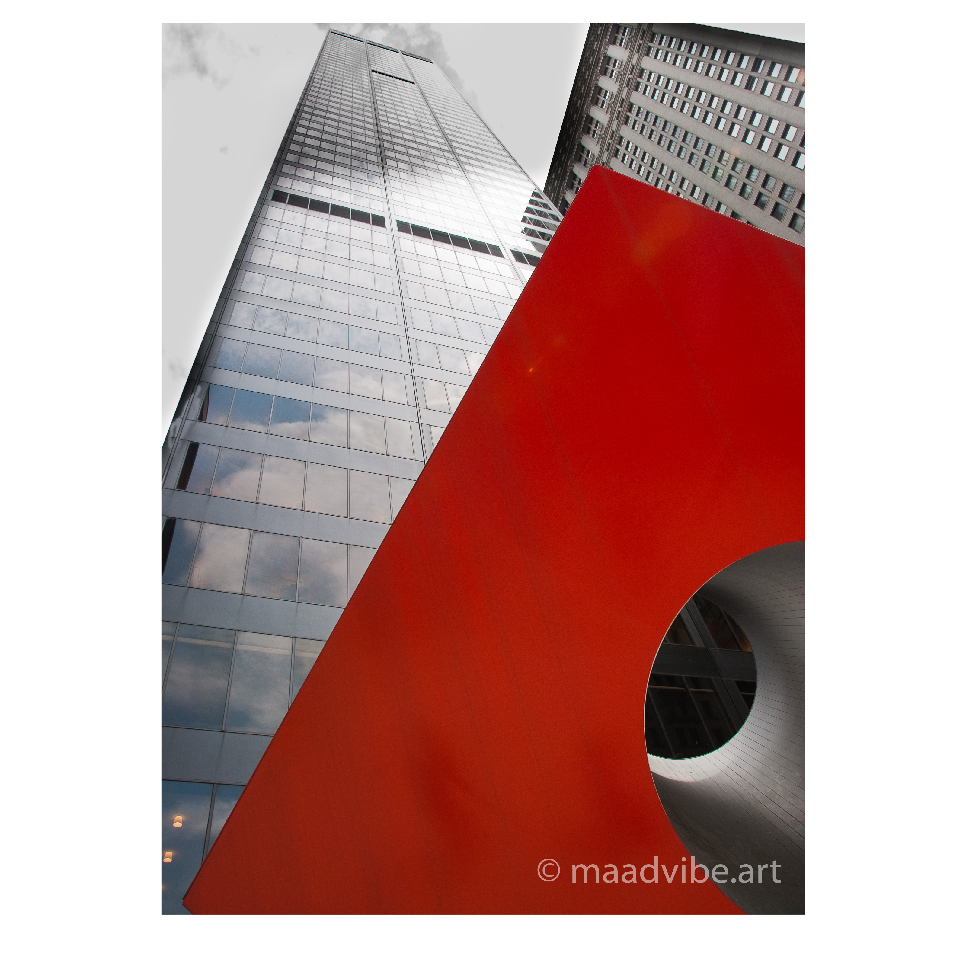
I believe the issue has to do with the composition; the red bit in the forefront and the side skyscraper. I believe it would have been better taken from a different angle so that both buildings appear to be coming from earth, and probebly stepping away so that the red piece does not overpower the rest of the image.
Best wishes
JG
Community guidelines
Be kind and respectful, give credit to the original source of content, and search for duplicates before posting.
Learn more
Copyright © 2024 Adobe. All rights reserved.
 AdChoices