 Adobe Community
- Home
- Stock Contributors
- Discussions
- Re: Inappropriate content quality
- Re: Inappropriate content quality
Copy link to clipboard
Copied


 3 Correct answers

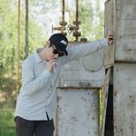
When zooming in to between 100% - 200%, the details of the sign look soft to me, and I feel as though this was the only element of the photo intended to be in sharp focus. I couldn't tell what the billboard was at first and it just looked like a teal mark on your photo, I think this detracts from quality of the photo. I also wonder if the weather this photo portrays evokes a feeling of wanting to go for a bike ride.
I like the concept and think it's worth exploring further though 🙂
It's not
...
I agree with @George_F about the focus problems. I also think it's a bit too dark (underexposed).
Compare your work with other Stock inventory like this example.

Adobe Stock customers expect the highest visual and technical quality for use in commercial projects. Read these links.
...
Hi @Micro4elik ,
Too much of your frame is out of focus. It comes across as a landscape capture that is out of focus. If you wanted the sign only you should either zoom in more on the sign or capture a portrait. And as was said even the sign is not in sharp focus. If you wanted to include the landscape, you should set your camera for more depth. There is also a slight blue fringe around the sign. The capture is slightly under exposed and has a slight blue tint (white balance issue).
Best wishes
... 4
Replies
4
4
Replies
4
Copy link to clipboard
Copied
When zooming in to between 100% - 200%, the details of the sign look soft to me, and I feel as though this was the only element of the photo intended to be in sharp focus. I couldn't tell what the billboard was at first and it just looked like a teal mark on your photo, I think this detracts from quality of the photo. I also wonder if the weather this photo portrays evokes a feeling of wanting to go for a bike ride.
I like the concept and think it's worth exploring further though 🙂
It's not uncommon for different stock agencies to accept different assets. I have many assets with Adobe Stock not accepted by other agencies and vice versa. Every agency has its own criteria to evaluate assets for.
George F, Fine Art Landscape Photographer
Copy link to clipboard
Copied
I agree with @George_F about the focus problems. I also think it's a bit too dark (underexposed).
Compare your work with other Stock inventory like this example.
Adobe Stock customers expect the highest visual and technical quality for use in commercial projects. Read these links.
- https://helpx.adobe.com/stock/contributor/help/reasons-for-content-rejection.html
- https://helpx.adobe.com/stock/contributor/help/quality-and-technical-issues.html
- https://helpx.adobe.com/stock/contributor/user-guide.html/stock/contributor/help/photography-illustr...
- https://helpx.adobe.com/stock/how-to/tips-stock-image-acceptance.html
Hope that helps.
Alt-Web Design & Publishing ~ Web : Print : Graphics : Media
Copy link to clipboard
Copied
Hi @Micro4elik ,
Too much of your frame is out of focus. It comes across as a landscape capture that is out of focus. If you wanted the sign only you should either zoom in more on the sign or capture a portrait. And as was said even the sign is not in sharp focus. If you wanted to include the landscape, you should set your camera for more depth. There is also a slight blue fringe around the sign. The capture is slightly under exposed and has a slight blue tint (white balance issue).
Best wishes
Jacquelin

Copy link to clipboard
Copied
The sign is too soft and not entirely in focus. There is too nuch background in relation to your subject. This results in too much overexposed highlighted sky.
 AdChoices