 Adobe Community
- Home
- Stock Contributors
- Discussions
- Re: Is it acceptable to add two versions of the sa...
- Re: Is it acceptable to add two versions of the sa...
Copy link to clipboard
Copied
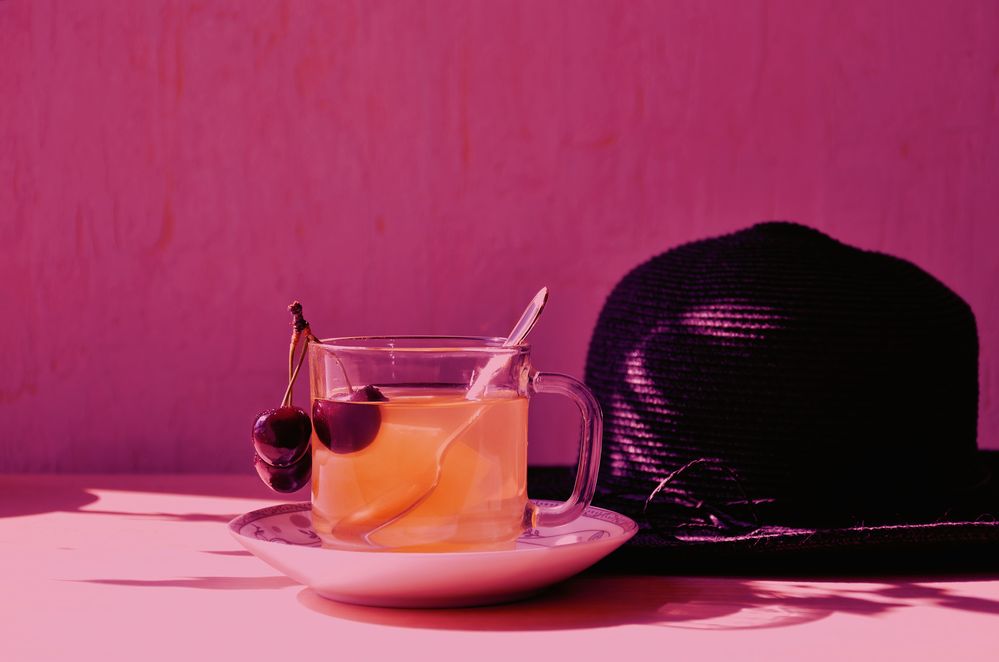
Is it acceptable to add two versions of the same image for review? Differences in colors and the addition of hand-drawn graphics?
 1 Correct answer
Seems to me Adobe are looking for realism in photos, so neither is likely to be accepted.
By @Test Screen Name
With a high probability, there will be refusals on technical issues, as the picture in itself does not meet the quality requirements, but the idea to add a variant is acceptable, and you can submit 2 pictures that are essentially the same differing in some addition. The addition needs, however, to be well done. In @Layla_F 's case, the added graphics does not look right (perspective,
...Copy link to clipboard
Copied
Yes.
If you are new to stock, you should consider these resources: https://helpx.adobe.com/stock/contributor/tutorials.html
Please read the contributor user manual for more information on Adobe stock contributions: https://helpx.adobe.com/stock/contributor/user-guide.html
See here for rejection reasons: https://helpx.adobe.com/stock/contributor/help/reasons-for-content-rejection.html
and especially quality and technical issues: https://helpx.adobe.com/stock/contributor/help/quality-and-technical-issues.html
Copy link to clipboard
Copied
Seems to me Adobe are looking for realism in photos, so neither is likely to be accepted.
Copy link to clipboard
Copied
Seems to me Adobe are looking for realism in photos, so neither is likely to be accepted.
By @Test Screen Name
With a high probability, there will be refusals on technical issues, as the picture in itself does not meet the quality requirements, but the idea to add a variant is acceptable, and you can submit 2 pictures that are essentially the same differing in some addition. The addition needs, however, to be well done. In @Layla_F 's case, the added graphics does not look right (perspective, tea stream). I would also stay with correct colours. The buyer can apply his colour filter if he wants.
Copy link to clipboard
Copied
Thank you very much for your help, Abambo. I received very detailed answers to my questions in your comment and quite quickly. I think I will make the necessary adjustments based on your recommendations.
Copy link to clipboard
Copied
Thank you for your comment. It would be easier for me to post a photo with the least changes, but I decided to try the recommendations in accordance with the article "Appetizing colors and textures", which recommends using visual effects, working with shades from colder tones to rich brights that reflect the brightness of summer life. It was from the section: https://pages.adobe.com/stock/ru/artisthub/get-inspired/seasonal/summer-2022
Copy link to clipboard
Copied
Hello,
There are some questions you ought to ask yourself before submitting.
- What are you trying to illustrate in these photos?
- How can these be used in a commercial setting?
- What value do they add to a potential buyer, and how can they use them!?
From a technical point of view, don't colourise them!
There is no detail in the shadow area. Is that a hat in the corner?
The 'teapot' is pouring outside the cup! I kinda expect a genie to be coming out...
If you offer the same picture but with different colour versions, it will probably be rejected on technical issues, other than that, for being similar.
Copy link to clipboard
Copied
Hello, ricky336
Many thanks for your comment!
In this case, I was thinking about how to convey in some fantasy form the atmosphere of summer, hot days, the desire to quench my thirst with natural drinks. A straw hat is just a summer accessory to complement. This image, in my opinion, could be used for an advertising banner on summer themes, as an option. Of course, I may be wrong in my views, I'm trying to improve my work, work on the mistakes, which is why I posted this post for discussion.
Copy link to clipboard
Copied
Great idea, but it doesn't work for me. I don't get the summer vibe from this.
Hope I don't sound too brutal!
Copy link to clipboard
Copied
Oh, thank you very much for your attention and answers. I was very interested and your opinion is important.
Copy link to clipboard
Copied
Colorization is a project designers judgement call.
I think you'll have more sales potential with natural colors and neutral white balance. Customers can decide for themselves if they need to colorize or not based on their particular project's requirements.
For more tips, read the DOs & DON'Ts in your Stock Contributor User Guide.
- https://helpx.adobe.com/stock/contributor/help/reasons-for-content-rejection.html
- https://helpx.adobe.com/stock/contributor/help/quality-and-technical-issues.html
- https://helpx.adobe.com/stock/contributor/user-guide.html/stock/contributor/help/photography-illustr...
- https://helpx.adobe.com/stock/how-to/tips-stock-image-acceptance.html
Alt-Web Design & Publishing ~ Web : Print : Graphics : Media
Copy link to clipboard
Copied
Thank you very much for your attention to my question and important recommendations. I have read the materials you suggested. Since in this post all the professionals have written that it is better to offer natural colors, I will strive for this. Of course, it is important for me to create materials that will be in demand.


