 Adobe Community
- Home
- Stock Contributors
- Discussions
- Not Accepted for Quality Problems
- Not Accepted for Quality Problems
Copy link to clipboard
Copied
Hi! These photos were not accepted due to quality problems. How could I fix them so they are accepted?
 2 Correct answers
When viewing at 100% view, here is what I noticed:
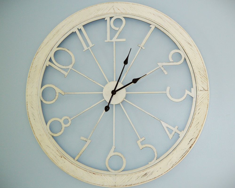
7420: Soft in details and noisy at 100% view, and there is a slight yellow colorcast. That may just be the color of the clock though.
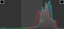
4961: Quite blurry at 100% view, and a bit of noticeable noise in the shadow areas. The histogram showed no information at either end of the histogram, and I think some exposure correction like setting the white and black points would fix that. It would also add more contrast to the photo.
Although the to
...Your first is completely out of focus, misses the required colour profile and has a flat histogram at the left (blacks) and the right (whites). This creates a contrastless look, that is sometimes nicely applied, but is unsuitable for stock.
I haven't looked into other issues, they have been amply discussed.
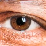
Your second also missed the colour profile. For an ISO 1250 picture, you did a decent job in the noise reduction, but you have forgotten the colour noise.

Copy link to clipboard
Copied
When viewing at 100% view, here is what I noticed:
7420: Soft in details and noisy at 100% view, and there is a slight yellow colorcast. That may just be the color of the clock though.
4961: Quite blurry at 100% view, and a bit of noticeable noise in the shadow areas. The histogram showed no information at either end of the histogram, and I think some exposure correction like setting the white and black points would fix that. It would also add more contrast to the photo.
Although the tones and contrast may be correctable, I don't think sharpening will bring back enough detail for these to be a viable asset unfortunately.
I hope you have better luck with future submissions 🙂
George F, Fine Art Landscape Photographer
Copy link to clipboard
Copied
Thank you for your help!
Copy link to clipboard
Copied
Also:
1. Composition is untidy. Unexplained things lying on the wood.
2. Unless you invented and made this clock, you need permission from the owner of the design. You cannot sell photographs of purchased objects you own unless they are very generic.
Copy link to clipboard
Copied
Both @Test Screen Name and @George_F are correct. Focus, noise, cropping and composition are a problem in both photos. Also, an IP release for the clock design may be required.
Copy link to clipboard
Copied
Your first is completely out of focus, misses the required colour profile and has a flat histogram at the left (blacks) and the right (whites). This creates a contrastless look, that is sometimes nicely applied, but is unsuitable for stock.
I haven't looked into other issues, they have been amply discussed.
Your second also missed the colour profile. For an ISO 1250 picture, you did a decent job in the noise reduction, but you have forgotten the colour noise.

The pointers are too contrasty. The clock is too iconic to pass like this. This could be a similar failure like the Swiss train station clock look on the iPhone.
I would not invest a lot of time to correct.
Look at your pictures at 100% for sharpness and 200% to detect artefacts. Look at the histogram to get an evenly exposed picture. Do careful noise reduction. Colour noise reduction can be aggressive in most of the cases. When photographing, keep your ISO low. Use a tripod when possible.
If you are new to stock, you should consider these resources: https://helpx.adobe.com/stock/contributor/tutorials.html
Please read the contributor user manual for more information on Adobe stock contributions: https://helpx.adobe.com/stock/contributor/user-guide.html
See here for rejection reasons: https://helpx.adobe.com/stock/contributor/help/reasons-for-content-rejection.html
and especially quality and technical issues: https://helpx.adobe.com/stock/contributor/help/quality-and-technical-issues.html


