 Adobe Community
- Home
- Stock Contributors
- Discussions
- Re: Rejected for TECHNICAL ISSUES - not sure why, ...
- Re: Rejected for TECHNICAL ISSUES - not sure why, ...

Copy link to clipboard
Copied
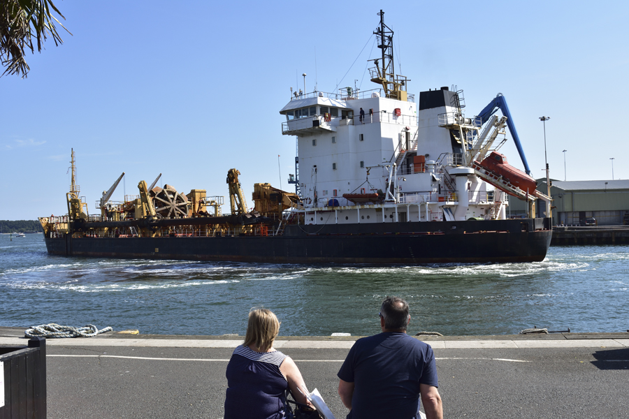
Any ideas why this ship was turned down for TECHNICAL ISSUES?


 1 Correct answer

In addition to what has been mentioned, also, don't forget about white balance as your image is a bit too blue - which is why it may appear a bit too saturated. This is also under 'Technical Issues'. The colour temperature could be increased a bit. (I think the reviewer was probably thinking about this primarily.)
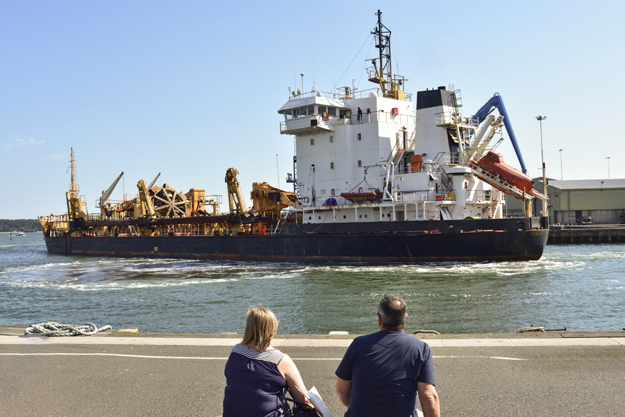
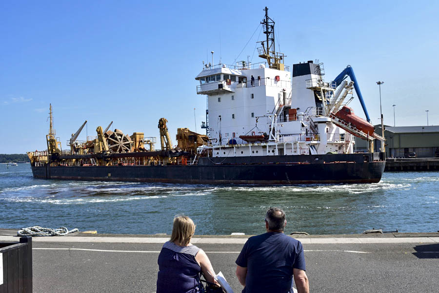
You can also see that it makes a difference to the picture when these other 'unwanted' objects are removed - which I did quickly as Abambo suggested.
 9
Replies
9
9
Replies
9

Copy link to clipboard
Copied
Hi stevem
The lower section of the ship is too dark. As a result the details are not visible. It seem you were facing the light source for this shoot. That created at dark area in your image - the couple's back and the lower side of the ship. To prevent that you should have applied exposure compensation during shooting. In addition you might have applied a little too much saturation during postprocessing. Using your editor to make level adjustment, possibly brightening the midtones, or lightening the black, and shadows, should make the correction.
I hope this helps
Best wishes
JG

Copy link to clipboard
Copied
Hi Steve,
I would like to add to Jacqueline's excellent analysis that the framing is very bad. As the couple's back could add some suspense to the picture, having cut off like that disturbs me. I would have tried to get the people and the ship completely in the image.
In addition I suggest reworking the picture it may still be accepted, especially if you have shot raw, you will have good chances to rework the picture:
Copy link to clipboard
Copied
...and I did forget: Adding some sky would help...
...and the right side of the pier looks like it was edited . Even if it wasn't it needs some corrections. The shadow too could be taken out. And as we are anyhow modifying the image, take also out the box (dark wood construction) at the left. As it does not disturb too much, your image would be better off without. Be sure to get your image as clean as possible and without the impression of having edited it.
...and a last: f11 is normally not the sharpest opening of lenses. Knowing the sweat point of a lens helps getting the sharpest images.
Copy link to clipboard
Copied
The pier wasn't corrected but thanks for pointing it out, I hadn't noticed it! I'm going back to the location to see if it wonky in real life!
Copy link to clipboard
Copied
Sometimes it looks photoshopped but it is not. That’s when you should photoshop.
Copy link to clipboard
Copied
In addition to what has been mentioned, also, don't forget about white balance as your image is a bit too blue - which is why it may appear a bit too saturated. This is also under 'Technical Issues'. The colour temperature could be increased a bit. (I think the reviewer was probably thinking about this primarily.)
You can also see that it makes a difference to the picture when these other 'unwanted' objects are removed - which I did quickly as Abambo suggested.

Copy link to clipboard
Copied
ricky336 wrote
You can also see that it makes a difference to the picture when these other 'unwanted' objects are removed - which I did quickly as Abambo suggested.
Great. 

Copy link to clipboard
Copied
Hi rickey336,
What an excellent example you have posted here. It shows the photo as greatly improved and ready for submission. One photo is worth a thousand words - for sure! This is a generous gift to the contributor. Kind regards, JH
Copy link to clipboard
Copied
Thanks, it does look better. I'm trying my best not to edit my photos but of course you are right sometimes there are objects that just need removing!
 AdChoices