 Adobe Community
- Home
- Stock Contributors
- Discussions
- Re: Rejected for technical issues. Please help me ...
- Re: Rejected for technical issues. Please help me ...

Copy link to clipboard
Copied


 1 Correct answer

Hi carlosmartin
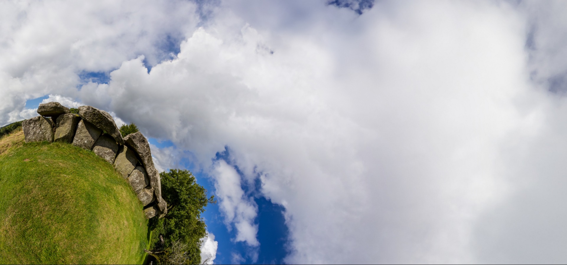
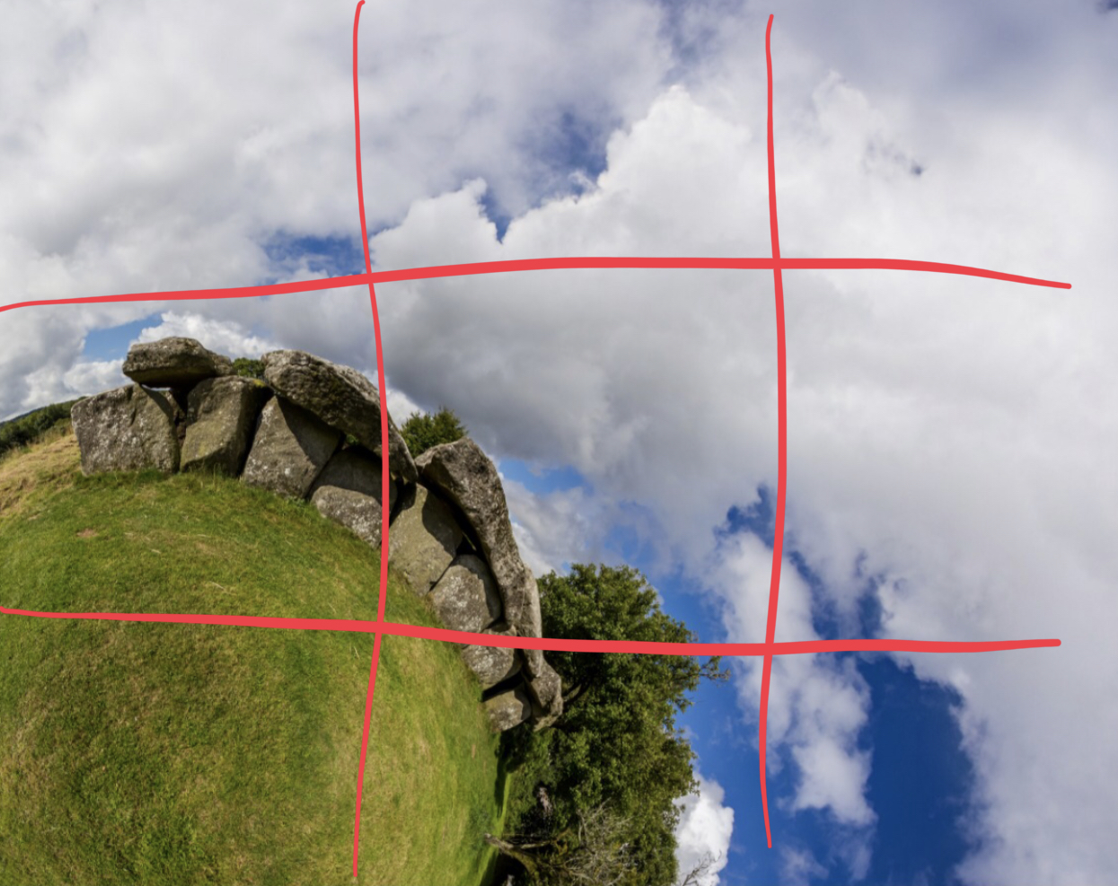
Nice picture, with one exception; you did not capture more of that green area. Hence you have a bad framing and that is a reason for technical error rejection.
You should either have all sky, or more of the green area more to the base rather than in a small corner.
Regards
JG
 12
Replies
12
12
Replies
12
Copy link to clipboard
Copied
Hi carlosmartin
Nice picture, with one exception; you did not capture more of that green area. Hence you have a bad framing and that is a reason for technical error rejection.
You should either have all sky, or more of the green area more to the base rather than in a small corner.
Regards
JG

Copy link to clipboard
Copied
Hello,
I agree with Jacquelin, your composition isn't good. It's top heavy. It's weighted down too much (the ground) on the left of the frame.
From Adobe:
Quality and technical issues rejected at Adobe Stock
Technical issues
When we reject a file based on technical issues, we have identified technical flaws other than focus, exposure, or artifacts, which we call out specifically.
...
General composition: Is your horizon straight? Have you cropped the image too much? Consider leaving a designer room to add their own text or objects.
___________________________________________________________________________________________________________
Therefore, I think in this situation the 'Technical issues' would come under composition.
Copy link to clipboard
Copied
Thank you very much Jacqueline and Ricky for the comments.
The composition of the image is not, effectively, counterbalanced, but this effect is done on purpose thus leaving a large space for text or other graphic material related for example with prehistory, the green planet, humanity, the environment ... The composition itself, alone, I agree that it is not correct.
Another image of this same style and composition was recently accepted. So, finally, I do not know if contributions of this type will be accepted in the future.
Thanks again for the feedback and your time.
Copy link to clipboard
Copied
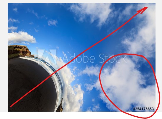
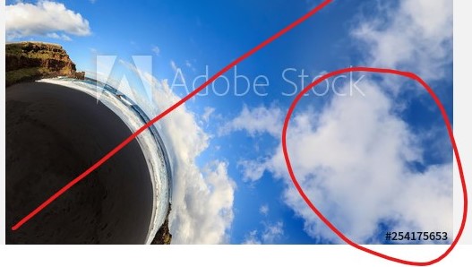
Just for comparison if you like, could you post your accepted one? We could then compare and contrast the differences between them.
Copy link to clipboard
Copied
Hi carlosmartin
Probably we could highlight the difference. I you prefer, you could just send us the photo ID and we could look it up and see the difference.
Regards
JG
Copy link to clipboard
Copied
Hello again and thanks for your time!
The ID of the accepted image is 254175653
I'm not sure if the link bellow will work
I think the two images (this and the rejected one) have a similar composition showing a significant part of a little planet projection and leaving ample room to introduce additional text or graphics.
Regards,
Carlos
Copy link to clipboard
Copied
Hello,
I can see a difference. The other photo works. Why? It's more of a square format and is better balanced. You have more space at the top, and the cloud fits nicely in the bottom right and the black sand fits nicely in the bottom left. You also get a nice diagonal going through the image as well.
Your other image is too rectangular and that is why it appears top heavy, and therefore composition not working very well.
That's how I see it.
It is a better image than the other one! If you also made this more rectangular, it also wouldn't work very well.
Copy link to clipboard
Copied
Your are right!
I could argue that in a later use of the image, taking into account that the size is large, one could crop the image as needed, but I fully understand that the reviewer must judge the quality of the image for itself in just a few minutes and effectively I agree that the composition is not correct.
Thank you very much for your comments. Very interesting and useful for future contributions.
Regards,
Carlos
Copy link to clipboard
Copied
Hi carlosmartin
While post copping could be a solution to some image balancing, it is not recommended. Adobe prefer you upload the image the size you take it. Therefore it is important that you make your best framing from the outset.
Regards
JG

Copy link to clipboard
Copied
I’ve cropped pictures to get a better composition. Crop, resubmit and see what happens:
Copy link to clipboard
Copied
Hi Abambo
I did not say no post crop, I said "Adobe prefer you upload the image the size you take it". I was not the one who came up with that. When I just started out, I got rejections that specified I should not crop, but upload as I take them. Since then I do small cropping and submission is accepted, thus I state it's a preference.
Therefore, it is better to frame images so that they will not need to be post-cropped.
Regards
JG
Copy link to clipboard
Copied
Thanks Abambo, Jacqueline and Ricky for your comments!
I agree that a good composition from the beginning is always the best option but, in my opinion, a small crop in post-processing is unavoidable.
In the case of these little planet mosaics, which have been built with around 10 shots each, you have plenty of pixels in the original equirectangular file (in my case usually more than 12000x6000), so you can build your final composition as you like: the complete little planet in the center, in one side, more or less sky, or multiple partial views, as is the case with these little planets in a corner.
In my case, the purpose that I foresee for this kind of composition with the planet in one corner is not the use of the image itself just like that, but in the context of a graphical work, where you have a big and empty sky background in one side (with or without clouds) where you can place text, graphic material, charts, other images, etc. using the lateral background as a canvas for your message
Having said that, my conclusion for future contributions of this kind is that in addition to leaving a lateral large free space for possible further use, the general composition of the image has to be right by itself avoiding an excessive unbalance.
Thanks again for your time and useful advice.
Regards,
Carlos
 AdChoices