 Adobe Community
Technical Issues

Copy link to clipboard
Copied


 7
Replies
7
7
Replies
7

Copy link to clipboard
Copied
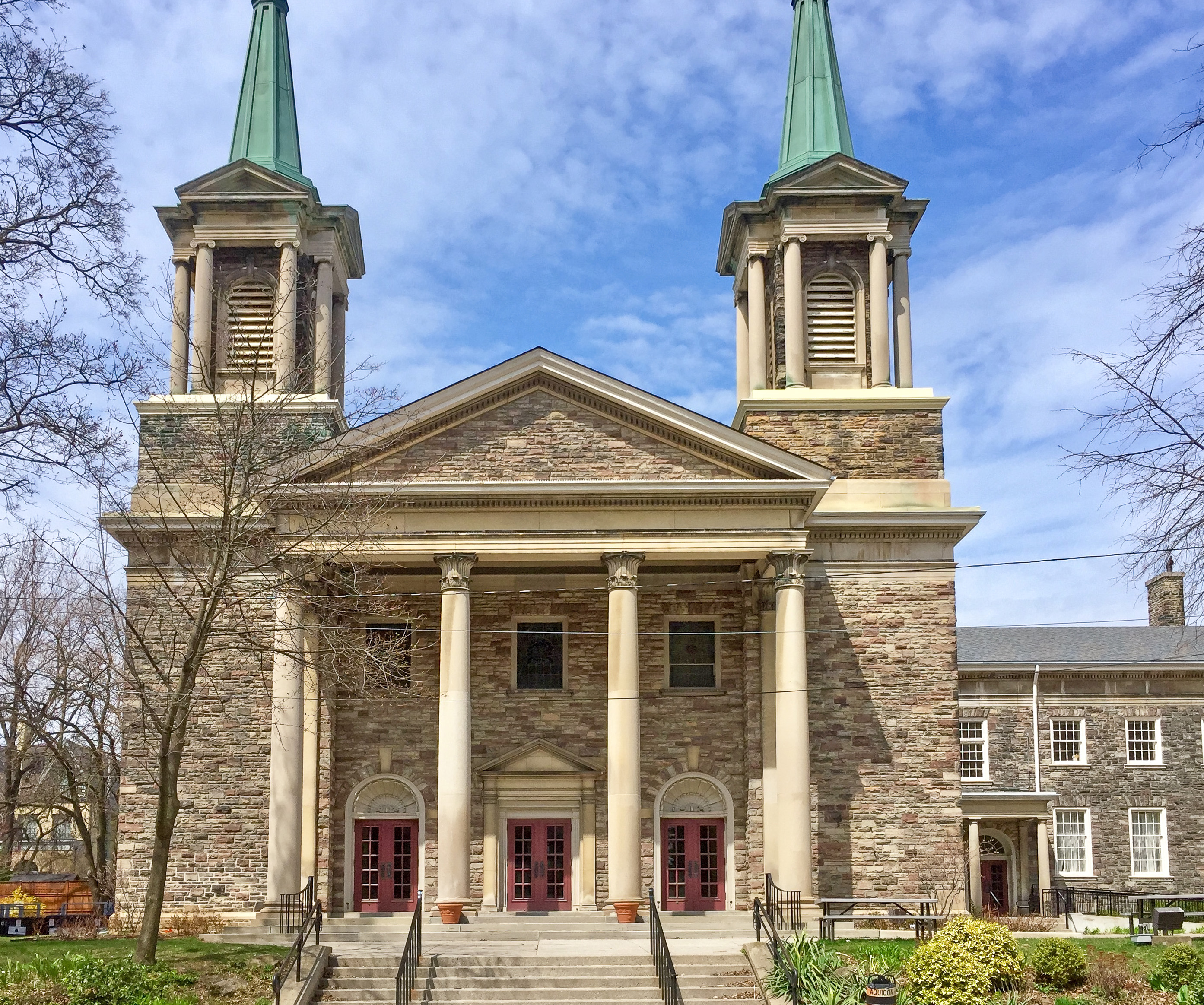
It will be helpful if you add the images directly in you post so people don't need to download the photos to view. I think each image is borderline. Probably could have been approved assuming there isn't an IP violation with the building specifically but the rejections make sense too. Of the four, #7953 is the best. If I had to guess why it was rejected I would speculate it was perceived to be oversaturated. The HDR effect makes it look too unnatural. It's not bad, but the review process is subjective. It also appears the building is leaning back due to lens distortion. You can probably correct that by activating the lens correction button in Lightroom.
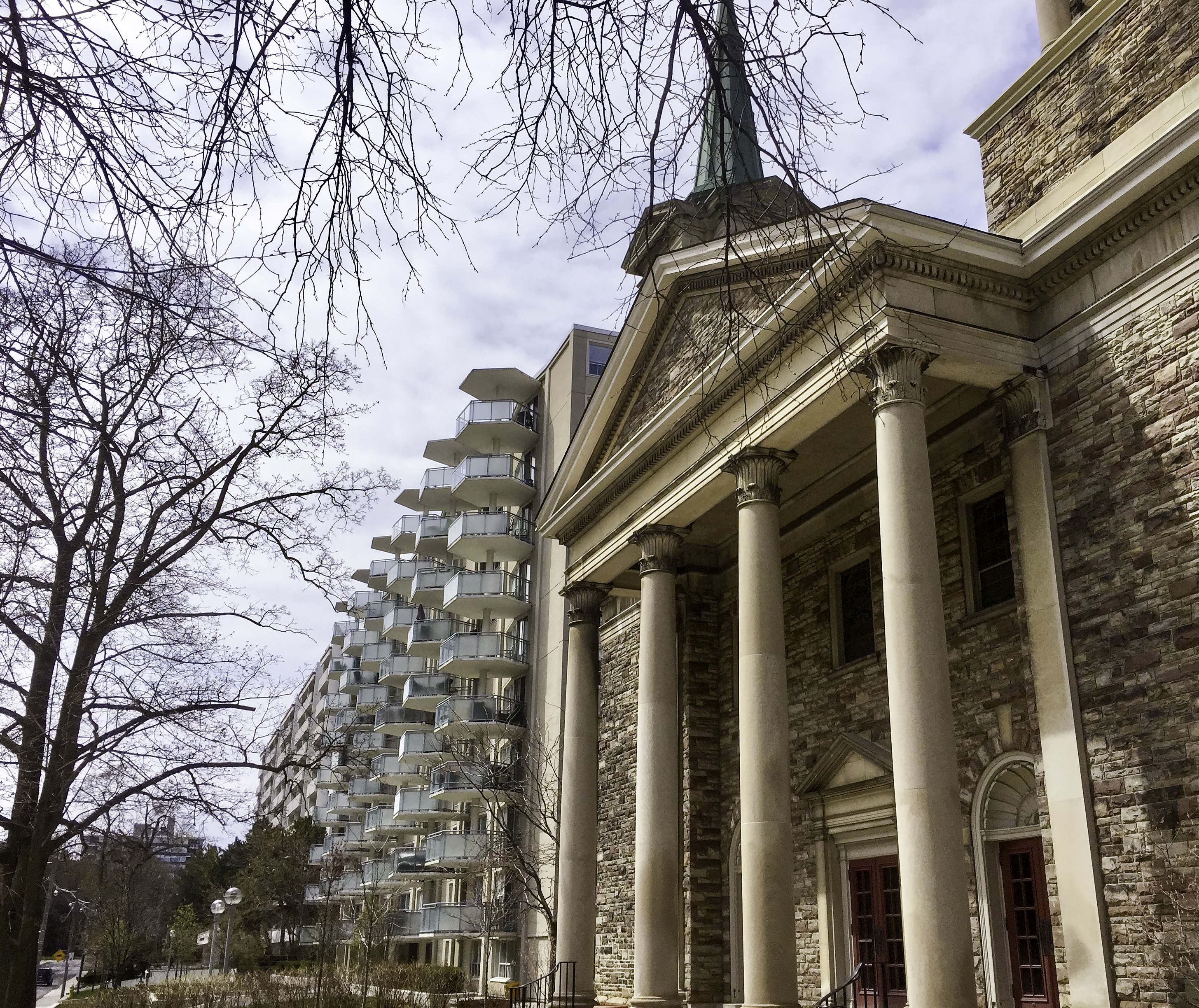
Images 7950 and 7967 have composition issues. The crop is uncomfortable and is a distraction as important elements of the building are missing. Sometimes this can be an effective form of composition but in this case it appears as though it's a lens limitation vs a creative choice. If you don't have a wider lens, next time consider backing up a few steps.
Image 7981 seems to lack any real commercial potential in my opinion. There isn't much going on here. Specific technical issues would be the white balance too warm and composition issues. Assuming the main building you've been shooting is fine for IP, the apt building next to it featured in this shot is likely a deal breaker for IP however. More importantly in my opinion is the general aesthetic of the image. I get what you're going for here but the scene isn't idyllic. The setting of the picnic table seems so random and unappealing and the grass surrounding it is a mess. I don't know what this image would be used for if licensed.
Keep trying! I wish you the best of luck with your future submissions.
-Mat Hayward
Copy link to clipboard
Copied
Thank you, Mat, for your detailed feedback. You helped me to understand the issues better. I will fix the image #7953 and resubmit it.
Olga

Copy link to clipboard
Copied
Hi Olgae,
Beautiful buildings you got there. However in addition to what is already said there is the matter of noise. All photos are excessively noisy - both chromatic and luminance. Images 7953 and 7950 has a halo around the edges. It is more noticeable at the edges at the right.
7981 has a case of too much highlights to the left, blowing out some details. This photo has a high level of chromatic noise.
7967-2 has a case of blue and purple color fringing that are especially visible around the edges of the trees of the left side of the photo.
Please zoom to between 100 and 200% to see these issues.
Best wishes
JG
Copy link to clipboard
Copied
Hi JG,
Thank you very much for pointing me in the right direction. I might be able to improve the images and submit them again.
Sincerely,
Olga
Copy link to clipboard
Copied
You are welcome Olga

Copy link to clipboard
Copied
Hello,
You may have another problem with the submission of these photos and that is that you took them on a smartphone - according to the metadata. The problem with smartphone photos is that it is taken on a small sensor and saved as a JPEG file. This introduces JPEG compression artifacts and can be noticed when you enlarged them like here - img 7953:

You get a 'blocky like' appearance of the pixels.
Another rejection reason, therefore, could be artifacts.
Generally speaking, I have found that smartphone pictures are not so good for Adobe Stock. The quality of the picture has to be as good as if taken on a DLSR - or a camera with a bigger sensor.
Have a read of this guide from Adobe:
https://helpx.adobe.com/stock/contributor/user-guide.html
Copy link to clipboard
Copied
Hi Ricky,
Thank you for looking into the issue. I have been thinking about investing in DLSR for a while. You have provided me with a good reason to do that.
Sincerely,
Olga
 AdChoices