 Adobe Community

Copy link to clipboard
Copied
I submitted a photo of a cappuccino coffee mug and it was turned down due to Aesthetic/Commercial reasons. So i checked to see what else similar/equivalent was in Adobe's stock photo library, in order to understand the decline reasons. I didn't see much better photos than mine, at least no enough to justify a decline. Also the same pic that Adobe declined is in other image bank sites, with great success.
What can i do about this, can make an appeal perhaps, and if so... how?


 1 Correct answer

You can re-submit it for review, Maybe give it a new title and select interesting descriptive words. I have done this several times and once my art is corrected it is usually accepted. Check it for contrast - see how it looks best, lighter or darker.
 10
Replies
10
10
Replies
10

Copy link to clipboard
Copied
Hi,
I think a good first step to answer your question is to show the photo here so that the forum participants can give their opinion.
Greets,
v.poth
Copy link to clipboard
Copied
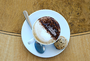
Here is my masterpiece 
Copy link to clipboard
Copied
Personally, I like it. It is in perfect form. Balance. Maybe not enough contrast in the lighting - a bit too perfect. Aesthetic means characterized by strict discipline and firm restraint. Synonym = severe. So, how shall that apply here? Did you check the guidelines and information on Adobe information pages? JH
Copy link to clipboard
Copied
Thanks for your time, which guidelines exactly are you referring to?
Copy link to clipboard
Copied
Hi,
I think of this kind of motif there are thousands of them in the Adobe database and here you have to provide very good material to get it accepted. Unfortunately, I don't see the picture as such.
One point is the coloration of the image, which is too blue and therefore the coffee and biscuit do not look natural and "tasty".
Another point is the picture design, here I see a problem in the position of the spoon and the handle of the cup. These are arranged by you according to your graphic viewpoints, but they do not correspond to the usual arrangement of an observer. At least the handle of the cup should be on the right side, as this gives the viewer the impression that he can "grab" the cup so directly. The same applies to the spoon.
Sometimes you can break rules like that, but it doesn't fit here, I mean.
Greets,
v.poth
Copy link to clipboard
Copied
The handle is placed on purpose as such because this photo is for left handed people
Anyway, i know what you mean but that photo is surely better than others that are already in, but apparently my submission came in late.
Copy link to clipboard
Copied
You were definitely right about the "blueish" color on the white cup plate i presume! I just corrected that, but there is no point now since the pic was rejected!
Copy link to clipboard
Copied
You can re-submit it for review, Maybe give it a new title and select interesting descriptive words. I have done this several times and once my art is corrected it is usually accepted. Check it for contrast - see how it looks best, lighter or darker.

Copy link to clipboard
Copied
Composition would come under aesthetic reasons - although the arrangement of the cup handle may depend whether one is right or left handed.  I don't think the spoon should be directly under the handle. As you are looking directly down you have too many lines - spoon intersecting the handle and then the curved line intersecting the cup. I don't think the arrangement works well works well as v.poth mentioned. Other people may disagree of course.
I also agree with v.poth - the picture is a bit too blue- so here your white balance is not good. However that aspect comes under 'technical reasons'.
I also personally feel it's a 'nothing special' shot - but again this a subjective thing.
Copy link to clipboard
Copied
The guidelines I refer to can be found here - in a note from Adobe which usually accompanies each rejected project. The more you study these helpful training and information pages, the more of your products are accepted. JH
"To learn more about the type of content we're looking for, please visit this page": https://www.adobe.com/go/stock-contributor-help
 AdChoices