 Adobe Community

Copy link to clipboard
Copied
It can be very frustrating when the reviewers give no feedback, beside the generic 'exposure problem.' Is there a place where they are typing clues but I just haven't found it? I already brightened this picture 0.5 stops in another version and resubmitted, but that too was rejected for the generic 'exposure problem' (no feedback provided that I can find). I assume they're not looking for me to turn night into day, which would be comical. Is it the camera screen? Is it the rocks (which has some clipped shadows in the cracks where there is no light, it's night).
This one really has me scratching my head, but one can only spend so much time on a stock photo. Since I can't seem to find any notes, I have since sent this picture to two other stock services where the photo was twice accepted, which is a shame because I enjoy using Adobe. I would really appreciate it if someone could help me understand for future submissions. It must be right in front of my nose, but for some reason I just can't see it.
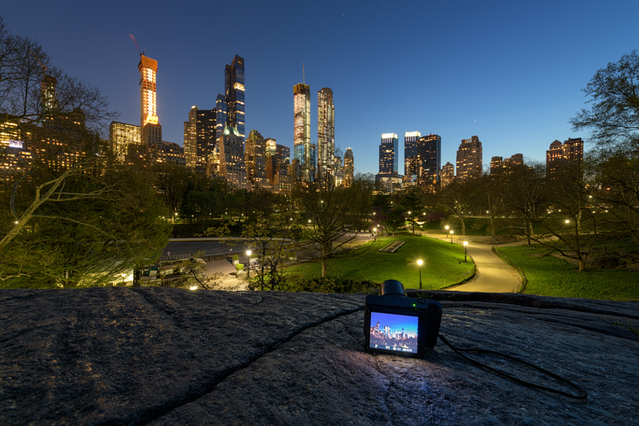
8256x5504, 30 sec. f/8 14mm, D850, 14-24mm f/2.8, ISO 80


 1 Correct answer

As it is a night time shot, you don't seem to have a lot of depth to your colours - kind of washed out a bit. I think you need you to darken your exposure a bit. The sky is a bit washed out and not a deeper blue as it should be. I guess you took this in raw, so I would suggest that you darken your exposure a bit. Something like this maybe! Although the difference here is subtle, it is more noticeable in Adobe Photoshop. However, this could also be a matter of opinion! Sometimes, it is only a sub
... 16
Replies
16
16
Replies
16

Copy link to clipboard
Copied
At a first sight, the picture seams to be ok. I suppose it’s that stripe of trees causing problems. It took me some time to understand that part of the image. Slight editing in that part could help.
Copy link to clipboard
Copied
As it is a night time shot, you don't seem to have a lot of depth to your colours - kind of washed out a bit. I think you need you to darken your exposure a bit. The sky is a bit washed out and not a deeper blue as it should be. I guess you took this in raw, so I would suggest that you darken your exposure a bit. Something like this maybe! Although the difference here is subtle, it is more noticeable in Adobe Photoshop. However, this could also be a matter of opinion! Sometimes, it is only a subtle difference between acceptance and rejection, as I have found out myself!

Copy link to clipboard
Copied
Much better image if you cut away the monitor imo.
Copy link to clipboard
Copied
Thanks so much oleschwander, I appreciate the feedback. I took the picture that you suggested. That is a different shot and is in the native 8256x5504 without being cropped. This one here was intended to be a recreation shot about photography or travel related, with the theme of taking pictures in Central Park with the night lights. It's not a big deal and really doesn't matter. This image is now available for sale elsewhere so I won't be editing it any further.
I was just hoping to understand the mysterious "exposure problem" that has me scratching my head and is not clear in the histogram. Some people have suggested it needs brightening while others think it needs to be darkened with, perhaps, increased saturation. I just wanted to know for future submissions so that I could improve and better meet the guidelines. The note that I was given doesn't provide any guidance on this shot.
Copy link to clipboard
Copied
As I can see that the image on the monitor is not in focus. In such an image it should be in focus Imo. By the way - is anything in focus ..?
Copy link to clipboard
Copied
Thank you oleschwander. Yes, I am seeing what you are seeing. This forum required me to down-sample the original image so that it could be posted here. I believe I had to generate a small 900 pixel image, which is surprising considering it's a forum dedicated to image quality. I didn't see a work around, unless I missed something. So, I agree with you, it appears a little blurry. The original is certainly not and the rejection note was "exposure problem."
Copy link to clipboard
Copied
scottsegler wrote
The original is certainly not and the rejection note was "exposure problem."
It may be that when you correct the „exposure“ problem, that the next refusal will be something other. You never know...
Anyhow I find the camera OK. If a buyer needs the panorame, he can crop out the camera, that‘s no problem. May be you should look at the exposure a little bit and resubmit.
Copy link to clipboard
Copied
scottsegler wrote
This one here was intended to be a recreation shot about photography or travel related, with the theme of taking pictures in Central Park with the night lights.
For what it's worth, I like your idea of using the camera screen showing a nighttime picture. Cropping out the bottom part would defeat the purpose of the picture. So, thumbs up from me on your idea!
Copy link to clipboard
Copied
Many thanks, ricky. I was just trying for something a little different. I always thought the rejection would come for intellectual property. Although I scrubbed all marking from the camera, it is a product and I would guess subject to trademark and whatnot. I figured that would be the risk here, not "exposure problem."

Copy link to clipboard
Copied
Hello scottsegler,
Abambo and rickey336 are very good with this sort of thing. I do notice something not mentioned by either. The very strong white in places of the picture from the tv screen in the foreground to the street lights and many building lights. If you will take down any glare and mute the whites that stand out, it will help your next review. I presume you are looking at this shot at 100-200 % magnification where all things show up. Is there a reason you left the bottom part in? The tv set seems to have a picture of a picture in a picture, but I wonder if a buyer could find a use for it. Take a look and do look at the guidelines for contributors to Adobe Stock. Best regards, JH
https://helpx.adobe.com/stock/contributor/help/quality-and-technical-issues.html
Select an article:
ON THIS PAGE
Applies to: Stock Contributor
Last Published: September 25, 2017
Copy link to clipboard
Copied
joanh22203655 wrote
Is there a reason you left the bottom part in? The tv set seems to have a picture of a picture in a picture, but I wonder if a buyer could find a use for it.
Hi Joan!
Thanks for the flowers. Just to say: The "TV set" is really a camera and there is a reflection of that on the rock. If you take that part away, you need to cut of the whole rocky part.
Copy link to clipboard
Copied
You are right and I was hinting that might be a good thing, crop the entire bottom/rock section. Best regards, JH
Copy link to clipboard
Copied
Yes, I thought about it at first too.
Copy link to clipboard
Copied
Thanks so much to everyone for your kind feedback. I really appreciate everyone's ideas.
I wish I knew what the reviewer was thinking with a few typed words like "treeline dark," "increase saturation," "drop exposure," or "story doesn't work." I guess 'exposure problem' can mean many different things to different people. It would be so helpful to Adobe's community if the reviewers typed a few or two simple words to clue us in.
Copy link to clipboard
Copied
We do not know neither what reviewers are thinking. Sometimes it’s obvious...but there are also cases where you could get a decision one or the other way. Please note: a reviewer has very little time to take his decision.

Copy link to clipboard
Copied
Do not get distracted. The rejection is not about technical issue, it's about exposure - too much light, or too little light. Ricky's rendition looks more like it. Scottsegler's photo looks a bit washed out.
 AdChoices