 Adobe Community
- Home
- Stock Contributors
- Discussions
- Images rejected due to technical problems
- Images rejected due to technical problems

Copy link to clipboard
Copied
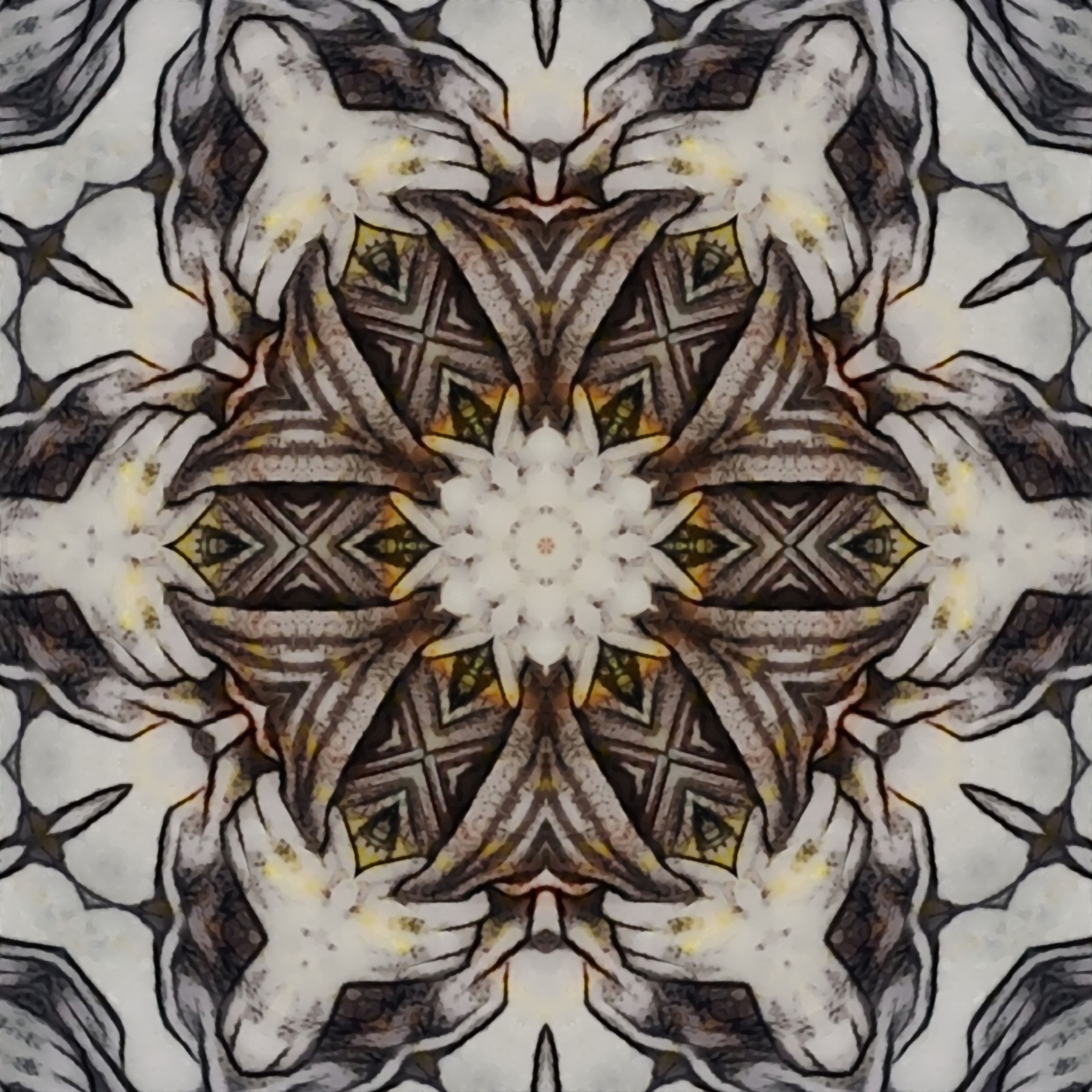
Hi everyone, I write here because I would like to understand what's wrong. I sent a series of kaleidoscopic images: some were accepted and others were rejected due to technical problems. I enclose two of the rejected images.
I use the same program to create them and the same program to make them in high resolution in the final measure of 50 cm x 50 cm with a resolution of 300 dpi. I use the same working parameters with all of them. I don't understand why they were rejected and others not. Where am I wrong? How can I improve these images to be able to send them again? I accept your opinion. Thank you.


 1 Correct answer

I would suggest maybe using 'auto tone' in Photoshop for example. Why? The images are a bit dull. You could have more contrast added to them.
For Adobe 'Technical Issues include:
Contrast: There may be too much or not enough contrast.
Saturation: Oversaturation may give your file an unnatural look, but under-saturated or spot color can also result in technical decline.
https://helpx.adobe.com/stock/contributor/help/quality-and-technical-issues.html
 4
Replies
4
4
Replies
4

Copy link to clipboard
Copied
I know your frustration. One of my image was rejected apparently for technical issues. It's as sharp as you can get it. I'm closing this account and will go somewhere else (there are plenty). We work hard for our images and I for one at 78 years of age and 63 years as a photographer and in the business of Photography and have other things to do. I don't think they know anything about quality. I worked hard into putting an image on their page and that's whatI get. Oh yeah, I'm not using an iPhone to make pictures that must be why. I tried putting several images together as a group and everything froze. I couldn't get those images out for approval and I did everything they tell us to do. Go to Shutterstock, they're much better and the process is much simpler.
Copy link to clipboard
Copied
I thank you for your comment. I would like to understand where is the mistake in my images so that I can process them taking into account any correct parameters (sharpness, contrast, brightness, dpi, ...). Also because using 3 different software, I can adjust what it takes to make the image correct. Many of my images are light slightly blurred because I process them by hand on tablets and PCs to make them look like paintings, so they can't be sharp as a vectorial image. However, I don't understand why some images of the same type are accepted and others not.
And I'd like to know it so as to optimize the time that I possess to process the other images I have in my drawer (around 1500) for don't find them rejected in the end.
Copy link to clipboard
Copied
I would suggest maybe using 'auto tone' in Photoshop for example. Why? The images are a bit dull. You could have more contrast added to them.
For Adobe 'Technical Issues include:
Contrast: There may be too much or not enough contrast.
Saturation: Oversaturation may give your file an unnatural look, but under-saturated or spot color can also result in technical decline.
https://helpx.adobe.com/stock/contributor/help/quality-and-technical-issues.html
Copy link to clipboard
Copied
Thank you so much for your suggestions. I will try to correct the images as you suggest and I will send them again.
 AdChoices