 Adobe Community
- Home
- Stock Contributors
- Discussions
- Not all pictures need to be perfect
- Not all pictures need to be perfect

Copy link to clipboard
Copied
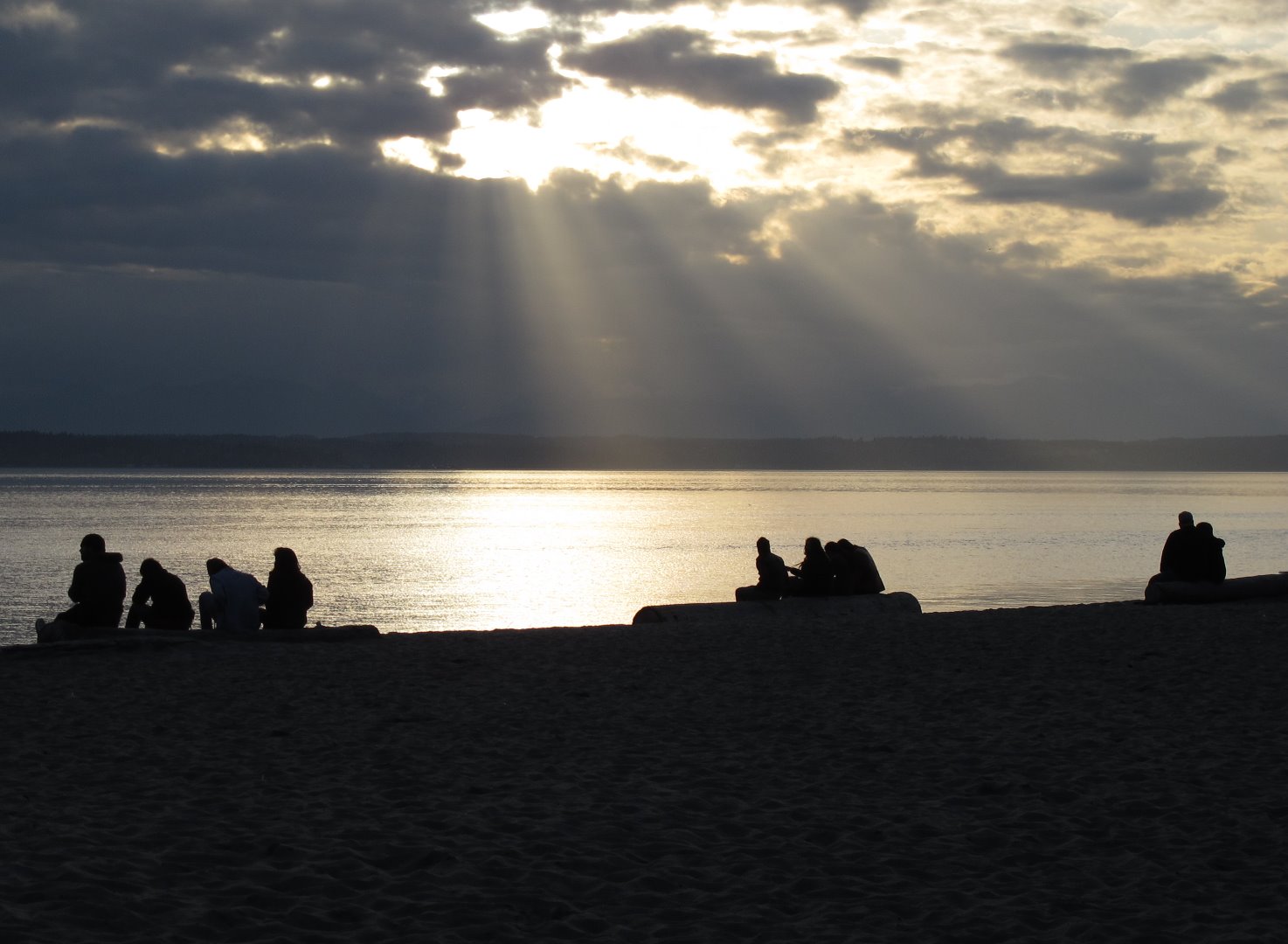
I submitted this and it was rejected.
The point of this picture is light and shadow. The silhouettes of people are in contrast to the light filtering through the clouds. I admit I am biased, but what is wrong with this picture?


 1 Correct answer

I would suggest this could have been rejected due to exposure issues. Despite the intent of light and dark, the white bit is a bit of a white blob - burnt out, and foreground somewhat too dark and too much of a dark blob. However, this is just my opinion!
 7
Replies
7
7
Replies
7
Copy link to clipboard
Copied
you have not mentioned reason of rejection here. May be you have submitted as commercial without model release of all people in your image.
Copy link to clipboard
Copied
It had an artifacts problem. Nobody is recognizable here, so there would be no need for a release.
Copy link to clipboard
Copied
I would suggest this could have been rejected due to exposure issues. Despite the intent of light and dark, the white bit is a bit of a white blob - burnt out, and foreground somewhat too dark and too much of a dark blob. However, this is just my opinion!

Copy link to clipboard
Copied
I agree with ricky336, too much contrast and bright whites. This is the Adobe information about rejections. JH

Copy link to clipboard
Copied
The images you upload should be as "perfect" as possible, I think, in terms of technical, design and commercial usability, in order to address the headline of your thread.
My guess for the rejection:
Technically everything is ok, but the picture looks too "sad" for a stock picture. The sky is very pale, has little drawing and little colour. The foreground is very dark and forms a strong contrast to the background. It looks very dark overall and not very positive. It is probably not suitable as a beach vacation photo and for a weather phenomenon it is not "dramatic" enough, I think.
Which buyer should use it for what purpose is the question?
Greets
v.poth
Copy link to clipboard
Copied
Thank you for your input.

Copy link to clipboard
Copied
Colors are dull the white in the sky is blown out – and you can't really see what the people are doing and they are too far from each other - wrong composition imo.
 AdChoices