 Adobe Community

Copy link to clipboard
Copied


 1 Correct answer

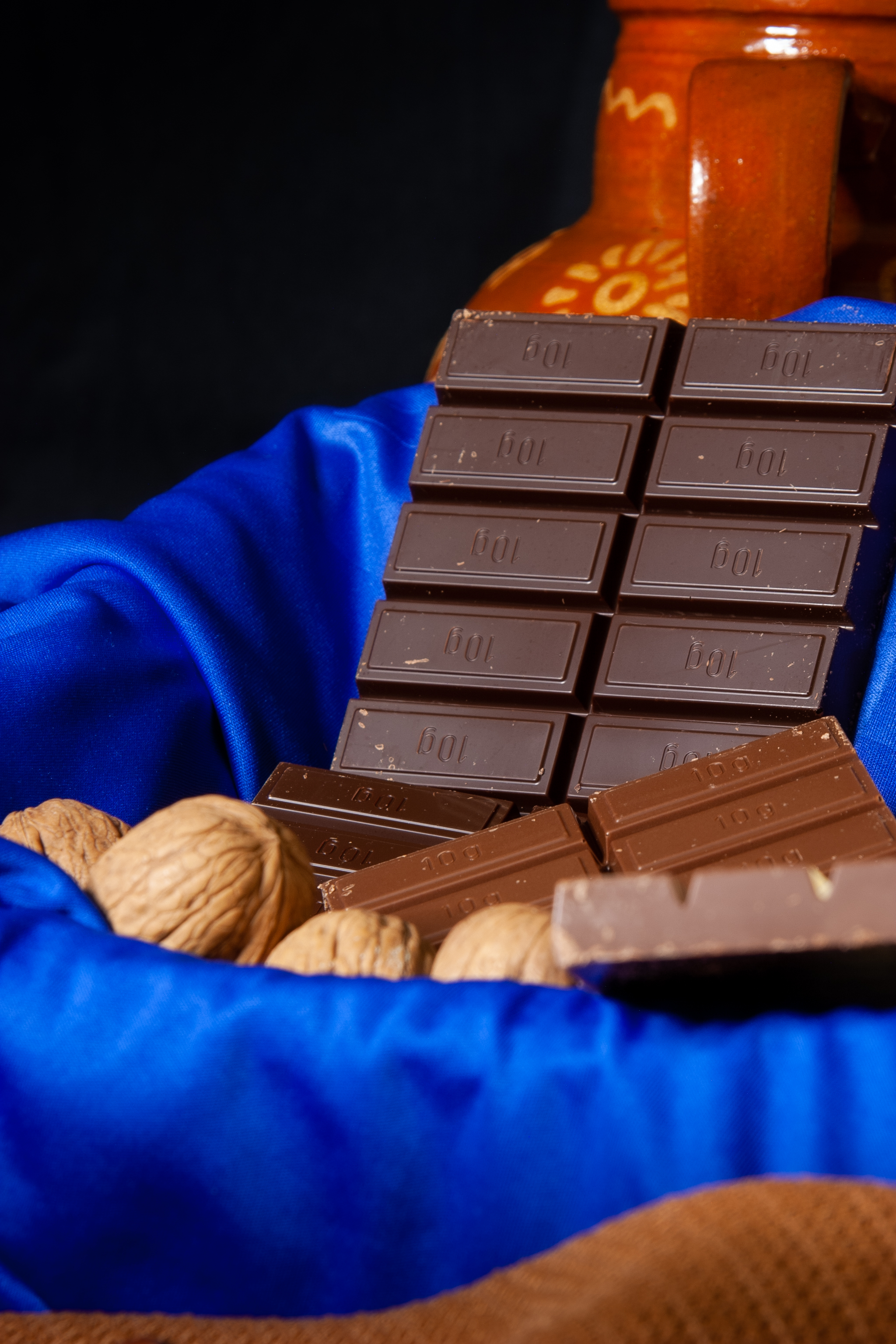
4: Composition and white balance (picture is too cool). I would also photoshop the highlights out.
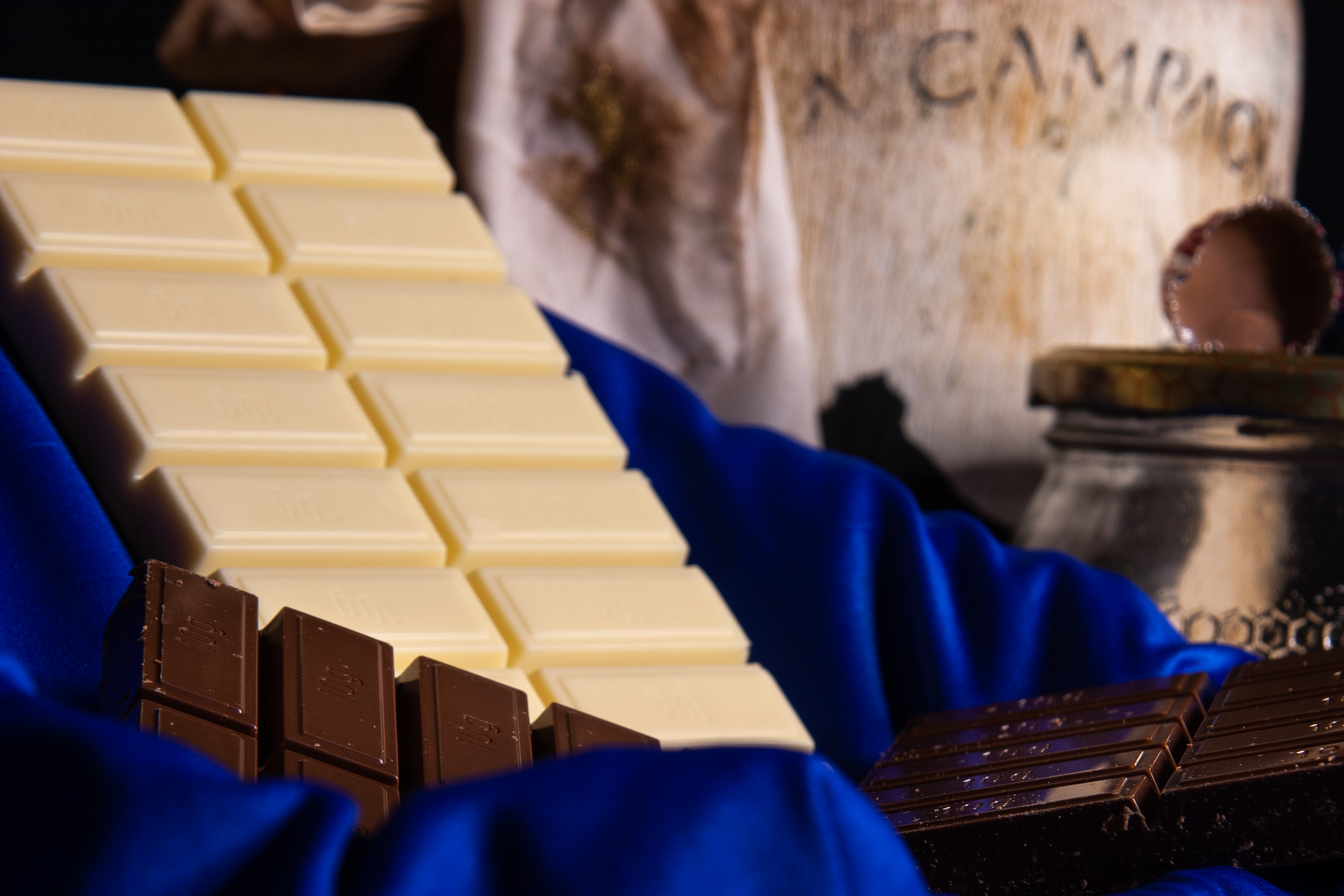
3: Composition — the white chocolate should be in focus, I would even tend that all chocolate needs to be in focus. In addition, the white chocolate should not be cut off at the edge.

10. Nice composition. The nut in the foreground could get less exposure. I suppose also here is the white balance off. It's not easy for a camera to get the correct colour with such a blue cloth and blue light reflec
... 5
Replies
5
5
Replies
5
Copy link to clipboard
Copied
4: Composition and white balance (picture is too cool). I would also photoshop the highlights out.
3: Composition — the white chocolate should be in focus, I would even tend that all chocolate needs to be in focus. In addition, the white chocolate should not be cut off at the edge.
10. Nice composition. The nut in the foreground could get less exposure. I suppose also here is the white balance off. It's not easy for a camera to get the correct colour with such a blue cloth and blue light reflecting everywhere.
6. You have an underexposure of the darker chocolate and over exposure of the white one. Furthermore, the white chocolate looks a bit unappetizing and also the darker ones show traces of wear.
I suppose that the moderator was quite stringent for most of your pictures because of the quality of the competition.
Copy link to clipboard
Copied
Thank you very much, your comments help me a lot, I will take them into account.
Copy link to clipboard
Copied
You're welcome. I suggest also that you look at others portfolio for chocolate pictures. (I'm getting hungry...)

Copy link to clipboard
Copied
In the first image, the out of focus components in the foreground are distracting. I think we're trained to expect items in the foreground to be in focus, while items in the background can fall off in focus somewhat. I can't discern what the orange pottery is or why it's there - a pot? a cup? a mug? The frame should have been composed so that the item can be detected and its function can be understood. While it's not actually a "technical issue" I would have preferred to see some of the nicks and cuts in the chocolate in all the images cleaned up. Also, the shiny blue cloth doesn't lend an organic feel to the image as the other items in the composition do. It seems rather jarring and out of place, though this is more of an aesthetic issue than a technical issue.
Copy link to clipboard
Copied
Your advice helps me a lot, I will take them into account and apply them to my future photographs, thank you very much.
 AdChoices