 Adobe Community
- Home
- The Lounge
- Discussions
- how to make musical concert poster for adobe start...
- how to make musical concert poster for adobe start...

Copy link to clipboard
Copied
I'm a adobe starter
I learned a few skills from adobe tutorial
I want to make band performance poster
to make poster I want to see few samples and skills which makes a better images, fonts
anyone who have experience about making poster can give me advice or show some sample poster?


 1 Correct answer

From your user name, I am guessing you are asking about Korean pop? Or what I believe is referred to as K-Pop?
With that in mind, Google is your friend.
From a quick look on Google, I'd say that the photography is the important part. These are well lit studio shot, and not something you could take outside with your iPhone. Putting the poster together is the easy bit.


 5
Replies
5
5
Replies
5
Copy link to clipboard
Copied
From your user name, I am guessing you are asking about Korean pop? Or what I believe is referred to as K-Pop?
With that in mind, Google is your friend.
From a quick look on Google, I'd say that the photography is the important part. These are well lit studio shot, and not something you could take outside with your iPhone. Putting the poster together is the easy bit.

Copy link to clipboard
Copied
The posters that you put here is the one I'm looking for and thank you for your advice too. It was hard for me to imagine the whole picture and I realized photo, letter, background is all I needed
Actually my brother asked me his band performance poster but I think I can make it easier than before
Copy link to clipboard
Copied
가영여13794960 The K-Pop photographic style seems to be very clean and well lit studio shots. The Diamond Edge poster image of the lads, is actually quite technically challenging, and I am thinking it would be difficult for a keen amateur to achieve that look. The sea of white clothes are remarkably well controlled with not a single blown pixel that I can see. If I had to take a group photo with that look, but without professional studio equipment, I'd look for a brightly lit (preferably LED lighting) with white walls. The room would need to be just big enough to contain the lads. You'd be cutting them out from the background with a clipping mask, so walls are not going to be a problem, but you want to keep all the light coming from all around to give you those lovely soft shadows.
To put this 'look' into some sort of perspective, it reminds me of the images Dave Hill was famous for. His group shots at least. There used to be all sorts of theories about how he achieved his style, but it turned out he used to use a bunch of 2000W studio lights. He'd set up the shot, then mark each person's position, and shoot them individually so he could get the lights in close without the subjects casting shadows on each other. Then he'd composite them back together. There is a story about how he did a certain famous three person band, and had the lights _really_ close. Unfortunately he forgot to warn them how powerful the lights were, and the BANG, and brilliant white light from the first shot nearly gave them heart attacks.
You can hear these stories first hand from the Lightsource Studio Photography podcasts. They stopped making them in 2010, but there is so much experience from some truly great photographers in those podcasts. I was going to mention a few names, but it is impossible to pick out a few with so many great names on the list. If you have ambitions to be a professional photographer, then work your way through the list. There is information there you simply won't get from books or websites.
LightSource Studio Photography Podcast by StudioLighting.net on Apple Podcasts

Copy link to clipboard
Copied
Are you planning to have this professionally printed? Talk to your print professional before you start to understand exactly what he expects from you. Start with the paper type and size you will be working with.
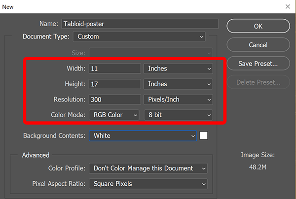
For printed posters, I always start in Photoshop with a new canvas of required height and width, a resolution of 300 pixels per inch and an RGB color mode. After the project is completed, I export it to PDF and a CMYK color preset.
Alt-Web Design & Publishing ~ Web : Print : Graphics : Media
Copy link to clipboard
Copied
your tip is very useful although the poster I would make is not professionally printed

 AdChoices