 Adobe Community
- Home
- The Lounge
- Discussions
- Re: Where Can I Find A Good Tutorial About Selecti...
- Re: Where Can I Find A Good Tutorial About Selecti...
Where Can I Find A Good Tutorial About Selecting Fonts and Typography In General?

Copy link to clipboard
Copied
I have, on occasion, run into folks who say that certain fonts are "inappropriate" for certain uses and that somebody's use of typography is "wrong" - but they rarely offer any advice.
I admit to seeing this when reading comments on commercial website templates, and not in respect to my own work, but it really makes me wonder what they are talking about! I always just go with what looks good and is easily readable (i.e. - no fancy script fonts with lots of ornamental bits for headlines and logos) but even things which seem fine to me get these criticisms.
I'd love to find a tutorial explaining what characteristics to look for in a font for the intended use, and exactly what is meant by "bad typography" in a layout.
If you've read some of my previous posts, you probably know I'd prefer a free tutorial, but am open to a commercial one if it is in depth and comprehensive.
Ironically, I had a hard time finding any in my searches. So any advice would be appreciated.


 16
Replies
16
16
Replies
16

Copy link to clipboard
Copied
Very large, subjective topic... Is there a particular area of design that you are seeking info? This would help to direct this discussion to the right forum as the Lounge isn't really for answering questions though I understand why you posted here. This topic can cover miles of info and directions change as design fads (not the best choice of words) determine what is good and what is bad. So if you can pick an area that best describes where you are headed with this search will at least get you a start hopefully in a direction.

Copy link to clipboard
Copied
Disclaimer - Not a designer with no formal design training... so that may be of help (or not).
I tend to attack things in much the way you are... what looks good for the purpose. But, what you are wanting to know is 'what looks better'. The difference between 'good' and 'great'. That is very similar to asking why the Mona Lisa is so famous, and just about every other female portrait is not. The subjective field here is a mile wide (1.6km) and an inch (2.4cm) deep. The problem tends to the holes you can't see where you trip and get a face full.
So - I would start by learning all you can about fonts and typography in general. There are a LOT of articles on Wikipedia that discuss all sorts of both technical topics (baseline, counter, descender, etc.), as well as aesthetic ones (need of optical 'fattening' when designing light on dark, kerning, leading, hinting, design differences between: light, regular, roman, normal, book, bold, black, and ultra-black).
Study a few well known fonts - Can you quickly identify Helvetica versus Arial? Times Roman versus TimesNewRoman? Why are they different? Why are they similar? Why is Comic Sans MS evil?
Next - Read up on what the font designer was attempting to do with the particular font you are using. For example, Frutiger was not designed for a lot of wordy prose. It was designed for the signage at Charles de Gaulle airport. As such, it makes a great heading font and a poor (if not lousy) body font. But, if you want one that is similar in style - Univers is similar. But, I personally prefer serif fonts for body text.
Then try things, practice, ask folks around you - which one do you like better? Don't give them mumbo jumbo about the fonts... just a visual question. Which do you find easier to read/understand? You do it enough you will start to get a feel for what works and what doesn't.
When you buy fonts be sure purchase high-quality ones from design houses. They may be big (e.g. Monotype Imaging), famous (Typography.com), or tiny little ones where the designer is the web-master, and lives with their spouse and cat out in the country. Great type design in a labor of love and passion. Help support those that do so by paying for their work. You generally won't be disappointed.
If you deal with anything having to do with international I would bone up on UNICODE and why e' is not the same as é, and why you really, really need to be sure to use the correct character codes for the language you are trying to communicate in. Especially languages that don't use the generally available Latin glyphs.
Finally, two great books on the subject -
Stop Stealing Sheep' - Erik Spiekermann & E.M. Ginger
The Elements of Typographic Style - Robert Bringhurst
Better than a video as they perform the layout on the page. You can look at it and see exactly what they are talking about.
Good luck my friend.
Copy link to clipboard
Copied
Doug Hanna wrote:
Why is Comic Sans MS evil?
Ya know... This one has always confused me!
I have what I believe to be reasonably good analytical skills and I have never understood the mass aversion to this particular font!
Everyone seems to deride, berate, and insult anybody using it for anything - anywhere! No reasons given, other than "it's Comic Sans!"
It was this unqualified outrage that convinced me to use it for Certificates Of Analysis for the lab at which I work my day job. I can be an instigator at times 
Now that I think about it, I would actually like to know the answer to why that font is considered so evil.
It's readable, and a bit lighthearted in "mood and feel" - even if it does seem a bit childish for professional use. But I am not above childish behaviour occasionally (as the quote from Doctor Who goes - "What's the point of being grown up if you can't act childish once in a while").

Copy link to clipboard
Copied
Sockratease wrote:
Doug Hanna wrote:
Why is Comic Sans MS evil?Ya know... This one has always confused me!
...
Now that I think about it, I would actually like to know the answer to why that font is considered so evil.
It's not just readable, it's screen-readable. It was designed specifically to be read easily on screens and it's really good for that.
The hate for it comes from office managers (and the like) misusing it. Papyrus and Comic Sans are arguably the two most misused typefaces in the world. There is a time and a place for both of them, but they are so often used out of their element that people forget that.
Copy link to clipboard
Copied
Thanks for the info. I don't understand how a font can be misused if it is easily read, but it may just be a "designer thing" and us self taught types may never grasp the idea.
Papyrus can be hard to read a block of text, so that makes sense - but I am going to get myself condemned as an amateur because I still see nothing wrong with Comic Sans and not afraid to say so publicly!
That said - I doubt I'll ever use it on a website or for a book, but for my Certificates Of Analysis at work... I think I will continue using it. Nobody ever said a word, and it's been 20 years, so it can't be all bad.
Copy link to clipboard
Copied
Sockratease wrote:
Thanks for the info. I don't understand how a font can be misused if it is easily read,

I have some typography nerds as friends who would likely die if they read that!
Typefaces are designed very specifically for certain things. They carry feelings and innuendo in their shapes and structures. I don't know a good way to describe it, but I can show you some examples.
BAD use of Comic Sans:

Comic Sans is a playful, friendly, childlike font. This is not the time or the place for that sort of thing.
HAHA HAVE YOU BEEN RAPED?  LET'S GO PLAY IN THE PARK!
Here's another example of bad use:
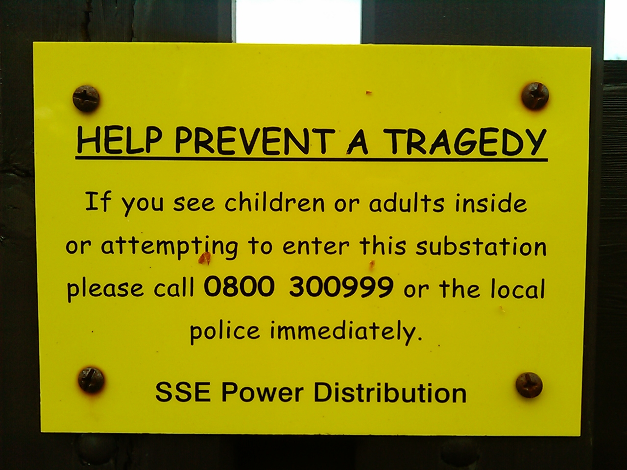
The playfulness of the typeface completely distracts and nullifies the serious nature of this sign. I mean, just within the first glance at this sign, you don't take it seriously at all.
Here's an example of it being used correctly:

Playful, colorful, supposed to be handwriting.
And this one:

It's like a comic book dialog bubble. PERFECT use for Comic Sans.
This image explains it well:

Copy link to clipboard
Copied
I almost see what you mean, but I guess I never really got any mood or any feelings at all from any font except the highly ornamental script and gothic ones. One I saw dripping blood or whatever too.
But to me, plain letters are plain letters and I don't see the big deal.
But in this case, I can *almost* see the point.
Still unconvinced, but I can see where some people may draw those conclusions.
I guess it must be because my handwriting is so sloppy that I learned a long time ago to never make judgements based on how something is written, and just read the words and judge their meaning. A variation on not judging books by their covers, I suppose.
Thanks for the examples though! It does clarify things a little 

Copy link to clipboard
Copied
Summer School
Where your summer comes to die... LOL! 
Alt-Web Design & Publishing ~ Web : Print : Graphics : Media

Copy link to clipboard
Copied
I've found that Robin Williams' (the author, not the actor) "Non Designers's Type Book" and "Non Designer's Design Book" are great places to start. The books are filled with easy to understand concepts that are directly applicable in creating better designs.
Mike
Copy link to clipboard
Copied
Sockratease wrote:
Ironically, I had a hard time finding any in my searches. So any advice would be appreciated.
Not too surprising given how wide and subjective this topic is.
I won't get too specific here other than to say designing for print is not the same as designing for screen. IMO, serif fonts like Georgia & Palatino are much easier to read on printed pages. Whereas sans-serif fonts like Open Sans are easier to read on screen. I do occasionally use serif fonts for screen headings. But I rarely (never) use them in screen paragraphs.
There is a good deal of psychology that goes into choosing the right fonts for your project. Obviously, it needs to communicate the message effectively. The Best Fonts to Use in Print, Online, and Email
Within those two broad flights of fonts, you have a lot of choices now from TypeKit, Google and Edge plus many others. But please read your font licenses very carefully. Understand that many fonts are not licensed for use on the web. So while you may find that perfect font for a particular product package or brand, you might not be able to use that font on the web unless it's embedded in an image. It gets tricky.
Nancy O.
Alt-Web Design & Publishing ~ Web : Print : Graphics : Media
Copy link to clipboard
Copied
Sorry for the delayed reply - Life is still happening...
Thanks for the replies, everyone! I'm just looking for general website design related information. No print related restrictions (yet!).
As far as knowing the differences between various fonts, yes - I can spot them, but am not too strong on naming them. I often use the kerning and leading settings, but mostly to make things fit in a specific space without effecting readability.
I have played with an old trial of FontLab Studio, but that was a long time ago and I mostly made fonts from vectorized images for symbols that could easily be loaded into my 3D Programs.
As for where this discussion belongs, I thought this was the best forum for it, but if there is a problem with it being a question, we can change the title to Font and Typography Discussion and then there should be no conflict. I think...
I'll look for the books mentioned, and I do worry about font licenses - I made a habit of pulling all the fonts off old computers when upgrading, so I have a ton of fonts, many of which I might not be allowed to use. I've even read that many fonts that ship with a computer are not for commercial use, so I'll be careful. I never planned on uploading any for inclusion on a site, just using them in rendered images and allowing the user's default fonts to cope with most aspects of a page on the web. I always thought that was the best way to approach things, but it does not seem to be the norm! Just another drawback of being self-taught.
Thanks for all the leads and tips, everybody. I'll be sure to do my research 
Copy link to clipboard
Copied
Typography has always been a passion for me. It is not an easy area to pinpoint as many have stated here. I have always thought about what I wished to convey visually with type in regard to either the client I was working with or what visual message I wished the type to say. That always lead me to areas that I could choose from and if couldn't locate then I created my own font. There are many avenues to learn from and many aspects to consider when working with type. It really falls in your creative hands to pass the message on visually!
Copy link to clipboard
Copied
One way to learn is to post your creation and ask for cc. Ask them to be specific as to why it works or not. Buy magazines in the topics or subjects you are designing for to understand what is trending or not at the time. If your project is retro - look at other retro ads and pay attention to the style and fonts. If it is holiday inspired then look at cards or ads for holiday themes. Also, pay attention to what turns you on or off to any particular add or article (fonts) and why. Soon you will develope an eye for what works or not.
YouTube and Vimeo has videos on the topic - but the subject is super broad since there are so many fonts and styles. Narrow it down to a subject or style you are trying to create and work out from there.
Copy link to clipboard
Copied
I should have said:
Why is Comic Sans MS evil?  <-- note added smiley
The point with Comic Sans, as with all fonts, there is a time and place. As a noob I can understand this to some small extent. Comic Sans MS is for fun, whimsical items. Team/Dept. outing or event. Find a serious font for serious things. For example, the SSE Power Distribution sign would have been better if 1) header was DANGER in 144pt. white on black 2) was in Frutiger or a similar typeface.
I think as screen resolutions continue to increase we will start to see an emergence of serif fonts for the screen. As someone who grew up learning to read with New Century Schoolbook (Dick & Jane books) - I have a fondness for serif'd fonts for long form reading (read: novels). I use them on my Kindle HD at the smallest type size - and find them to be very fluid and comfortable. I'm also weird in that I prefer to hold my Kindle landscape while reading.
As I said, I am not a designer nor creative - my day-job role is to research and purchase fonts for various teams within our company to match other companies branding. Finding the exact correct variant of a popular font can be an interesting exercise - especially if the client company has it customized in some manner (kerning, leading, letterform tweaking, etc.). As such I use FontLab Studio regularly to inspect & compare metrics, convert fonts to other formats (with foundry permission, of course), and seeing how a font for a complex script works. It's expensive, but a great tool. Sort of the difference between a Kobalt or Husky socket ratchet from Lowes or Home Depot, and one from Snap-On.
Back to my research on Myanmar/Burmese typography, UNICODE, and dealing with complex scripts. 
Doug

Copy link to clipboard
Copied
Sockratease -- This one:
https://www.amazon.co.uk/Points-Spacing-Arrangement-Classic-Typography/dp/0881791199
doesn't have to say much about typefaces, but for arranging type and spacing it's one of my favourites. And it's a good read too.
Peter
Copy link to clipboard
Copied
Thanks again for all the replies and tips!
I now have a few books to hope are in the library when I go there this weekend - the library is the best source of free tutorial books I have ever found

 AdChoices