- Home
- Type & Typography
- Discussions
- Re: Adobe Caslon Pro Font Spacing in Word 2016
- Re: Adobe Caslon Pro Font Spacing in Word 2016
Copy link to clipboard
Copied
After upgrading to Office 2016, Adobe Caslon Pro True Type Font is not appearing correctly within Word. Unless using exact spacing, the document prints (and converts to PDF) with different spacing than appears on-screen in Word. For example, if I am using single spacing and format a document so it fits perfectly on a single page, when I print the document, it prints on two pages. This is new to Word 2016; I did not have this issue with any previous versions of Word. Does anyone know why is this happening and if there is a timeline for a solution? Does the font need to be updated somehow?
 1 Correct answer
Using Word 2013 with Adobe Caslon Pro with paragraph line spacing set to Single, I see the same extra spacing on screen as for PDF output or printing. When I get back to my office in mid-February, I will see whether with Word 2016, the spacing differs on screen than for PDF output or printing.
The base cause of this anomaly is that Word has its own heuristics as to what Single spacing (or for that matter, Double, or Triple spacing) is. Instead of taking the text point size and multiplying it by s
...Copy link to clipboard
Copied
Moving the discussion to Type & Typography
Copy link to clipboard
Copied
There is no TrueType version of Adobe Caslon Pro!
Perhaps you mean an OpenType CFF font? And for those, we aren't aware of any particular issues with this font family. That having been said, Microsoft Office products are a bit wonky in terms of how they derive normal spacing. Perhaps you can post a copy of your Word file that uses Adobe Caslon for us to look at?
- Dov
Copy link to clipboard
Copied
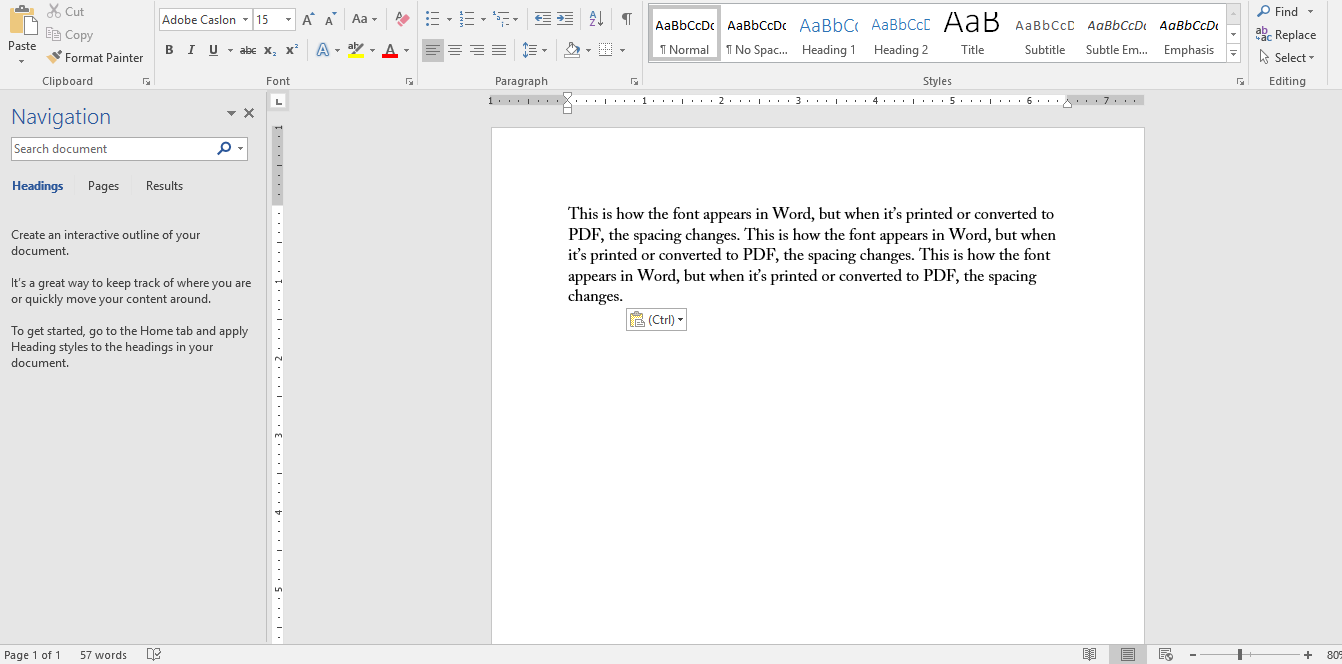
You're right. I'm using OpenType font. Here is how the font appears in Word when using single spacing:

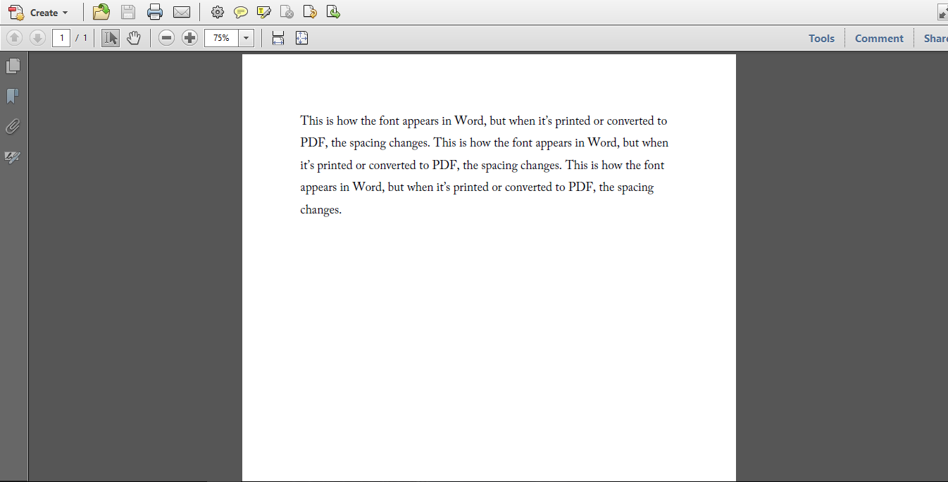
Here is how it appears when printed or converted to PDF:

As you see, the spacing widens when it prints, so if I format a document to be a page in Word, it will end up being more than a page when I print.
Copy link to clipboard
Copied
Using Word 2013 with Adobe Caslon Pro with paragraph line spacing set to Single, I see the same extra spacing on screen as for PDF output or printing. When I get back to my office in mid-February, I will see whether with Word 2016, the spacing differs on screen than for PDF output or printing.
The base cause of this anomaly is that Word has its own heuristics as to what Single spacing (or for that matter, Double, or Triple spacing) is. Instead of taking the text point size and multiplying it by some factor (often 1.2 such that 10pt type is set with 12pt leading and 12pt type is set with 14pt leading), Word seems to look inside the font for some metric such as the height of the tallest glyph in the font. A font such as Adobe Caslon Pro has a number of tall “ornament” glyphs and I suspect that Word is using their height for determining what Single spacing should be. This phenomena is nothing new.
There is nothing that Adobe can do about this algorithmic quirk on the part of Microsoft. What we would suggest is that when you use professional fonts in Microsoft Office applications, you set line spacing using the Exactly setting with the value in points equaling 1.2 times the text point size. This is typically what would be done in professional layout programs, but unfortunately, Office tried historically to be too clever.
- Dov
Copy link to clipboard
Copied
Thanks. This issue is new to Word 2016. I did not have any problem with Word 2013 either. I usually use exact spacing; I suppose now I will always use it.
Copy link to clipboard
Copied
I have the same problem with Arno Pro. Never had this problem in previous versions of Word. It is extremely annoying, esp. when printing older documents (in which I didn't use exact line spacing). I'm really starting to look into Microsoft Office alternatives, as this problem has been signaled to Microsoft several times already but they don't seem to be willing to solve it.
Copy link to clipboard
Copied
I tried using Dov's suggestion of using the "Exactly" setting (under "Paragraph") to a multiple of 1.2 x the font size for Adobe Caslon Pro. This solved the problem with the line spacing increasing when saving a word document to a PDF. However, in word and on the pdf, the text is clipped (for example, the bottom of the letter "g" is cut off).
Is there a way to adjust the spacing so that the letters are not cut-off but the spacing remains the same when converting to pdf?
Copy link to clipboard
Copied
I know this is an old thread but a better way to work around this MS issue is to set up a word template file .dotm. Then enable compatibility mode using the VB editor with code "ActiveDocument.SetCompatibilityMode 14". Next go to options and select Advance and under compatibility select "Use printer metrics to lay out document".
Copy link to clipboard
Copied
I obtained Adobe Caslon Pro as part of a set of basic fonts of Adobe Originals. I am having this line-spacing issue in all applications on Windows 10, including the standard Notepad editor. Am I correct in understanding that Windows 10 does this because there are some tall glyphs in the character set? Is there any resolution? It makes the font essentially unusable on my system, and it is too bad because it's very aesthetic.
Copy link to clipboard
Copied
It is not a “Windows 10 issue¨ but rather, a specific application issue, typically with Microsoft applications.
The problem doesn't occur with professional applications from Adobe, Corel, Quark, etc. You might contact Microsoft and see whether they can or will fix the problem from their end. There is nothing in the Adobe Caslon family that doesn't conform to the OpenType font specification.
- Dov
Copy link to clipboard
Copied
However, I am seeing this problem in CorelDRAW 2017 as well, and even the Windows Notepad, so I think this is an OS-wide issue. I guess there is no fix for it.
Copy link to clipboard
Copied
I just tried an example using CorelDraw 2018 under Windows 10 and didn't see any issues at all with Adobe Caslon Pro, regardless of the interline spacing. Nothing was cutoff or missing. Note that you should properly set the interline spacing. The default may not be to your liking. At text sizes, 120% is usually standard and produces pleasant results.
- Dov
Copy link to clipboard
Copied
I see that when I use Adobe Caslon Pro in a paragraph box in CorelDRAW 2017 it works well because the line spacing is set manually. I guess that makes sense. Thanks for your assistance.
Best,
Chris
Copy link to clipboard
Copied
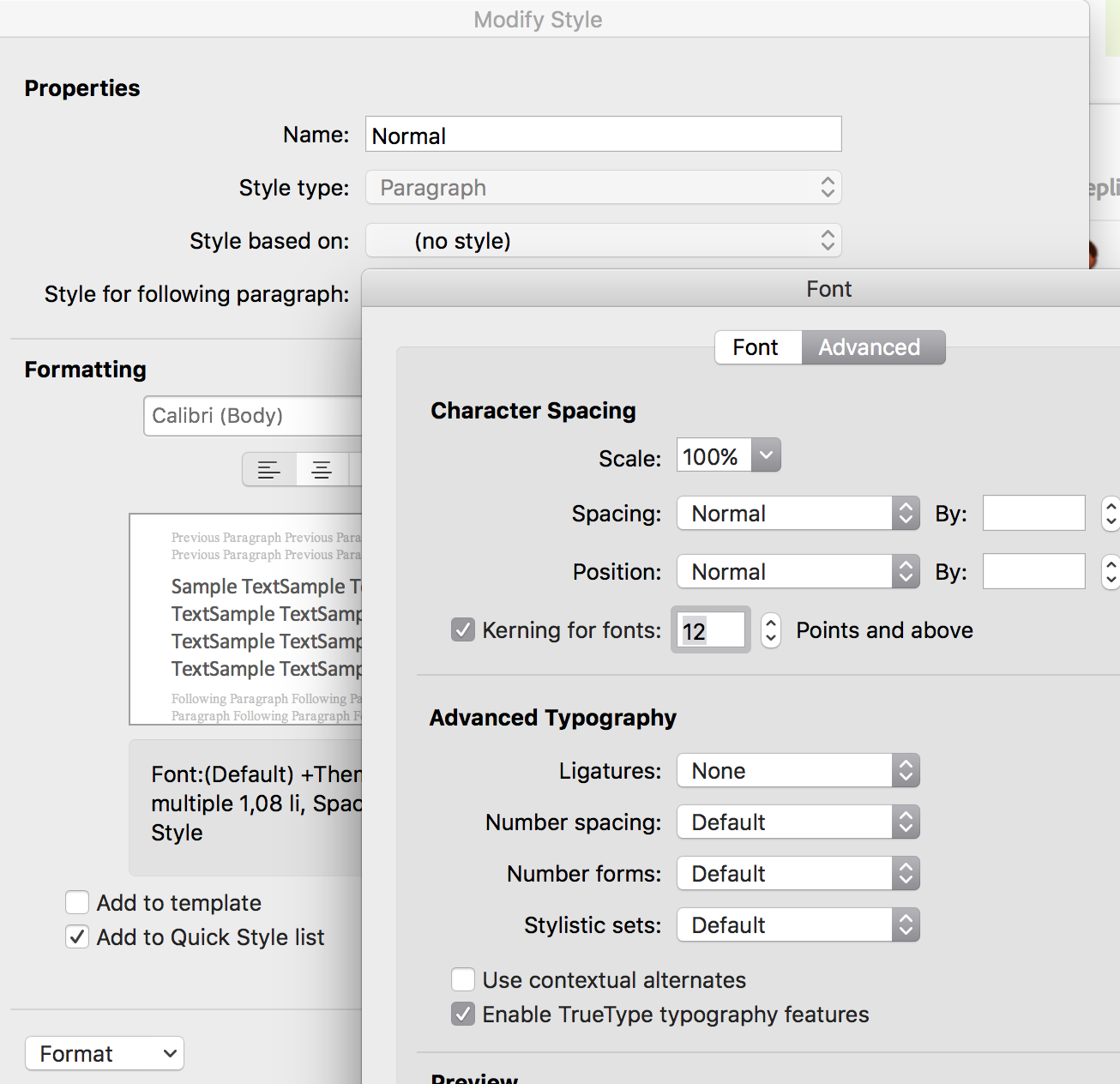
You can set to apply kerning in MS Word. It's not on by default, and you set "for fonts above" and then choose a minimum value to be kerned. It does require the Operating system to have access to the font metrics, because Word only Kerns with metrics.
Modify the Paragraph Format choose Font and then go to the Advanced tab. 
Copy link to clipboard
Copied
I tried this kerning trick and it doesn't affect the line spacing, just the spacing between characters. The extra spacing remains.
Copy link to clipboard
Copied
Oh ok sorry spacing you can set in Paragraph and you can set to exact and give a pt size did you try that? (word uses spacing for both horizontal and vertical better when it's called leading). Note that in Word space before and after is not summative as in graphics programmes.
Copy link to clipboard
Copied
I have used the exact line spacing and it does work. 12-pt Caslon on 16-pt line spacing looks pretty good.
Find more inspiration, events, and resources on the new Adobe Community
Explore Now