• Global community
    • Language:
      • Deutsch
      • English
      • Español
      • Français
      • Português
  • 日本語コミュニティ
    Dedicated community for Japanese speakers
  • 한국 커뮤니티
    Dedicated community for Korean speakers
Exit
1

Quill Ink Effect needed

New Here ,
May 27, 2018 May 27, 2018

Copy link to clipboard

Copied

Good day,

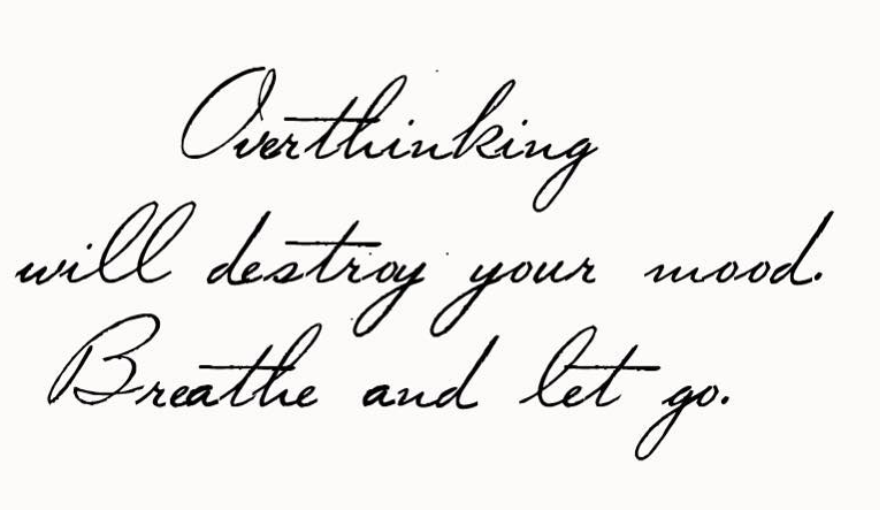
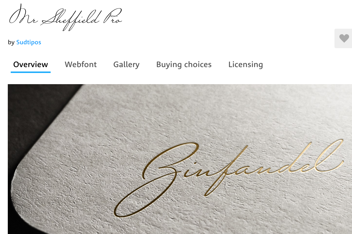
I came across this image online. I can identify the typeface as Mr Sheffield Pro. However the type has been given an effect, with very slight ink dots around the words; and the script has a more uneven / natural look to it, as if it was truly written in an earlier time with a quill pen (as an example). Please advise as to how I can get this affect, once I download the appropriate typeface. Or perhaps some one knows of a suitable tutorial?

Thank you so much.

[I have attached two examples of the effect, and one image of the typeface itself]

Screen Shot 2018-05-27 at 20.53.25.pngScreen Shot 2018-05-27 at 20.53.12.pngScreen Shot 2018-05-28 at 07.48.22.png

Views

528

Translate

Translate

Report

Report
Community guidelines
Be kind and respectful, give credit to the original source of content, and search for duplicates before posting. Learn more
community guidelines
no replies

Have something to add?

Join the conversation